General modules
The general modules of the vois library contain functions and classes of general use.

colors module
Utility functions and classes to manage colors and color interpolation.
- colors.analogousColor(rgb)[source]
Given a tuple color (r,g,b) returns a list of two analogous colors (see: Analogous colors meaning)
- Parameters:
rgb (tuple) – Tuple of 3 integers representing the RGB components in the range [0,255]
- Return type:
List of two tuples of 3 integers representing the output RGB components in the range [0,255]
Example
Display a palette showing an input random color and the two analogous colors:
from vois import colors
from IPython.display import display

col = colors.randomColor()
display(colors.paletteImage([col] + [colors.rgb2hex(x) for x in colors.analogousColor(colors.string2rgb(col))], interpolate=False))
- class colors.colorInterpolator(colorlist, minValue=0.0, maxValue=100.0)[source]
Class to perform color interpolation given a list of colors and a numerical range [minvalue,maxvalue]. The list of colors is considered as a linear range spanning from minvalue to maxvalue and the method
colors.colorInterpolator.GetColor()can be used to calculate any intermediate color by passing as input any numeric value.- Parameters:
colorlist (list of strings representing colors in 'rgb(r,g,b)' or '#rrggbb' format) – Input list of colors
minvalue (float, optional) – Minimum value for the interpolation (default is 0.0)
maxvalue (float, optional) – Maximum numerical value for the interpolation (default is 100.0)
Examples
Creation of a color interpolator from a list of custom colors:
from vois import colors

colorlist = ['rgb(247,251,255)',
             'rgb(198,219,239)',
             'rgb(107,174,214)',
             'rgb(33,113,181)',
             'rgb(8,48,107)']
c = colors.colorInterpolator(colorlist)
print( c.GetColor(50.0) )
Creation of a color interpolator using one of the Plotly library predefined colorscales (see Plotly sequential color scales and Plotly qualitative color sequences ):
import plotly.express as px
from vois import colors

c = colors.colorInterpolator(px.colors.sequential.Viridis, 0.0, 100.0)
print( c.GetColor(33.3) )
To visualize a color palette from a list of colors, the
colors.paletteImage()function can be used:from vois import colors import plotly.express as px img = colors.paletteImage(px.colors.sequential.Blues, width=400, height=40) display(img)

Fig. 26 Display of a Plotly colorscale.
- colors.complementaryColor(rgb)[source]
Given a tuple color (r,g,b) returns the complementary version of the input color (see: Complementary color meaning and Color wheel online)
- Parameters:
rgb (tuple) – Tuple of 3 integers representing the RGB components in the range [0,255]
- Return type:
Tuple of 3 integers representing the output RGB components in the range [0,255]
Example
Display a palette of a random color followed by its complementary color:
from vois import colors
from IPython.display import display

col = colors.randomColor()
colcomp  = colors.rgb2hex(colors.complementaryColor(colors.string2rgb(col)))
display(colors.paletteImage([col, colcomp], interpolate=False))
- colors.hex2rgb(color)[source]
Converts from a hexadecimal string representation of the color ‘#rrggbb’ to a (r,g,b) tuple
- Parameters:
color (string) – A string containing the color represented as hexadecimals in the ‘#rrggbb’ format
- Return type:
Tuple of 3 integers representing the RGB components in the range [0,255]
Example
Convert a color from ‘#rrggbb’ to (r,g,b):
from vois import colors
print( colors.hex2rgb( '#ff0000' ) )
- colors.image2Base64(img)[source]
Given a PIL image, returns a string containing the image in base64 format
- Parameters:
img (PIL image) – Input PIL image
- Return type:
A string containing the image in base64 format
- colors.isColorDark(rgb)[source]
Returns True if the color (r,g,b) is dark
- Parameters:
rgb (tuple) – Tuple of 3 integers representing the RGB components in the range [0,255]
- colors.monochromaticColor(rgb, increment=0.2)[source]
Given a tuple color (r,g,b) returns a darker (if increment is negative) or lighter (if increment is positive) version of the input color (see: Monochromatic colors meaning)
- Parameters:
rgb (tuple) – Tuple of 3 integers representing the RGB components in the range [0,255]
increment (float, optional) – Increment/decrement in lightness in [-1.0, 1.0] (default is 0.2)
- Return type:
Tuple of 3 integers representing the output RGB components in the range [0,255]
Example
Display a palette of a random color followed by its darker and lighter version:
from vois import colors
from IPython.display import display

col = colors.randomColor()
coldarker  = colors.rgb2hex(colors.monochromaticColor(colors.string2rgb(col), increment=-0.25))
collighter = colors.rgb2hex(colors.monochromaticColor(colors.string2rgb(col), increment=0.25))
display(colors.paletteImage([col, coldarker, collighter], interpolate=False))
- colors.paletteImage(colorlist, width=400, height=40, interpolate=True)[source]
Given a list of colors, calculates and returns a PIL image displaying the color palette.
- Parameters:
colorlist (list of strings representing colors in 'rgb(r,g,b)' or '#rrggbb' format) – Input list of colors
width (int, optional) – Width in pixel of the image (default is 400)
height (int, optional) – Height in pixel of the image (default is 40)
interpolate (bool, optional) – If True the colors of the list are interpolated, if False, only the color in the list are displayed (default is True)
- Return type:
A PIL image displaying the color palette
Examples
Creation of a color palette image from a list of colors:
from vois import colors
import plotly.express as px

img = colors.paletteImage(px.colors.sequential.Viridis, width=400, height=40)
display(img)
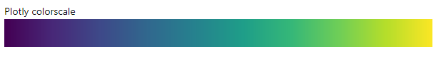
Fig. 27 Display of a Plotly colorscale.
- colors.rgb2hex(rgb)[source]
Converts from a color represented as a (r,g,b) tuple to a hexadecimal string representation of the color ‘#rrggbb’
- Parameters:
rgb (tuple of 3 int values) – Input color described by its RGB components as 3 integer values in the range [0,255]
- Return type:
A string containing the color represented as hexadecimals in the ‘#rrggbb’ format
Example
Convert a color from (r,g,b) to ‘#rrggbb’:
from vois import colors
print( colors.rgb2hex( (255,0,0) ) )
- colors.splitComplementaryColor(rgb)[source]
Given a tuple color (r,g,b) returns a list of two split complementary colors (see: Split complementary colors meaning and Color wheel online)
- Parameters:
rgb (tuple) – Tuple of 3 integers representing the RGB components in the range [0,255]
- Return type:
List of two tuples of 3 integers representing the output RGB components in the range [0,255]
Example
Display a palette showing an input random color and the two split complementary colors:
from vois import colors
from IPython.display import display

col = colors.randomColor()
display(colors.paletteImage([col] + [colors.rgb2hex(x) for x in colors.splitComplementaryColor(colors.string2rgb(col))], interpolate=False))
- colors.squareColor(rgb)[source]
Given a tuple color (r,g,b) returns a list of three square colors (see: Color wheel online)
- Parameters:
rgb (tuple) – Tuple of 3 integers representing the RGB components in the range [0,255]
- Return type:
List of three tuples of 3 integers representing the output RGB components in the range [0,255]
Example
Display a palette showing an input random color and the three tetradic colors:
from vois import colors
from IPython.display import display

col = colors.randomColor()
display(colors.paletteImage([col] + [colors.rgb2hex(x) for x in colors.squareColor(colors.string2rgb(col))], interpolate=False))
- colors.string2rgb(s)[source]
Converts from string representation of the color ‘rgb(r,g,b)’ or ‘#rrggbb’ to a (r,g,b) tuple
- Parameters:
color (string) – A string containing the color represented in the ‘rgb(r,g,b)’ format or in the ‘#rrggbb’ format
- Return type:
Tuple of 3 integers representing the RGB components in the range [0,255]
- colors.tetradicColor(rgb)[source]
Given a tuple color (r,g,b) returns a list of four tetradic colors (see: Tetradic colors meaning and Color wheel online)
- Parameters:
rgb (tuple) – Tuple of 3 integers representing the RGB components in the range [0,255]
- Return type:
List of four tuples of 3 integers representing the output RGB components in the range [0,255]
Example
Display a palette showing an input random color and the three tetradic colors:
from vois import colors
from IPython.display import display

col = colors.randomColor()
display(colors.paletteImage([col] + [colors.rgb2hex(x) for x in colors.tetradicColor(colors.string2rgb(col))], interpolate=False))
- colors.text2rgb(color)[source]
Converts from string representation of the color ‘rgb(r,g,b)’ to a (r,g,b) tuple
- Parameters:
color (string) – A string containing the color represented in the ‘rgb(r,g,b)’ format
- Return type:
Tuple of 3 integers representing the RGB components in the range [0,255]
Example
Convert a color from ‘rgb(r,g,b)’ to (r,g,b):
from vois import colors
print( colors.text2rgb( 'rgb(255,0,0)' ) )
- colors.triadicColor(rgb)[source]
Given a tuple color (r,g,b) returns a list of two split triadic colors (see: Triadic colors meaning and Color wheel online)
- Parameters:
rgb (tuple) – Tuple of 3 integers representing the RGB components in the range [0,255]
- Return type:
List of two tuples of 3 integers representing the output RGB components in the range [0,255]
Example
Display a palette showing an input random color and the two triadic colors:
from vois import colors
from IPython.display import display

col = colors.randomColor()
display(colors.paletteImage([col] + [colors.rgb2hex(x) for x in colors.triadicColor(colors.string2rgb(col))], interpolate=False))
download module
Utility functions for downloading text and binary files
- download.downloadBytes(bytesobj, fileName='download.bin')[source]
Download of an array of bytes as a binary file.
- Parameters:
bytesobj (bytearray or bytes object) – Bytes to be written in the binary file to be downloaded
fileName (str, optional) – Name of the file to download (default is “download.bin”)
Example
In order to download a binary file, the Output widget download.output must be displayed inside the notebook. This is required because the download operation is based on the execution of Javascript code, and this requires an Output widget displayed. After the download.output widget is visible, then the download.downloadBytes function can be called:
from vois import download

display(download.output)

with download.output:
    download.downloadBytes(bytearray(b'ajgh lkjhl '))
- download.downloadText(textobj, fileName='download.txt')[source]
Download of a string as a text file.
- Parameters:
textobj (str) – Text to be written in the text file to be downloaded
fileName (str, optional) – Name of the file to download (default is “download.txt”)
Example
In order to download a text file, the Output widget download.output must be displayed inside the notebook. This is required because the download operation is based on the execution of Javascript code, and this requires an Output widget displayed. After the download.output widget is visible, then the download.downloadText function can be called:
from vois import download

display(download.output)

with download.output:
    download.downloadText('aaa bbb ccc')
eucountries module
Utility functions and classes to manage information on EU countries.
- class eucountries.countries[source]
Class to store information on all the EU countries.
- Parameters:
countries_list (list of eucountries.country instances) – List of countries in the European Union
Examples
Get the list of all European Union or Euro Area countries:
from vois import eucountries as eu

countriesEU = eu.countries.EuropeanUnion()
print(countriesEU)

countriesEuro = eu.countries.EuroArea()
print(countriesEuro)
Display the flag image of a country given its code:
from vois import eucountries as eu
display( eu.countries.byCode('IT').flagImage() )
Display the flag image of a country given its name:
from vois import eucountries as eu
display( eu.countries.byName('Lithuania').flagImage() )
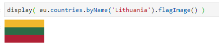
Fig. 28 Display of the flag of an EU country
Get the list of all the European Union country codes:
from vois import eucountries as eu
display( eu.countries.EuroAreaCodes() )
- classmethod EuroArea(sortByName=True)[source]
Static method that returns the list of all the country belonging to the Euro Area
- Parameters:
sortByName (bool, optional) – If True, the returned list of countries is sorted by the name of the country (default is True)
- classmethod EuroAreaCodes()[source]
Static method that returns the list of all the iso2codes of the countries belonging to the Euro Area
- classmethod EuropeanUnion(sortByName=True)[source]
Static method that returns the list of all the country belonging to the European Union
- Parameters:
sortByName (bool, optional) – If True, the returned list of countries is sorted by the name of the country (default is True)
- classmethod EuropeanUnionCodes()[source]
Static method that returns the list of all the iso2codes of the countries belonging to the European Union
- classmethod EuropeanUnionNames()[source]
Static method that returns the list of all the names of the countries belonging to the European Union
- classmethod add(name, iso2code, euro=False, iscountry=True, population=0)[source]
Static method to add a country to the countries_list
- Parameters:
name (str) – Name of the country
iso2code (str) – Two letter code of the country defined by EUROSTAT (https://ec.europa.eu/eurostat/statistics-explained/index.php?title=Glossary:Country_codes)
euro (bool, optional) – Flag that is True for countries belonging to the Euro Area (default is False)
iscountry (bool, optional) – True if it is a real country (default is True). For instance ‘Euro Area’ and ‘European Union’ have this value set to False
population (int, optional) – Last known population of the country
- classmethod byCode(iso2code)[source]
Static method that returns a country given its iso2code, or None if not existing
- Parameters:
iso2code (str) – Two letter code of the country defined by EUROSTAT (https://ec.europa.eu/eurostat/statistics-explained/index.php?title=Glossary:Country_codes)
- Return type:
Instance of country or None
- class eucountries.country(name, iso2code, euro=False, iscountry=True, population=0)[source]
Class to store information on a single EU country.
- Parameters:
name (str) – Name of the country
iso2code (str) – Two letter code of the country defined by EUROSTAT (https://ec.europa.eu/eurostat/statistics-explained/index.php?title=Glossary:Country_codes)
iso3code (str) – Three letter code of the country defined by ISO 3166 (https://en.wikipedia.org/wiki/ISO_3166-1_alpha-3)
euro (bool, optional) – Flag that is True for countries belonging to the Euro Area (default is False)
iscountry (bool, optional) – True if it is a real country (default is True). For instance ‘Euro Area’ and ‘European Union’ have this value set to False
population (int, optional) – Last known population of the country
- class eucountries.language(name, abbreviation, population=0)[source]
Class to store information on a language of the European Union.
- Parameters:
name (str) – Name of the language
abbreviation (str) – Abbreviation used for the language
population (int, optional) – Last known population that uses the language
- class eucountries.languages[source]
Class to store information on all the European Union languages.
- Parameters:
languages_list (list of eucountries.language instances) – List of languages in the European Union
Examples
Print the list of all European Union languages:
from vois import eucountries as eu
names = eu.languages.EuropeanUnionLanguages(sortByName=False)
print(names)
Print the list of all European Union languages abbreviations:
from vois import eucountries as eu
abbrev = eu.languages.EuropeanUnionAbbreviations()
print(abbrev)
- classmethod EuropeanUnionAbbreviations()[source]
Static method that returns the list of all the abbreviations of the EU languages
- classmethod EuropeanUnionLanguages(sortByName=True)[source]
Static method that returns the list of all the languages of the European Union
- Parameters:
sortByName (bool, optional) – If True, the returned list of languages is sorted by the name of the language (default is True)
geojsonUtils module
Utility functions to manage geospatial vector data in geojson format.
- geojsonUtils.geojsonAll(geojson, attributeName)[source]
Given a geojson string, returns the list of values of the attribute attributeName for all the features
- Parameters:
geojson (str) – String containing data in geojson format
attributeName (str) – Name of one of the attributes
- Return type:
List containing the values of the attribute for all the features of the input geojson dataset
Example
Load a geojson from file and print all the values of one if its attributes:
from vois import geojsonUtils

geojson = geojsonUtils.geojsonLoadFile('./data/example.geojson')

print('Values = ', geojsonUtils.geojsonAll(geojson,'ha'))
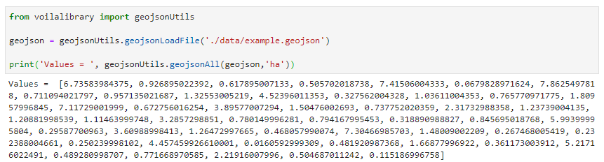
Fig. 29 Read a geojson file and print the values of one of its attributes for all the features of the dataset
- geojsonUtils.geojsonAttributes(geojson)[source]
Given a geojson string, returns the list of the attribute names of the features
- Parameters:
geojson (str) – String containing data in geojson format
- Return type:
List of strings containing the names of the attributes of the features in the input geojson string
Example
Load a geojson from file and print the names of its attributes:
from vois import geojsonUtils

geojson = geojsonUtils.geojsonLoadFile('./data/example.geojson')

print('Attributes = ', geojsonUtils.geojsonAttributes(geojson))
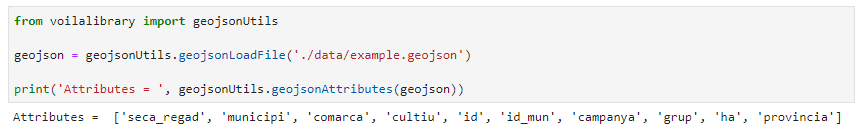
Fig. 30 Read a geojson file and print the names of its attributes
- geojsonUtils.geojsonCount(geojson)[source]
Given a geojson string, returns the number of features
- Parameters:
geojson (str) – String containing data in geojson format
- Return type:
Integer corresponding to the number of features in the input geojson string
- geojsonUtils.geojsonFilter(geojson, fieldname, fieldvalue)[source]
Filter a geojson by keeping only the features for which <fieldname> has value <fieldvalue> (fieldvalue can be also a list)
- Parameters:
geojson (str) – String containing data in geojson format
fieldname (str) – Name of one of the attributes of the input geojson
fieldvalue (single value or list of values) – Comparison value. Only the input features having this value on the <fieldname> attribute are kept in the output geojson returned
- Return type:
a string containing the modified geojson containing only the features that pass the filter operation
- geojsonUtils.geojsonJoin(geojson, keyname, addedfieldname, keytovaluedict, innerMode=False)[source]
Add a field to a geojson by joining a python dictionary through match with the field named keyname. If innerMode is True, the output geojson will only keep the joined features, otherwise all the original features are returned
- Parameters:
geojson (str) – String containing data in geojson format
keyname (str) – Name of the attribute of the input geojson to use as internal key for the join operation
addedfieldname (str) – Name of the attribute to add to the input geojson as a result of the join operation
keytovaluedict (dict) – Dictionary (key-value pairs) to use as joined values. The keys of the <keytovaluedict> are used as foreign keys to match the values of the <keyname> attribute of the input geojson. When a match is found, the attribute <addedfieldname> is added to the corresponding feature having the value read from the <keytovaluedict>
innerMode (bool, optional) – If innerMode is True, the output geojson will only keep the successfully joined features, otherwise all the original features are returned
- Return type:
a string containing the modified geojson after the join operation
Example
Load a geojson from file, print some information on attributes and values of the features, then join the features with a dictionary:
from vois import geojsonUtils

# Load a geojson file
geojson = geojsonUtils.geojsonLoadFile('./data/example.geojson')

# Add a new field by joining with a dictionary (with innerMode flag set to True)
keytovalue = { 37661: 'aaa', 37662: 'bbb'}
geojsonnew = geojsonUtils.geojsonJoin(geojson,'id', 'value', keytovalue, innerMode=True)

# Print the 'value' attribute values for the joined geojson dataset
print('Joined values =', geojsonUtils.geojsonAll(geojsonnew,'value'))
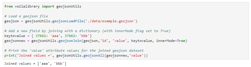
Fig. 31 Result of the Join operation
- geojsonUtils.geojsonJson(geojson)[source]
Given a geojson string, returns a json dictionary after having tested that the input string contains a valid geojson
- Parameters:
geojson (str) – String containing data in geojson format
- Return type:
Json dictionary
- Raises:
Exception if the input string is not in geojson format –
- geojsonUtils.geojsonLoadFile(filepath)[source]
Load a geojson content from file, testing that it contains valid geojson data
- Parameters:
filepath (str) – File path of the geojson file to load
- Return type:
File content as a geojson string
Example
Load a geojson from file, print the geojson string:
from vois import geojsonUtils

geojson = geojsonUtils.geojsonLoadFile('./data/example.geojson')

print(geojson)
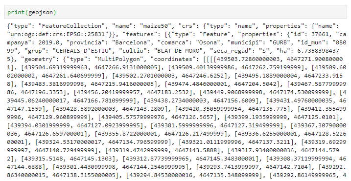
Fig. 32 Read a geojson file and print its content
interMap module
Utility functions for the creation of interactive maps using BDAP interactive library.
- interMap.bivariateLegend(v, filters1, filters2, colorlist1, colorlist2, title='', title1='', title2='', names1=[], names2=[], fontsize=14, fontweight=400, stroke='#000000', stroke_width=0.25, side=100, resizewidth='', resizeheight='')[source]
Creation of a bivariate choropleth legend for a polygon vector layer. See Bivariate Choropleth Maps: A How-to Guide for the idea. The function creates a legend for vector layer v based on two attributes of the layer and returns a string containing the SVG representation of the legend (that can be displayed using display(HTML(svgstring) call)
Note
This function is built on top of the BDAP interapro library to display dynamic geospatial dataset. For this reason it is not portable in other environments! Please refer to the module
lefletMapfor geospatial function not related to BDAP.- Parameters:
v (instance of inter.VectorLayer class) – Vector layer instance for which the bivariate legend has to be built
filters1 (list of strings) – List of strings defining the conditions for the classes based on the first attribute
filters2 (list of strings) – List of strings defining the conditions for the classes based on the second attribute
colorlist1 (list of colors) –
List of colors to use for the legend on the first attribute (see Plotly sequential color scales and Plotly qualitative color sequences )
colorlist2 (list of colors) –
List of colors to use for the legend on the second attribute (see Plotly sequential color scales and Plotly qualitative color sequences )
title (str, optional) – Main title of the legend chart (default is ‘’)
title1 (str, optional) – Title for the legend on the first attribute. It will be displayed vertically in the Y axis of the SVG. Default is ‘’.
title2 (str, optional) – Title for the legend on the second attribute. It will be displayed horizontally in the X axis of the SVG. Default is ‘’.
names1 (list of strings, optional) – List containing one string for each of the classes of the legend on the first attribute (default is [])
names2 (list of strings, optional) – List containing one string for each of the classes of the legend on the second attribute (default is [])
fontsize (int, optional) – Size in pixels of the font used for texts (default is 14)
fontweight (int, optional) – Weight of the font used for title texts (default is 400)
stroke (str, optional) – Color to use for the border of the polygons (default is ‘#000000’)
stroke_width (float, optional) – Width in pixels of the stroke to use for the border of the polygons (default is 0.25)
side (int, optional) – Side in pixels of the squares displayed in the SVG legend (default is 100)
resizewidth (str, optional) – Width of the resizing container (default is ‘’)
resizeheight (str, optional) – height of the resizing container (default is ‘’)
- Return type:
a string containing SVG text to display the bivariate legend using a call to display(HTML(…))
Example
Creation of a bivariate choropleth legend for the polygons of the Italian provinces. The first attribute is the short name of the province (attribute ‘SIGLA’), and the second attribute is the SHAPE_AREA attribute which contains the dimension in squared meters:
from ipywidgets import widgets, Layout, HTML
from IPython.display import display

from jeodpp import inter, imap
from vois import interMap, geojsonUtils

# Load data on italian provinces
geojson = geojsonUtils.geojsonLoadFile('./data/ItalyProvinces.geojson')
vector = interMap.interGeojsonToVector(geojson)
vector = vector.parameter("identifyfield", "SIGLA DEN_PROV SHAPE_AREA")
vector = vector.parameter("identifyseparator", "<br>")

# Create and display a Map instance
m = imap.Map(basemap=1, layout=Layout(height='600px'))
display(m)

# Creation of the bivariate legend
colorlist1 = ['#f3f3f3', '#eac5dd', '#e6a3d0']
colorlist2 = ['#f3f3f3', '#c2f1d5', '#8be2ae']

svg = interMap.bivariateLegend(vector,
                               ["[SIGLA] < 'FE'", "[SIGLA] >= 'FE' and [SIGLA] <= 'PU'", "[SIGLA] > 'PU'"],
                               ["[SHAPE_AREA] < 2500000000", "[SHAPE_AREA] >= 2500000000 and [SHAPE_AREA] <= 4500000000", "[SHAPE_AREA] > 4500000000 and [SHAPE_AREA] <= 7500000000", '[SHAPE_AREA] > 7500000000'],
                               colorlist1,
                               colorlist2,
                               title='Example of Bivariate Choropleth',
                               title1="Province initials",
                               names1=['< FE', 'in [FE,PU]', '> PU'],
                               title2="Province area",
                               names2=['Small', 'Medium', 'Large', 'XLarge'],
                               fontsize=24,
                               fontweight=500)

# Display of the vector layer on the map
p = vector.process()
m.clear()
m.addLayer(p.toLayer())
m.zoomToImageExtent(p)

inter.identifyPopup(m,p)

# Display the bivariate choropleth legend
display(HTML(svg))
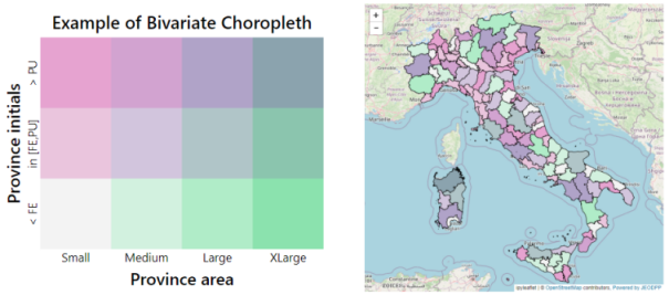
Fig. 33 Example of an interactive map showing polygons colored with a bivariate choropleth legend.
- interMap.countriesMap(df, code_column=None, value_column='value', codes_selected=[], center=None, zoom=None, width='99%', height='400px', min_width=None, basemap=1, colorlist=['#0d0887', '#46039f', '#7201a8', '#9c179e', '#bd3786', '#d8576b', '#ed7953', '#fb9f3a', '#fdca26', '#f0f921'], stdevnumber=2.0, stroke='#232323', stroke_selected='#00ffff', stroke_width=1.0, decimals=2, minallowed_value=None, maxallowed_value=None)[source]
Creation of an interactive map to display the countries of the world. An input Pandas DataFrame df is used to join a column of numeric values to the countries, using the iso2code (ISO 3166-2) as internal key attribute. Once the values are assigned to the countries, a graduated legend is calculated based on mean and standard deviation of the assigned values. A input list of colors is used to represent the countries given their assigned value.
Note
This function is built on top of the BDAP interapro library to display dynamic geospatial dataset. For this reason it is not portable in other environments! Please refer to the module
leafletMapfor geospatial function not related to BDAP.- Parameters:
df (Pandas DataFrame) – Pandas DataFrame to use for assigning values to the countries. It has to contain at least a column with numeric values.
code_column (str, optional) – Name of the column of the Pandas DataFrame containing the unique code of the countries in the ISO-3166-2 standard. This column is used to perform the join with the internal attribute of the countries vector dataset that contains the country code. If the code_column is None, the code is taken from the index of the DataFrame, (default is None)
value_column (str, optional) – Name of the column of the Pandas DataFrame containing the values to be assigned to the countries using the join on the ISO-3166-2 codes (default is ‘value’)
codes_selected (list of strings, optional) – List of codes of countries to display as selected (default is [])
center (tuple of (lat,lon), optional) – Geographical coordinates of the initial center of the interactive map visualization (default is None)
zoom (int, optional) – Initial zoom level of the interactive map (default is None)
width (str, optional) – Width of the map widget to create (default is ‘99%’)
height (str, optional) – Height of the map widget to create (default is ‘400px’)
min_width (str, optional) – Minimum width of the layout of the map widget (default is None)
basemap (int, optional) – Basemap to use as background in the map visualization (default is 1). Valid values are in [1,39], see https://jeodpp.jrc.ec.europa.eu/services/processing/interhelp/3.2_map.html?highlight=basemap#inter.Map.printAvailableBasemaps for details
colorlist (list of colors, optional) –
List of colors to assign to the country polygons (default is the Plotly px.colors.sequential.Plasma, see Plotly sequential color scales and Plotly qualitative color sequences )
stdevnumber (float, optional) – The correspondance between the values assigned to country polygons and the colors list is done by calculating a range of values [min,max] to linearly map the values to the colors. This range is defined by calculating the mean and standard deviation of the country values and applying this formula [mean - stdevnumber*stddev, mean + stdevnumber*stddev]. Default is 2.0
stroke (str, optional) – Color to use for the border of countries (default is ‘#232323’)
stroke_selected (str, optional) – Color to use for the border of the selected countries (default is ‘#00ffff’)
stroke_width (float, optional) – Width of the border of the country polygons in pixels (default is 1.0)
decimals (int, optional) – Number of decimals for the legend numbers display (default is 2)
minallowed_value (float, optional) – Minimum value allowed, to force the calculation of the [min,max] range to map the values to the colors
maxallowed_value (float, optional) – Maximum value allowed, to force the calculation of the [min,max] range to map the values to the colors
- Return type:
a jeodpp.imap instance (a Map object derived from the ipyleaflet Map)
Example
Creation of a map displaying a random variable on 4 european countries. The numerical values assigned to each of the countries are randomly generated using numpy.random.uniform and saved into a dictionary having the country code as the key. This dict is transformed to a Pandas DataFrame with 4 rows and having ‘iso2code’ and ‘value’ as columns. The graduated legend is build using the ‘inverted’ Reds Plotly colorscale (low values are dark red, intermediate values are red, high values are white):
import numpy as np
import pandas as pd
import plotly.express as px
from vois import interMap

countries = ['DE', 'ES', 'FR', 'IT']

# Generate random values and create a dictionary: key=countrycode, value=random in [0.0,100.0]
d = dict(zip(countries, list(np.random.uniform(size=len(countries),low=0.0,high=100.0))))

# Create a pandas dataframe from the dictionary
df = pd.DataFrame(d.items(), columns=['iso2code', 'value'])

m = interMap.countriesMap(df,
                          code_column='iso2code',
                          height='400px',
                          stroke_width=1.5,
                          stroke_selected='yellow',
                          colorlist=px.colors.sequential.Reds[::-1],
                          codes_selected=['IT'])
display(m)
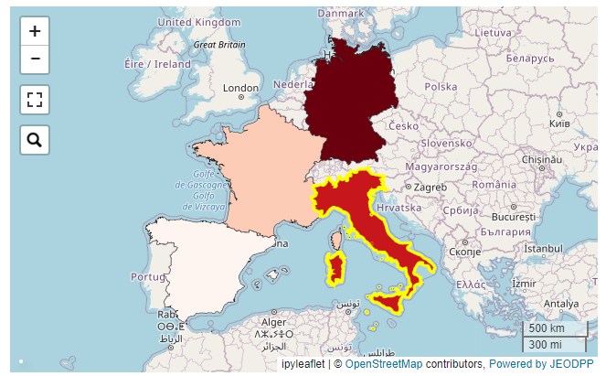
Fig. 34 Example of an interactive map displaying 4 european countries.
- interMap.geojsonMap(df, geojson_path, geojson_attribute, code_column=None, value_column='value', codes_selected=[], center=None, zoom=None, width='99%', height='400px', min_width=None, basemap=1, colorlist=['#0d0887', '#46039f', '#7201a8', '#9c179e', '#bd3786', '#d8576b', '#ed7953', '#fb9f3a', '#fdca26', '#f0f921'], stdevnumber=2.0, stroke='#232323', stroke_selected='#00ffff', stroke_width=1.0, decimals=2, minallowed_value=None, maxallowed_value=None)[source]
Creation of an interactive map to display a custom geojson dataset. An input Pandas DataFrame df is used to join a column of numeric values to the geojson features, using the <geojson_attribute> as the internal key attribute. Once the values are assigned to the features, a graduated legend is calculated based on mean and standard deviation of the assigned values. A input list of colors is used to represent the featuress given their assigned value.
Note
This function is built on top of the BDAP interapro library to display dynamic geospatial dataset. For this reason it is not portable in other environments! Please refer to the module
lefletMapfor geospatial function not related to BDAP.- Parameters:
df (Pandas DataFrame) – Pandas DataFrame to use for assigning values to features. It has to contain at least a column with numeric values.
geojson_path (str) – Path of the geojson file to load that contains the geographic features in geojson format
geojson_attribute (str) – Name of the attribute of the geojson dataset that contains the unique codes of the features. This attribute will be use as internal key in the join operation with the df Pandas DataFrame
code_column (str, optional) – Name of the column of the df Pandas DataFrame containing the unique code of the features. This column is used to perform the join with the internal attribute of the geojson vector dataset that contains the unique code. If the code_column is None, the code is taken from the index of the DataFrame, (default is None)
value_column (str, optional) – Name of the column of the Pandas DataFrame containing the values to be assigned to the features using the join on geojson unique codes (default is ‘value’)
codes_selected (list of strings, optional) – List of codes of features to display as selected (default is [])
center (tuple of (lat,lon), optional) – Geographical coordinates of the initial center of the interactive map visualization (default is None)
zoom (int, optional) – Initial zoom level of the interactive map (default is None)
width (str, optional) – Width of the map widget to create (default is ‘99%’)
height (str, optional) – Height of the map widget to create (default is ‘400px’)
min_width (str, optional) – Minimum width of the layout of the map widget (default is None)
basemap (int, optional) – Basemap to use as background in the map visualization (default is 1). Valid values are in [1,39], see https://jeodpp.jrc.ec.europa.eu/services/processing/interhelp/3.2_map.html?highlight=basemap#inter.Map.printAvailableBasemaps for details
colorlist (list of colors, optional) –
List of colors to assign to the country polygons (default is the Plotly px.colors.sequential.Plasma, see Plotly sequential color scales and Plotly qualitative color sequences )
stdevnumber (float, optional) – The correspondance between the values assigned to features and the colors list is done by calculating a range of values [min,max] to linearly map the values to the colors. This range is defined by calculating the mean and standard deviation of the country values and applying this formula [mean - stdevnumber*stddev, mean + stdevnumber*stddev]. Default is 2.0
stroke (str, optional) – Color to use for the border of countries (default is ‘#232323’)
stroke_selected (str, optional) – Color to use for the border of the selected countries (default is ‘#00ffff’)
stroke_width (float, optional) – Width of the border of the country polygons in pixels (default is 1.0)
decimals (int, optional) – Number of decimals for the legend numbers display (default is 2)
minallowed_value (float, optional) – Minimum value allowed, to force the calculation of the [min,max] range to map the values to the colors
maxallowed_value (float, optional) – Maximum value allowed, to force the calculation of the [min,max] range to map the values to the colors
- Return type:
a jeodpp.imap instance (a Map object derived from the ipyleaflet Map)
Example
Creation of a map displaying a custom geojson. The numerical values assigned to each of the countries are randomly generated using numpy.random.uniform and saved into a dictionary having the country code as the key. This dict is transformed to a Pandas DataFrame with 4 rows and having ‘iso2code’ and ‘value’ as columns. The graduated legend is build using the ‘inverted’ Reds Plotly colorscale (low values are dark red, intermediate values are red, high values are white):
import numpy as np
import pandas as pd
import plotly.express as px
from vois import interMap

countries = ['DE', 'ES', 'FR', 'IT']

# Generate random values and create a dictionary: key=countrycode, value=random in [0.0,100.0]
d = dict(zip(countries, list(np.random.uniform(size=len(countries),low=0.0,high=100.0))))

# Create a pandas dataframe from the dictionary
df = pd.DataFrame(d.items(), columns=['iso2code', 'value'])

m = interMap.geojsonMap(df,
                        './data/ne_50m_admin_0_countries.geojson',
                        'ISO_A2_EH',   # Internal attribute used as key
                        code_column='iso2code',
                        height='400px',
                        stroke_width=1.5,
                        stroke_selected='yellow',
                        colorlist=px.colors.sequential.Reds[::-1],
                        codes_selected=['IT'])
display(m)
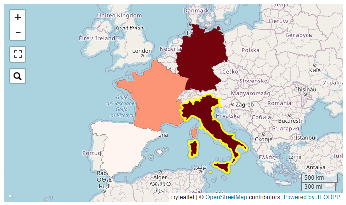
Fig. 35 Example of an interactive map displaying 4 european countries from a custom geojson file.
- interMap.interGeojsonToVector(geojson)[source]
Load a geojson string and returns a inter.VectorLayer object (see https://jeodpp.jrc.ec.europa.eu/services/processing/interhelp/3.5_vectorlayer.html)
- Parameters:
geojson (str) – String containing data in geojson format
- Return type:
An instance of the inter.Vector class of the interapro library
Note
This function is built on top of the BDAP interapro library to display dynamic geospatial dataset. For this reason it in not portable in other environments!
- interMap.trivariateLegend(v, filter1, filter2, filter3, color1='#ff60ff', color2='#ffff60', color3='#60ffff', color4='#ffffff', title='', title1='', title2='', title3='', fontsize=14, fontweight=300, stroke='#000000', stroke_width=0.25, radius=100)[source]
Creation of a trivariate choropleth legend for a polygon vector layer. See Some Thoughts on Multivariate Maps for the idea. The function creates a legend for vector layer v based on three attributes of the layer and returns a string containing the SVG representation of the legend (that can be displayed using display(HTML(svgstring) call).
Note
This function is built on top of the BDAP interapro library to display dynamic geospatial dataset. For this reason it is not portable in other environments! Please refer to the module
lefletMapfor geospatial function not related to BDAP.- Parameters:
v (instance of inter.VectorLayer class) – Vector layer instance for which the trivariate legend has to be built
filter1 (str) – Condition to filter the polygons on the first attribute
filter2 (str) – Condition to filter the polygons on the second attribute
filter3 (str) – Condition to filter the polygons on the third attribute
color1 (str, optional) – Color to assign to polygons that satisfy the condition on the first attribute (default is ‘#ff80ff’)
color2 (str, optional) – Color to assign to polygons that satisfy the condition on the second attribute (default is ‘#ffff80’)
color3 (str, optional) – Color to assign to polygons that satisfy the condition on the third attribute (default is ‘#ff80ff’)
color4 (str, optional) – Color to assign to polygons that do not satisfy any of the three conditions (default is ‘#ffffff’)
title (str, optional) – Main title of the legend chart (default is ‘’)
title1 (str, optional) – Title for the legend on the first attribute (default is ‘’)
title2 (str, optional) – Title for the legend on the second attribute (default is ‘’)
title3 (str, optional) – Title for the legend on the third attribute (default is ‘’)
fontsize (int, optional) – Size in pixels of the font used for texts (default is 14)
fontweight (int, optional) – Weight of the font used for title texts (default is 400)
stroke (str, optional) – Color to use for the border of the polygons (default is ‘#000000’)
stroke_width (float, optional) – Width in pixels of the stroke to use for the border of the polygons (default is 0.25)
radius (int, optional) – Radius in pixels of the circles displayed in the SVG legend (default is 100)
- Return type:
a string containing SVG text to display the trivariate legend using a call to display(HTML(…))
Example
Creation of a simple trivariate choropleth legend (with 7 colors) for a polygons layer containing crop data. The three attributes AL_PERC, PC_PERC and PG_PERC contain the percentage presence of the three specific crops inside the polygon:
from ipywidgets import widgets, Layout, HTML
from IPython.display import display

from jeodpp import inter, imap
from vois import interMap

# Load data
vector = inter.loadLocalVector("DEBY_2019_LandCover.shp")
vector = vector.parameter("identifyfield", "LAU_NAME YEAR AL_PERC PC_PERC PG_PERC")
vector = vector.parameter("identifyseparator", "<br>")

# Create and display a Map instance
m = imap.Map(basemap=60, layout=Layout(height='600px'))
display(m)

# Creation of the bivariate legend
svg = interMap.trivariateLegend(vector,
                                "[AL_PERC] > 60",
                                "[PC_PERC] > 10",
                                "[PG_PERC] > 20",
                                '#ff60ff',
                                '#ffff60',
                                '#60ffff',
                                '#ffffff55',
                                title='Example of Trivariate Choropleth',
                                title1="Arable Land",
                                title2="Perm. Crop",
                                title3="Permanent Grassland",
                                fontsize=12,
                                fontweight=500,
                                radius=70)

# Display of the vector layer on the map
p = vector.process()
m.clear()
m.addLayer(p.toLayer())
m.zoomToImageExtent(p)

inter.identifyPopup(m,p)

# Display the trivariate choropleth legend
display(HTML(svg))
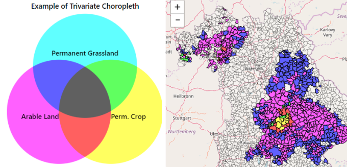
Fig. 36 Example of an interactive map showing polygons colored with a trivariate choropleth legend.
- interMap.trivariateLegendEx(v, attribute1, attribute2, attribute3, n=3, min1=0.0, max1=100.0, min2=0.0, max2=100.0, min3=0.0, max3=100.0, color1='#ff80f7', color2='#00d1d0', color3='#cfb000', color4='#ffffff', title='', title1='', title2='', title3='', fontsize=14, fontweight=400, stroke='#000000', stroke_width=0.25, side=200, resizewidth='', resizeheight='', digits=2, maxticks=0, showarrows=True)[source]
Creation of a trivariate choropleth legend for a polygon vector layer. See Choropleth maps with tricolore for the idea. The function creates a legend for vector layer v based on three attributes of the layer and returns a string containing the SVG representation of the legend in the form of a triangle (that can be displayed using display(HTML(svgstring) call)
Note
This function is built on top of the BDAP interapro library to display dynamic geospatial dataset. For this reason it is not portable in other environments! Please refer to the module
lefletMapfor geospatial function not related to BDAP.- Parameters:
v (instance of inter.VectorLayer class) – Vector layer instance for which the trivariate legend has to be built
attribute1 (str) – Name of the first numerical attribute
attribute2 (str) – Name of the second numerical attribute
attribute3 (str) – Name of the third numerical attribute
n (int, optional) – Number of intervals for each of the three numerical attributes (default is 3). Accepptable values are those in the range [2,10]
min1 (float, optional) – Minimum value for the first attribute (default is 0.0)
max1 (float, optional) – Maximum value for the first attribute (default is 100.0)
min2 (float, optional) – Minimum value for the second attribute (default is 0.0)
max2 (float, optional) – Maximum value for the second attribute (default is 100.0)
min3 (float, optional) – Minimum value for the third attribute (default is 0.0)
max3 (float, optional) – Maximum value for the third attribute (default is 100.0)
color1 (str, optional) – Color to assign to polygons that have the maximum value on the first attribute (default is ‘#ff80f7’)
color2 (str, optional) – Color to assign to polygons that have the maximum value on the second attribute (default is ‘#00d1d0’)
color3 (str, optional) – Color to assign to polygons that have the maximum value on the third attribute (default is ‘#cfb000’)
color4 (str, optional) – Color to assign to polygons that have all the three values of the attributes smaller than the corresponding minimal value (default is ‘#ffffff’). For this color, the transparency can be set, for instance using ‘#ffffff88’ for partial transparency or ‘#ffffffff’ for full transparency.
title (str, optional) – Main title of the legend chart (default is ‘’)
title1 (str, optional) – Title for the legend on the first attribute. It will be displayed on the bottom side of the triangle SVG. Default is ‘’.
title2 (str, optional) – Title for the legend on the second attribute. It will be displayed on the right side of the triangle SVG. Default is ‘’.
title3 (str, optional) – Title for the legend on the third attribute. It will be displayed on the left side of the triangle SVG. Default is ‘’.
fontsize (int, optional) – Size in pixels of the font used for texts (default is 14)
fontweight (int, optional) – Weight of the font used for title texts (default is 400)
stroke (str, optional) – Color to use for the border of the polygons (default is ‘#000000’)
stroke_width (float, optional) – Width in pixels of the stroke to use for the border of the polygons (default is 0.25)
side (int, optional) – Dimension in pixels of one side of the triangle displayed in the SVG legend (default is 200)
resizewidth (str, optional) – Width of the resizing container (default is ‘’)
resizeheight (str, optional) – height of the resizing container (default is ‘’)
digits (int, optional) – Number of decimal digits to use for displaying numerical values on the axis of the SVG chart (default is 2)
maxticks (int, optional) – Maximum number of tick marks to display on each of the triangle sides. If 0 or less, the ticks for all the intervals are shown. Default is 0
showarrows (bool, optional) – If True displays small arrows to help identify the three axes (default is True)
- Return type:
a string containing SVG text to display the trivariate legend using a call to display(HTML(…))
Example
Creation of a complex trivariate choropleth legend for a polygons layer containing crop data. The three attributes AL_PERC, PC_PERC and PG_PERC contain the percentage presence of the three specific crops inside the polygon:
from ipywidgets import widgets, Layout, HTML
from IPython.display import display

from jeodpp import inter, imap
from vois import interMap

# Load data
vector = inter.loadLocalVector("DEBY_2019_LandCover.shp")
vector = vector.parameter("identifyfield", "LAU_NAME YEAR AL_PERC PC_PERC PG_PERC")
vector = vector.parameter("identifyseparator", "<br>")

# Create and display a Map instance
m = imap.Map(basemap=60, layout=Layout(height='600px'))
display(m)

svg = interMap.trivariateLegendEx(vector,
                                  "AL_PERC",
                                  "PC_PERC",
                                  "PG_PERC",
                                  6,
                                  0.0,
                                  100.0,
                                  0.0,
                                  100.0,
                                  0.0,
                                  100.0,
                                  color1='#ff80f7',
                                  color2='#00d1d0',
                                  color3='#cfb000',
                                  color4='#ffffff00',
                                  title='Complex Trivariate Choropleth',
                                  title1="Arable Land",
                                  title2="Perm. Crop",
                                  title3="Perm. Grassl.",
                                  fontsize=18,
                                  fontweight=500,
                                  side=400,
                                  digits=0,
                                  maxticks=5,
                                  showarrows=True)

# Display of the vector layer on the map
p = vector.process()
m.clear()
m.addLayer(p.toLayer())
m.zoomToImageExtent(p)

inter.identifyPopup(m,p)

# Display the trivariate choropleth legend
display(HTML(svg))
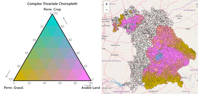
Fig. 37 Example of an interactive map showing polygons colored with a complex trivariate choropleth legend.
ipytrees module
Utility functions for the creation ipytrees from hierarchical data.
- ipytrees.createIpytreeFromDF2Columns(df, colindexLabels1, colindexLabels2, colindexValues=-1, rootName='', handle_click=<function basic_handle_click>, select_root=False)[source]
Create a two level ipytree from two columns of a Pandas DataFrame
- Parameters:
df (Pandas DataFrame) – Input Pandas DataFrame
colindexLabels1 (int) – Index of the column that contains the labels of the first level of the tree
colindexLabels2 (int) – Index of the column that contains the labels of the second level of the tree
colindexValues (int, optional) – Index of the column that contains the values for the nodes of the tree
rootName (str, optional) – Name to be displayed as root of the tree (default is ‘’)
handle_click (function, optional) – Python function to call when the selected nodes change caused by user clicking (default is ipytree.basic_handle_click)
select_root (bool, optional) – If True the root node is selected at start (default is False)
- Returns:
A tuple of 3 elements
- Return type:
the tree instance, a dict containing the info on the nodes, a dict containing the parent of each of the nodes
- ipytrees.createIpytreeFromList(nameslist=[], rootName='', separator='.', valuefor={}, handle_click=<function basic_handle_click>, select_root=False)[source]
Create a ipytree from a list of names with an implicit tree structure, example: [‘JRC’, ‘JRC.D’, ‘JRC.D.3’, …]
- Parameters:
nameslist (list of strings, optional) – List of strings that contain a hierarchical structure, considering the separator character (default is [])
rootName (str, optional) – Name to be displayed as root of the tree (default is ‘’)
separator (str, optional) – String or character to be considered as separator for extracting the hierarchical structure from the nameslist list of strings (default is ‘.’)
valuefor (dict, optional) – Dictionary to assign a numerical value to each node of the tree (default is {})
handle_click (function, optional) – Python function to call when the selected nodes change caused by user clicking (default is ipytree.basic_handle_click)
select_root (bool, optional) – If True the root node is selected at start (default is False)
- Returns:
A tuple of 3 elements
- Return type:
the tree instance, a dict containing the info on the nodes, a dict containing the parent of each of the nodes
Example
Example of the creation of a ipytree from a list of strings with hierarchy defined by the ‘.’ character:
from vois import ipytrees

def onclick(event):
    if event['new']:
        print(event.owner, event.owner.value)

tree, n, p = ipytrees.createIpytreeFromList(['A','A.1','A.2',
                                            'A.1.1','A.3.1',
                                            'A.4.1.2','A.5.2.1',
                                            'A.4.2.3.1','B','B.A'],
                                            rootName='Directorates',
                                            valuefor={'A.1.1': 10.0,
                                                      'A.3.1': 5.0},
                                            handle_click=onclick)
display(tree)
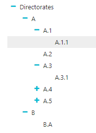
Fig. 38 Ipytree produced by the example code
leafletMap module
Utility functions for the creation of interactive maps using ipyleaflet Map.
- leafletMap.countriesMap(df, code_column=None, value_column='value', codes_selected=[], center=None, zoom=None, width='99%', height='400px', min_width=None, basemap={'attribution': '(C) OpenStreetMap contributors', 'html_attribution': '© <a href="https://www.openstreetmap.org/copyright">OpenStreetMap</a> contributors', 'max_zoom': 19, 'name': 'OpenStreetMap.Mapnik', 'url': 'https://tile.openstreetmap.org/{z}/{x}/{y}.png'}, detailedcountries=False, colorlist=['#0d0887', '#46039f', '#7201a8', '#9c179e', '#bd3786', '#d8576b', '#ed7953', '#fb9f3a', '#fdca26', '#f0f921'], stdevnumber=2.0, stroke='#232323', stroke_selected='#00ffff', stroke_width=3.0, decimals=2, minallowed_value=None, maxallowed_value=None, style={'dashArray': '0', 'fillOpacity': 0.6, 'opacity': 1}, hover_style={'dashArray': '0', 'fillOpacity': 0.85, 'opacity': 1})[source]
Creation of an interactive map to display the countries of the world. An input Pandas DataFrame df is used to join a column of numeric values to the countries, using the iso2code (ISO 3166-2) as internal key attribute. Once the values are assigned to the countries, a graduated legend is calculated based on mean and standard deviation of the assigned values. A input list of colors is used to represent the countries given their assigned value.
- Parameters:
df (Pandas DataFrame) – Pandas DataFrame to use for assigning values to the countries. It has to contain at least a column with numeric values.
code_column (str, optional) – Name of the column of the Pandas DataFrame containing the unique code of the countries in the ISO-3166-2 standard. This column is used to perform the join with the internal attribute of the countries vector dataset that contains the country code. If the code_column is None, the code is taken from the index of the DataFrame, (default is None)
value_column (str, optional) – Name of the column of the Pandas DataFrame containing the values to be assigned to the countries using the join on the ISO-3166-2 codes (default is ‘value’)
codes_selected (list of strings, optional) – List of codes of countries to display as selected (default is [])
center (tuple of (lat,lon), optional) – Geographical coordinates of the initial center of the interactive map visualization (default is None)
zoom (int, optional) – Initial zoom level of the interactive map (default is None)
width (str, optional) – Width of the map widget to create (default is ‘99%’)
height (str, optional) – Height of the map widget to create (default is ‘400px’)
min_width (str, optional) – Minimum width of the layout of the map widget (default is None)
basemap (instance of basemaps type, optional) – Basemap to use as background map (default is basemaps.OpenStreetMap.Mapnik)
detailedcountries (bool, optional) – If True loads the more detailed version of the countries dataset (default is False()
colorlist (list of colors, optional) –
List of colors to assign to the country polygons (default is the Plotly px.colors.sequential.Plasma, see Plotly sequential color scales and Plotly qualitative color sequences )
stdevnumber (float, optional) – The correspondance between the values assigned to country polygons and the colors list is done by calculating a range of values [min,max] to linearly map the values to the colors. This range is defined by calculating the mean and standard deviation of the country values and applying this formula [mean - stdevnumber*stddev, mean + stdevnumber*stddev]. Default is 2.0
stroke (str, optional) – Color to use for the border of countries (default is ‘#232323’)
stroke_selected (str, optional) – Color to use for the border of the selected countries (default is ‘#00ffff’)
stroke_width (float, optional) – Width of the border of the country polygons in pixels (default is 3.0)
decimals (int, optional) – Number of decimals for the legend numbers display (default is 2)
minallowed_value (float, optional) – Minimum value allowed, to force the calculation of the [min,max] range to map the values to the colors
maxallowed_value (float, optional) – Maximum value allowed, to force the calculation of the [min,max] range to map the values to the colors
style (dict, optional) – Style to apply to the features (default is {‘opacity’: 1, ‘dashArray’: ‘0’, ‘fillOpacity’: 0.6})
hover_style (dict, optional) – Style to apply to the features when hover (default is {‘opacity’: 1, ‘dashArray’: ‘0’, ‘fillOpacity’: 0.85})
- Return type:
a ipyleaflet.Map instance
Example
Creation of a map displaying a random variable on 4 european countries. The numerical values assigned to each of the countries are randomly generated using numpy.random.uniform and saved into a dictionary having the country code as the key. This dict is transformed to a Pandas DataFrame with 4 rows and having ‘iso2code’ and ‘value’ as columns. The graduated legend is build using the ‘inverted’ Reds Plotly colorscale (low values are dark red, intermediate values are red, high values are white):
import numpy as np
import pandas as pd
import plotly.express as px
from ipyleaflet import basemaps
from vois import leafletMap

countries = ['DE', 'ES', 'FR', 'IT']

# Generate random values and create a dictionary: key=countrycode, value=random in [0.0,100.0]
d = dict(zip(countries, list(np.random.uniform(size=len(countries),low=0.0,high=100.0))))

# Create a pandas dataframe from the dictionary
df = pd.DataFrame(d.items(), columns=['iso2code', 'value'])

m = leafletMap.countriesMap(df,
                            code_column='iso2code',
                            height='400px',
                            stroke_width=2.0,
                            stroke_selected='yellow',
                            basemap=basemaps.Stamen.Terrain,
                            colorlist=px.colors.sequential.Reds[::-1],
                            codes_selected=['IT'],
                            center=[43,12], zoom=5)
display(m)
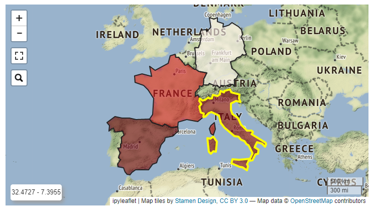
Fig. 39 Example of an ipyleaflet Map displaying 4 european countries.
- leafletMap.geojsonCategoricalMap(geojson_path, geojson_attribute, center=None, zoom=None, width='99%', height='400px', min_width=None, basemap={'attribution': '(C) OpenStreetMap contributors', 'html_attribution': '© <a href="https://www.openstreetmap.org/copyright">OpenStreetMap</a> contributors', 'max_zoom': 19, 'name': 'OpenStreetMap.Mapnik', 'url': 'https://tile.openstreetmap.org/{z}/{x}/{y}.png'}, colormap={}, stroke='#232323', stroke_width=3.0, fill='#aaaaaa', style={'dashArray': '0', 'fillOpacity': 0.6, 'opacity': 1}, hover_style={'dashArray': '0', 'fillOpacity': 0.85, 'opacity': 1})[source]
Creation of an interactive map to display a custom geojson dataset where colors are assigned to feature based on the values of an internal attribute of the input geojson file. The colormap parameter is a dictionary with keys corresponding to all the unique values of the internal attribute, which are mapped to the colors to use for representing each class.
- Parameters:
geojson_path (str) – Path of the geojson file to load that contains the geographic features in geojson format
geojson_attribute (str) – Name of the attribute of the geojson dataset that contains the thematisatio attribute of the features. This attribute will be used to retrieve the colors to assign to the features using the colormap parameter
center (tuple of (lat,lon), optional) – Geographical coordinates of the initial center of the interactive map visualization (default is None)
zoom (int, optional) – Initial zoom level of the interactive map (default is None)
width (str, optional) – Width of the map widget to create (default is ‘99%’)
height (str, optional) – Height of the map widget to create (default is ‘400px’)
min_width (str, optional) – Minimum width of the layout of the map widget (default is None)
basemap (basemap instance, optional) – Basemap to use as background in the map visualization (default is basemaps.OpenStreetMap.Mapnik). See Documentation of ipyleaflet for details
colormap (dictionary containing geojson_attribute values as keys and colors as values) – Colors to assign to each distinct value of the geojson_attribute
stroke (str, optional) – Color to use for the border of polygons (default is ‘#232323’)
stroke_width (float, optional) – Width of the border of the polygons in pixels (default is 3.0)
fill (str, optional) – Default fill color to use for the polygons (default is ‘#aaaaaa’)
style (dict, optional) – Style to apply to the features (default is {‘opacity’: 1, ‘dashArray’: ‘0’, ‘fillOpacity’: 0.6})
hover_style (dict, optional) – Style to apply to the features when hover (default is {‘opacity’: 1, ‘dashArray’: ‘0’, ‘fillOpacity’: 0.85})
- Return type:
a ipyleaflet.Map instance
Example
Creation of a map displaying a custom geojson with data on landuse. The colors are assigned to the polygons based on the values of the ‘fclass’ attribute of the input geojson file. The colormap parameter is a dictionary with keys corresponding to all the unique landuse classes, which are mapped to the colors of a Plotly discrete color scale (see Color Sequences in Plotly Express):
import plotly.express as px
from IPython.display import display
from ipywidgets import widgets, Layout
from vois import leafletMap, svgUtils, geojsonUtils

# Load landuse example and get unique landuse classes
filepath = './data/landuse.geojson'
geojson = geojsonUtils.geojsonLoadFile(filepath)
landuses = sorted(list(set(geojsonUtils.geojsonAll(geojson,'fclass'))))

# Create a colormap (dictionary that maps landuses to colors)
colors   = px.colors.qualitative.Dark24
colormap = dict(zip(landuses, colors))

m = leafletMap.geojsonCategoricalMap(filepath,
                                     'fclass',
                                     stroke_width=1.0,
                                     stroke='black',
                                     colormap=colormap,
                                     width='79%',
                                     height='700px',
                                     center=[51.005,13.6],
                                     zoom=12,
                                     basemap=basemaps.CartoDB.Positron,
                                     style={'opacity': 1, 'dashArray': '0', 'fillOpacity': 1})

outlegend = widgets.Output(layout=Layout(width='230px',height='680px'))
with outlegend:
    display(HTML(svgUtils.categoriesLegend("Landuse legend",
                                           landuses,
                                           colorlist=colors[:len(landuses)])))
widgets.HBox([m,outlegend])
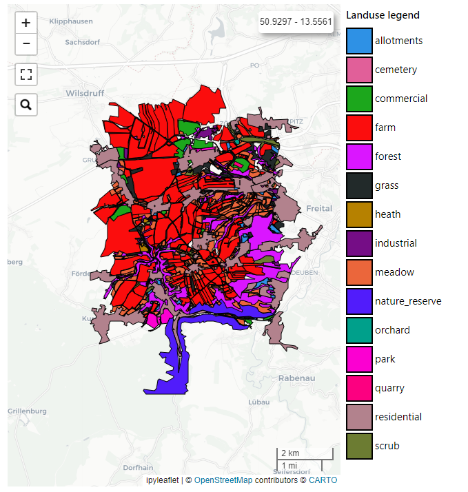
Fig. 40 Example of an ipyleaflet Map displaying 4 european countries from a custom geojson file.
- leafletMap.geojsonMap(df, geojson_path, geojson_attribute, code_column=None, value_column='value', codes_selected=[], center=None, zoom=None, width='99%', height='400px', min_width=None, basemap={'attribution': '(C) OpenStreetMap contributors', 'html_attribution': '© <a href="https://www.openstreetmap.org/copyright">OpenStreetMap</a> contributors', 'max_zoom': 19, 'name': 'OpenStreetMap.Mapnik', 'url': 'https://tile.openstreetmap.org/{z}/{x}/{y}.png'}, colorlist=['#0d0887', '#46039f', '#7201a8', '#9c179e', '#bd3786', '#d8576b', '#ed7953', '#fb9f3a', '#fdca26', '#f0f921'], stdevnumber=2.0, stroke='#232323', stroke_selected='#00ffff', stroke_width=3.0, decimals=2, minallowed_value=None, maxallowed_value=None, style={'dashArray': '0', 'fillOpacity': 0.6, 'opacity': 1}, hover_style={'dashArray': '0', 'fillOpacity': 0.85, 'opacity': 1})[source]
Creation of an interactive map to display a custom geojson dataset. An input Pandas DataFrame df is used to join a column of numeric values to the geojson features, using the <geojson_attribute> as the internal key attribute. Once the values are assigned to the features, a graduated legend is calculated based on mean and standard deviation of the assigned values. A input list of colors is used to represent the featuress given their assigned value.
- Parameters:
df (Pandas DataFrame) – Pandas DataFrame to use for assigning values to features. It has to contain at least a column with numeric values.
geojson_path (str) – Path of the geojson file to load that contains the geographic features in geojson format
geojson_attribute (str) – Name of the attribute of the geojson dataset that contains the unique codes of the features. This attribute will be use as internal key in the join operation with the df Pandas DataFrame
code_column (str, optional) – Name of the column of the df Pandas DataFrame containing the unique code of the features. This column is used to perform the join with the internal attribute of the geojson vector dataset that contains the unique code. If the code_column is None, the code is taken from the index of the DataFrame, (default is None)
value_column (str, optional) – Name of the column of the Pandas DataFrame containing the values to be assigned to the features using the join on geojson unique codes (default is ‘value’)
codes_selected (list of strings, optional) – List of codes of features to display as selected (default is [])
center (tuple of (lat,lon), optional) – Geographical coordinates of the initial center of the interactive map visualization (default is None)
zoom (int, optional) – Initial zoom level of the interactive map (default is None)
width (str, optional) – Width of the map widget to create (default is ‘99%’)
height (str, optional) – Height of the map widget to create (default is ‘400px’)
min_width (str, optional) – Minimum width of the layout of the map widget (default is None)
basemap (basemap instance, optional) –
Basemap to use as background in the map visualization (default is basemaps.OpenStreetMap.Mapnik). See Documentation of ipyleaflet for details
colorlist (list of colors, optional) –
List of colors to assign to the country polygons (default is the Plotly px.colors.sequential.Plasma, see Plotly sequential color scales and Plotly qualitative color sequences )
stdevnumber (float, optional) – The correspondance between the values assigned to features and the colors list is done by calculating a range of values [min,max] to linearly map the values to the colors. This range is defined by calculating the mean and standard deviation of the country values and applying this formula [mean - stdevnumber*stddev, mean + stdevnumber*stddev]. Default is 2.0
stroke (str, optional) – Color to use for the border of polygons (default is ‘#232323’)
stroke_selected (str, optional) – Color to use for the border of the selected polygons (default is ‘#00ffff’)
stroke_width (float, optional) – Width of the border of the polygons in pixels (default is 3.0)
decimals (int, optional) – Number of decimals for the legend numbers display (default is 2)
minallowed_value (float, optional) – Minimum value allowed, to force the calculation of the [min,max] range to map the values to the colors
maxallowed_value (float, optional) – Maximum value allowed, to force the calculation of the [min,max] range to map the values to the colors
style (dict, optional) – Style to apply to the features (default is {‘opacity’: 1, ‘dashArray’: ‘0’, ‘fillOpacity’: 0.6})
hover_style (dict, optional) – Style to apply to the features when hover (default is {‘opacity’: 1, ‘dashArray’: ‘0’, ‘fillOpacity’: 0.85})
- Return type:
a ipyleaflet.Map instance
Example
Creation of a map displaying a custom geojson. The numerical values assigned to each of the countries are randomly generated using numpy.random.uniform and saved into a dictionary having the country code as the key. This dict is transformed to a Pandas DataFrame with 4 rows and having ‘iso2code’ and ‘value’ as columns. The graduated legend is build using the ‘inverted’ Viridis Plotly colorscale:
import numpy as np
import pandas as pd
import plotly.express as px
from vois import leafletMap

countries = ['DE', 'ES', 'FR', 'IT']

# Generate random values and create a dictionary: key=countrycode, value=random in [0.0,100.0]
d = dict(zip(countries, list(np.random.uniform(size=len(countries),low=0.0,high=100.0))))

# Create a pandas dataframe from the dictionary
df = pd.DataFrame(d.items(), columns=['iso2code', 'value'])

m = leafletMap.geojsonMap(df,
                          './data/ne_50m_admin_0_countries.geojson',
                          'ISO_A2_EH',   # Internal attribute used as key
                          code_column='iso2code',
                          height='400px',
                          stroke_width=1.5,
                          stroke_selected='yellow',
                          colorlist=px.colors.sequential.Viridis[::-1],
                          codes_selected=['IT'],
                          center=[43,12], zoom=5)
display(m)
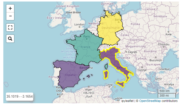
Fig. 41 Example of an ipyleaflet Map displaying 4 european countries from a custom geojson file.
svgBarChart module
SVG BarChart to display interactive vertical bars.
- svgBarChart.svgBarChart(title='', width=30.0, height=40.0, names=[], values=[], stddevs=None, dictnames=None, selectedname=None, fontsize=1.1, titlecolor='black', barstrokecolor='black', xaxistextcolor='black', xaxistextsizemultiplier=1.0, xaxistextangle=0.0, xaxistextextraspace=0.0, yaxistextextraspace=5.0, xaxistextdisplacey=0.0, valuestextsizemultiplier=0.7, valuestextangle=0.0, strokew_axis=0.2, strokew_horizontal_lines=0.06, strokecol_axis='#bbbbbb', strokecol_horizontal_lines='#dddddd', showvalues=False, textweight=400, colorlist=['rgb(247,251,255)', 'rgb(222,235,247)', 'rgb(198,219,239)', 'rgb(158,202,225)', 'rgb(107,174,214)', 'rgb(66,146,198)', 'rgb(33,113,181)', 'rgb(8,81,156)', 'rgb(8,48,107)'], colors_on_minmax_values=True, fixedcolors=False, enabledeselect=False, selectcolor='red', showselection=False, hovercolor='yellow', valuedigits=4, barpercentwidth=90.0, stdevnumber=2.0, minallowed_value=None, maxallowed_value=None, yaxis_min=None, yaxis_max=None, on_change=None)[source]
Creation of a vertical bar chart given a list of labels and corresponding numerical values. Click on the rectangles is managed by calling a custom python function.
- Parameters:
title (str, optional) – Title of the chart (default is ‘Ranking of labels’)
width (float, optional) – Width of the chart in vw units (default is 20.0)
height (float, optional) – Height of the chart in vh units (default is 90.0)
names (list of str, optional) – List of names to display inside the rectangles (default is [])
values (list of float, optional) – List of numerical values of the same length of the names list (default is [])
stddevs (list of float, optional) – List of numerical values representing the standard deviation of the values, to be displayed on top of the columns (default is None)
dictnames (dict, optional) – Dictionary to convert codes to names when displaying the selection (default is None)
selectedname (str, optional) – Name of the selected item (default is None)
fontsize (float, optional) – Size of the standard font to use for names in vh coordinates (default is 1.1vh). The chart title will be displayed with sizes proportional to the fontsize parameter (up to two times for the chart title)
titlecolor (str, optional) – Color to use for the chart title (default is ‘black’)
barstrokecolor (str, optional) – Color for the bars border (default is ‘black’)
xaxistextcolor (str, optional) – Color of labels on the X axis (default is ‘black’)
xaxistextsizemultiplier (float, optional) – Multiplier factor to calculate the x axis label size from the default fontsize (default is 1.0)
xaxistextangle (float, optional) – Angle in degree to rotate x axis labels (default is 0.0)
xaxistextextraspace (float, optional) – Extra space to reserve to xaxis labels (default is 0.0)
yaxistextextraspace (float, optional) – Extra space to reserve to yaxis labels in percentage (default is 5.0)
xaxistextdisplacey (float, optional) – Positional displace in y coordinate to apply to the xaxis labels (default is 0.0)
valuestextsizemultiplier (float, optional) – Multiplier factor to calculate the values text size from the default fontsize (default is 0.7)
valuestextangle (float, optional) – Angle in degree to rotate the values text on top of the bars (default is 0.0)
strokew_axis (float, optional) – Stroke width of the lines that define the x and y axis (default is 0.2)
strokew_horizontal_lines (float, optional) – Stroke width of the secondary horizontal lines starting from the y axis (default is 0.06)
strokecol_axis (str, optional) – Color to use for the lines of the x and y axis (default is “#bbbbbb”)
strokecol_horizontal_lines (str, optional) – Color to use for the secondary horizontal lines starting from the y axis (default is “#dddddd”)
showvalues (bool, optional) – If True the value of each bar is shown on top of the bar (default is False)
textweight (int, optional) – Weight of the text written inside the rectangles (default is 400). The chart title will be displayed with weight equal to textweight+100
colorlist (list of colors, optional) –
List of colors to assign to the rectangles based on the numerical values (default is the inverted Plotly px.colors.sequential.Blues, see Plotly sequential color scales and Plotly qualitative color sequences )
fixedcolors (bool, optional) – If True, the list of colors is assigned to the values in their original order (and colorlist must contain the same number of elements!). Default is False
colors_on_minmax_values (bool, optional) – If True, the colors are stretched on the min and max effective values, otherwise on the minallowed,maxallowed values range (default is True)
enabledeselect (bool, optional) – If True, a click on a selected element deselects it, and the on_change function is called with None as argument (default is False)
selectcolor (str, optional) – Color to use for the border of the selected rectangle (default is ‘red’)
showselection (bool, optional) – If True, the currently selected bar is framed with the selection color (default is False)
hovercolor (str, optional) – Color to use for the border on hovering the rectangles (default is ‘yellow’)
valuedigits (int, optional) – Number of digits to use for the display of the values (default is 4)
barpercentwidth (float, optional) – Percentage of element width occupied by the bar. The remaining percentage of the element width is the space before the next element. Default is 90.0.
stdevnumber (float, optional) – The correspondance between the values and the colors list is done by calculating a range of values [min,max] to linearly map the values to the colors. This range is defined by calculating the mean and standard deviation of the values and applying this formula [mean - stdevnumber*stddev, mean + stdevnumber*stddev]. Default is 2.0
minallowed_value (float, optional) – Minimum value allowed, to force the calculation of the [min,max] range to map the values to the colors
maxallowed_value (float, optional) – Maximum value allowed, to force the calculation of the [min,max] range to map the values to the colors
yaxis_min (float, optional) – Minimum value displayed on the y axis (default is None)
yaxis_max (float, optional) – Maximum value displayed on the y axis (default is None)
on_change (function, optional) – Python function to call when the selection of the rectangle items changes (default is None). The function is called with a tuple as unique argument. The tuple will contain (name, value, originalposition) of the selected rectangle
- Return type:
an instance of widgets.Output with the svg chart displayed in it
Example
Creation of a SVG chart to display a vertical bar chart:
from IPython.display import display
from ipywidgets import widgets
import numpy as np
import plotly.express as px
from vois import eucountries as eu
from vois import svgBarChart

# Names of EU countries
names  = [c.iso2code for c in eu.countries.EuropeanUnion()]

# Randomly generated values for each country
values = np.random.uniform(low=0.1, high=1.0, size=(len(names)))

# Randomly generated stdevs for each country
stddevs = np.random.uniform(low=0.01, high=0.2, size=(len(names)))

debug = widgets.Output()
display(debug)

def on_change(arg):
    with debug:
        print(arg)

out = svgBarChart.svgBarChart(title='Sample Bar Chart',
                              names=names,
                              values=values,
                              stddevs=stddevs,
                              width=39.0,
                              height=35.0,
                              fontsize=0.7,
                              barstrokecolor='#44444400',
                              xaxistextcolor='#666666',
                              showvalues=True,
                              colorlist=px.colors.sequential.Viridis,
                              hovercolor='blue',
                              stdevnumber=100.0,
                              valuedigits=2,
                              barpercentwidth=90.0,
                              enabledeselect=True,
                              showselection=False,
                              minallowed_value=0.0,
                              on_change=on_change)

display(out)
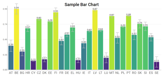
Fig. 42 Example of an interactive vertical bars chart
svgBubblesChart module
SVG bubbles chart from a pandas DataFrame.
- class svgBubblesChart.svgBubblesChart(df, xcolumn, ycolumn, sizecolumn, colorcolumn, width=100.0, height=50.0, xstart=6.0, strokewidth=1, strokecolor='#ffffff', backcolor='#aaaaaa', backlinecolor='#888888', bubblecolors=['rgb(27,158,119)', 'rgb(217,95,2)', 'rgb(117,112,179)', 'rgb(231,41,138)', 'rgb(102,166,30)', 'rgb(230,171,2)', 'rgb(166,118,29)', 'rgb(102,102,102)'], textcolor='black', textweight=400, fontsize=1.1, xtextangle=0.0, title='', mode='spread', legendrows=2, legenditemwidth=10)[source]
Creation of a bubbles chart given an input DataFrame. It is a convenient chart for representing a numerical value that depends on 3 discrete variables. It displays a bi-dimensional grid where the unique values of the x column are displayed on the X axis, while the unique values of the y column are displayed on the Y axis. Inside each cell of the grid, a group of bubbles is displayed, one for each distinct value of the color column, while the size of the circles is proportional to the numerical value read from the size column. See the below example on a mushrooms dataset (taken from https://www.kaggle.com/datasets/uciml/mushroom-classification). The SVG chart has the x coordinates expressed in vw coordinates and the y coordinates expressed in vh coordinates. Cliks on the legend is managed so that individual color categories can be excluded from the chart.
- Parameters:
df (pandas DataFrame) – Input DataFrame
xcolumn (str) – Name of the DataFrame column containing the values to be displayed on the X axis
ycolumn (str) – Name of the DataFrame column containing the values to be displayed on the X axis
sizecolumn (str) – Name of the DataFrame column containing the numerical values to be used to size the bubbles
colorcolumn (str) – Name of the DataFrame column containing the values to be used to give a color to the bubbles and to display the color legend
width (float, optional) – Width of the chart in vw units (default is 100.0)
height (float, optional) – Height of the chart in vh units (default is 50.0)
xstart (float, optional) – X coordinate on vw units where the grid starts (default is 6.0). This value can be used to leave more or less space to the Y axis strings
strokewidth (int, optional) – Width in pixels of the stroke to use for the bubbles (default is 1)
strokecolor (str, optional) – Color of the stroke to use for the bubbles (default is ‘#ffffff’)
backcolor (str, optional) – Background color of the grid (default is ‘#aaaaaa’)
backlinecolor (str, optional) – Color of the lines defining the cells of the grid (default id ‘#888888’)
bubblecolors (list of colors, optional) – List of colors to use for the bubble. Each color is assigned to one of the unique values of the color column of the input DataFrame (default is px.colors.qualitative.Dark2)
textcolor (str, optional) – Color to use for the texts, chart title, axis titles, axis values, etc. (default is ‘black’)
textweight (int, optional) – Weight of the text (default is 400). The chart title, the axis titles and the legend title will be displayed with weight equal to textweight+100
fontsize (float, optional) – Size of the standard font to use for values displayed in the X and Y axis in vh coordinates (default is 1.1vh). The chart title, the axis titles and the legend title will be displayed with sizes proportional to the fontsize parameter (up to two times for the chart title)
xtextangle (float, optional) – Angle to use for the rotation of values displayed on the X axis (default is 0.0)
title (str, optional) – Title of the chart (default is ‘’)
mode (str, optional) – Mode to use for the placement of bubbles inside the cells of the grid. Possible values are ‘spread’ (circles are horizontally displaced), ‘concentric’ (all circles have their centre in the center of the cell) or ‘tangent’ (circles are all tangent on the center-bottom point of the cell). Default is ‘spread’.
legendrows (int, optional) – Number of rows to use for the legend (default is 2)
legenditemwidth (int, optional) – Width in percent of the total width of each item of the legend (default is 10)
- Return type:
an instance of widgets.Output with the svg chart displayed in it
Example
Creation of a SVG bubble chart chart to display some of the columns of the mushroom dataset (see https://www.kaggle.com/datasets/uciml/mushroom-classification):
from IPython.display import display
import pandas as pd
import plotly.express as px
colorlist = px.colors.qualitative.Dark2
from vois import svgBubblesChart

df = pd.read_csv('https://jeodpp.jrc.ec.europa.eu/services/shared/csv/mushrooms.csv')

xcolumn     = 'cap-shape'
ycolumn     = 'cap-surface'
colorcolumn = 'habitat'
sizecolumn  = 'count'
dfgrouped = df.groupby([xcolumn, ycolumn, colorcolumn]).size().reset_index(name=sizecolumn)

dfgrouped.columns = ['Shape', 'Cap surface', 'Mushroom habitat:', 'count']

b = svgBubblesChart.svgBubblesChart(dfgrouped,
                                    height=50.0,
                                    xcolumn=dfgrouped.columns[0],
                                    ycolumn=dfgrouped.columns[1],
                                    colorcolumn=dfgrouped.columns[2],
                                    sizecolumn=dfgrouped.columns[3],
                                    strokewidth=1,
                                    strokecolor='#ffffff',
                                    backcolor='#f0f0f0',
                                    backlinecolor='#000000',
                                    bubblecolors=colorlist,
                                    fontsize=1.1,
                                    title='Mushrooms analysis',
                                    mode='spread')
display(b.draw())
display(HTML(b.getlegendsvg()))
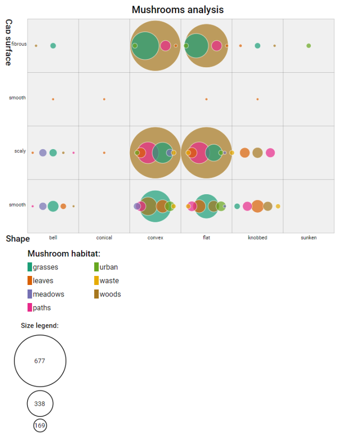
Fig. 43 Example of an interactive bubbles chart in SVG
svgGraph module
SVG visualization of a graph.
- svgGraph.svgGraph(nodes_name, nodes_label, nodes_color, nodes_pos, edges, edge_label='Value', textcolor='white', edgestrokecolor='lightgrey', edgestrokewidth=0.3, nodestrokecolor='grey', nodestrokewidth=0.3, selectedcolor='red', selectedstrokewidth=0.7, width=300.0, heightpercent=100.0, borderspercent=10.0, nodesradius=3.0, fontsize=3.0, onclick=None)[source]
Display of a graph.
- Parameters:
nodes_name (dict) – Dictionary with Key=nodeid and Value=name (short label to display inside the node)
nodes_label (dict) – Dictionary with Key=nodeid and Value=description (long description to display as tooltip of the nodes)
nodes_color (dict) – Dictionary with Key=nodeid and Value=color to use for the node
nodes_pos (dict) – Dictionary with Key=nodeid and Value=[x,y] coordinates of the node
edges (dict) – Dictionary with Key=(nodeid1,nodeid2) and Value containing a numerical value to display in the tooltip
edge_label (str, optional) – String to display inside the tooltip over an edge of the graph (default is ‘Value’)
textcolor (str, optional) – Color to use for text of nodes (default is ‘white’)
edgestrokecolor (str, optional) – Color to use to display the edges (default is ‘lightgrey’)
edgestrokewidth (float, optional) – Stroke width of the line used to display the edges (default is 0.3)
nodestrokecolor (str, optional) – Color to use for the border of the nodes (default is ‘grey’)
nodestrokewidth (float, optional) – Stroke width of the line used to display the border of the nodes (default is 0.3)
selectedcolor (str, optional) – Color to use to display the border of the selected node (default is ‘red’)
selectedstrokewidth (float, optional) – Stroke width of the line used to display the border of the selected node (default is 0.7)
width (int or float or str, optional) – Width of the drawing. If an integer or a float is passed, the size is intended in pixels units, otherwise a string containing the units must be passed (example: ‘4vw’). The default is 300.0 for 300 pixels
heightpercent (float, optional) – Height of the drawing in percentage of the Width (default is 100.0, meaning that a square chart will be created)
borderspercent (float, optional) – Border to add in percentage on each side of the chart to be sure that the nodes circles are completely inside (default is 10.0)
nodesradius (float, optional) – Radius of the circles that represent the nodes. The total graph drawing is created in SVG coordinates [0,100]. Default is 3.0.
fontsize (float, optional) – Size of the font used for nodes’ texts. The total graph drawing is created in SVG coordinates [0,100]. Default is 3.0.
onclick (function, optional) – Python function to call when the user clicks on one of the nodes of the graph. The function will receive as parameter the nodeid of the clicked node, or -1 when the click is outside of all the nodes
- Return type:
an ipywidgets.Output instance with the graph displayed inside
Example
Example of a generation and display of a random graph using networkx library and svgGraph module:
from vois import svgGraph
import networkx as nx
import random
r = lambda: random.randint(0,255)

# Generate a random graph using networkx
G = nx.gnp_random_graph(20, 0.2, seed=12345)

# Assign position to nodes using Fruchterman-Reingold force-directed algorithm
nodes_pos = nx.spring_layout(G, weight='weight', seed=12345)

# Extract nodes and edges information from the graph
nodes = list(G.nodes)
edges = list(G.edges)

# Generate dictionaries requested by the svgGraph module
nodes_name  = dict(zip(nodes,['N'+str(x) for x in nodes]))
nodes_label = dict(zip(nodes,['Description of node '+str(x) for x in nodes]))
nodes_color = dict(zip(nodes,['#%02X%02X%02X' % (r(),r(),r()) for x in nodes]))  # Random colors

edges_value = dict(zip(edges,[random.randint(0,100) for x in edges]))

# Display the graph
svgGraph.svgGraph(nodes_name, nodes_label, nodes_color, nodes_pos, edges_value, width=800)
Fig. 44 Example of a graph visualization
svgHeatmap module
SVG heatmap chart from a pandas DataFrame.
- svgHeatmap.heatmapChart(df, width=100.0, height=50.0, hTitle=5.0, wTitle=15.0, columnTitleMaxChar=40, textRows='Row', textColumns='Column', textValues='Value', title='Heatmap', fontsize=1.0, colorlist=['rgb(247,251,255)', 'rgb(222,235,247)', 'rgb(198,219,239)', 'rgb(158,202,225)', 'rgb(107,174,214)', 'rgb(66,146,198)', 'rgb(33,113,181)', 'rgb(8,81,156)', 'rgb(8,48,107)'], textcolor='black', textweight=400, backcolor='white', highlitecolor='#426bb4', highliteback='#dddddd', minvalue=0.0, maxvalue=1.0, decimals=2)[source]
Creation of a heatmap chart given an input DataFrame containing only numbers. The index strings and column names are taken as names for rows and columns. The SVG chart has x coordinates expressed in vw coordinates and the y coordinates expressed invh coordinates. Rows and columns of the chart can be selected and the chart will be sorted on decreasing values (when a column is selected, the rows are sorted, and viceversa)
- Parameters:
df (pandas DataFrame) – Input DataFrame containing only numbers
width (float, optional) – Width of the chart in vw units (default is 100.0)
height (float, optional) – Height of the chart in vh units (default is 50.0)
hTitle (float, optional) – Height of the Title bar in percentage on the height of the chart (default is 5.0)
wTitle (float, optional) – Width of the left space for row titles in percentage of the width pf the chart (default is 15.0)
columnTitleMaxChar (int, optional) – Max number of chars for the column names (longer names are splitted), (default is 40)
textRows (str, optional) – Title for the rows (default is ‘Row’)
textColumns (str, optional) – Title for the columns (default is ‘Column’)
textValues (str, optional) – Text to label the values in the tooltip when the mouse is over a cell of the chart (default is ‘Value’)
title (str, optional) – Title of the chart (default is ‘Heatmap’)
fontsize (float, optional) – Size of the standard font to use for values displayed in the X and Y axis in vh coordinates (default is 1.0vh). The chart title and the axis titles will be displayed with sizes proportional to the fontsize parameter (up to two times for the chart title)
colorlist (list of colors, optional) –
List of colors to assign to the country polygons (default is the Plotly px.colors.sequential.Blues, see Plotly sequential color scales and Plotly qualitative color sequences )
textcolor (str, optional) – Color to use for rows and columns text (default is ‘black’)
textweight (int, optional) – Weight of the text (default is 400). The chart title and the axis titles will be displayed with weight equal to textweight+100
backcolor (str, optional) – Background color (default is ‘white’)
highlitecolor (str, optional) – Color to use for displaying text of the selected row and colum (default is ‘#426bb4’)
highliteback (str, optional) – Color to use as background of the selected row and column (default is ‘#dddddd’)
minvalue (float, optional) – Minimum value of the DataFrame cells to be used for color assignment (default is 0.0)
maxvalue (float, optional) – Minimum value of the DataFrame cells to be used for color assignment (default is 1.0)
decimals (int, optional) – Number of decimals for the tooltip display of cell values (default is 2)
- Return type:
an instance of widgets.Output with the svg chart displayed in it
Example
Creation of a SVG heatmap chart to display a matrix of random numbers:
from IPython.display import display
import pandas as pd
import numpy as np
from vois import svgHeatmap

df = pd.DataFrame(np.random.random((20,50)))
display(svgHeatmap.heatmapChart(df, wTitle=7.0, hTitle=70)
Fig. 45 Example of an interactive heatmap chart in SVG
svgMap module
European map implemented in SVG.
- svgMap.country_codes = ['LV', 'AL', 'CH', 'AT', 'HR', 'ES', 'IS', 'RO', 'IT', 'VA', 'HU', 'SE', 'NL', 'CZ', 'DE', 'FR', 'ME', 'BE', 'SI', 'LU', 'IE', 'BA', 'MC', 'BG', 'PL', 'LI', 'GB', 'RS', 'SM', 'DK', 'IM', 'EE', 'SK', 'EL', 'LT', 'NO', 'PT', 'AD', 'MK', 'MT', 'GI', 'FI', 'XK', 'CY']
List of all the codes for the countries managed by the svgMap module, following the EUROSTAT country codes.
- Type:
List of 2 characters strings
- svgMap.country_name = {'AD': 'Andorra', 'AL': 'Albania', 'AT': 'Austria', 'BA': 'Bosnia and Herzegovina', 'BE': 'Belgium', 'BG': 'Bulgaria', 'CH': 'Switzerland', 'CY': 'Cyprus', 'CZ': 'Czechia', 'DE': 'Germany', 'DK': 'Denmark', 'EE': 'Estonia', 'EL': 'Greece', 'ES': 'Spain', 'FI': 'Finland', 'FR': 'France', 'GB': 'United Kingdom', 'GI': 'Gibraltar', 'HR': 'Croatia', 'HU': 'Hungary', 'IE': 'Ireland', 'IM': 'Isle of Man', 'IS': 'Iceland', 'IT': 'Italy', 'LI': 'Liechtenstein', 'LT': 'Lithuania', 'LU': 'Luxembourg', 'LV': 'Latvia', 'MC': 'Monaco', 'ME': 'Montenegro', 'MK': 'North Macedonia', 'MT': 'Malta', 'NL': 'Netherlands', 'NO': 'Norway', 'PL': 'Poland', 'PT': 'Portugal', 'RO': 'Romania', 'RS': 'Republic of Serbia', 'SE': 'Sweden', 'SI': 'Slovenia', 'SK': 'Slovakia', 'SM': 'San Marino', 'VA': 'Vatican', 'XK': 'Kosovo'}
dict with key=EUROSTAT code of countries, value=name of the country.
- svgMap.svgMapEurope(df, code_column=None, value_column='value', label_column='label', codes_selected=[], width='400px', height='600px', colorlist=['#0d0887', '#46039f', '#7201a8', '#9c179e', '#bd3786', '#d8576b', '#ed7953', '#fb9f3a', '#fdca26', '#f0f921'], stdevnumber=2.0, fill='#f1f1f1', stroke='#232323', stroke_selected='#00ffff', stroke_width=3.0, onhoverfill='yellow', decimals=2, minallowed_value=None, maxallowed_value=None, hoveronempty=False, legendtitle='', legendunits='', bordercolor='black', textcolor='black', dark=False)[source]
Static map of European countries with color legend obtained by joining with a Pandas DataFrame.
- Parameters:
df (Pandas DataFrame) – Pandas DataFrame to use for assigning values to the countries. It has to contain at least a column with numeric values.
code_column (str, optional) – Name of the column of the Pandas DataFrame containing the unique code of the countries in the EUROSTAT Country Codes standard (see https://ec.europa.eu/eurostat/statistics-explained/index.php?title=Glossary:Country_codes). This column is used to perform the join with the internal attribute of the countries vector dataset that contains the country code. If the code_column is None, the code is taken from the index of the DataFrame, (default is None)
value_column (str, optional) – Name of the column of the Pandas DataFrame containing the values to be assigned to the countries using the join on the EUROSTAT Country Codes (default is ‘value’)
codes_selected (list of strings, optional) – List of codes of countries to display as selected (default is [])
width (str, optional) – Width of the map (default is ‘400px’)
height (str, optional) – Height of the map (default is ‘600px’)
colorlist (list of colors, optional) –
List of colors to assign to the country polygons (default is the Plotly px.colors.sequential.Plasma, see Plotly sequential color scales and Plotly qualitative color sequences )
stdevnumber (float, optional) – The correspondance between the values assigned to country polygons and the colors list is done by calculating a range of values [min,max] to linearly map the values to the colors. This range is defined by calculating the mean and standard deviation of the country values and applying this formula [mean - stdevnumber*stddev, mean + stdevnumber*stddev]. Default is 2.0
fill (str, optional) – Fill color to use for the countries that are not joined (default is ‘#f1f1f1’)
stroke (str, optional) – Color to use for the border of countries (default is ‘#232323’)
stroke_selected (str, optional) – Color to use for the border of the selected countries (default is ‘#00ffff’)
stroke_width (float, optional) – Width of the border of the country polygons in pixels (default is 3.0)
onhoverfill (str, optional) – Color for highlighting countries on hover (default is ‘yellow’)
decimals (int, optional) – Number of decimals for the legend numbers display (default is 2)
minallowed_value (float, optional) – Minimum value allowed, to force the calculation of the [min,max] range to map the values to the colors
maxallowed_value (float, optional) – Maximum value allowed, to force the calculation of the [min,max] range to map the values to the colors
hoveronempty (bool, optional) – If True highlights polygon on hover even if no value present in input df for the polygon (default is False)
legendtitle (str, optional) – Title to add on top of the legend (default is ‘’)
legendunits (str, optional) – Units of measure to add to the bottom of the legend (default is ‘’)
bordercolor (str, optional) – Color for lines and rects of the legend (default is ‘black’)
textcolor (str, optional) – Color for texts of the legend (default is ‘black’)
dark (bool, optional) – If True, the bordercolor and textcolor are set to white (default is False)
- Return type:
a string containing SVG text to display the map of European countries
Example
Map of European countries joined with random values in [0,100]:
import numpy as np
import pandas as pd
import plotly.express as px
from vois import svgMap

countries = svgMap.country_codes

# Generate random values and create a dictionary: key=countrycode, value=random in [0.0,100.0]
d = dict(zip(countries, list(np.random.uniform(size=len(countries),low=0.0,high=100.0))))

# Create a pandas dataframe from the dictionary
df = pd.DataFrame(d.items(), columns=['iso2code', 'value'])

svg = svgMap.svgMapEurope(df,
                          code_column='iso2code',
                          width='650px',
                          height='800px',
                          stdevnumber=1.5,
                          colorlist=px.colors.sequential.Viridis,
                          stroke_width=4.0,
                          stroke_selected='red',
                          onhoverfill='#f8bd1a',
                          codes_selected=['IT'],
                          legendtitle='Legent title',
                          legendunits='KTOE per 100K inhabit.')
display(HTML(svg))
Fig. 46 Example of a static map of European countries created as an SVG drawing
svgPackedCirclesChart module
SVG Packed Circles chart from a pandas DataFrame.
- svgPackedCirclesChart.svgPackedCirclesChart(df, valuecolumn, labelcolumn, dimension=30.0, colorlist=['rgb(247,251,255)', 'rgb(222,235,247)', 'rgb(198,219,239)', 'rgb(158,202,225)', 'rgb(107,174,214)', 'rgb(66,146,198)', 'rgb(33,113,181)', 'rgb(8,81,156)', 'rgb(8,48,107)'], title='', titlecolor='black', titleweight=600, titlecentered=False, titlesize=1.6, labelcolor='black', fontsize=1.3, drawscale=True, scaledigits=2)[source]
Creation of a packed circles chart given an input DataFrame. Labels are taken from the labelcolumn column of the DataFrame, and numerical values from the valuecolumn column. The chart displays the values with proportional size circles packed toward the centre of the chart.
- Parameters:
df (pandas DataFrame) – Input DataFrame
valuecolumn (str) – Name of the DataFrame column containing the values to be used for the size of the circles
labelcolumn (str) – Name of the DataFrame column containing the description of each circle
dimension (float, optional) – Side of the square containing the chart in vw coordinates (default is 20.0). If drawscale is True, the total height of the chart will be titleh+dimension+fontsize+0.5 vw, otherwise it will be
colorlist (list of colors, optional) – List of colors to use for the circles, given their size (default is px.colors.sequential.Blues)
title (str, optional) – Title of the chart (default is ‘’)
titlecolor (str, optional) – Color to use for the title (default is ‘black’)
titleweight (int, optional) – Font weight to use for the title (default is 600)
titlecentered (bool, optional) – If True the title will be displayed in center-top position (default is False)
titlesize (float, optional) – Font size in vw coordinate to use for the title of the chart (default is 1.3)
labelcolor (str, optional) – Color to use for the labels of the circles (default is ‘black’)
fontsize (float, optional) – Font size in vw coordinates to use for the labels of the circles (default is 1.0)
drawscale (bool, optional) – If Trues, the chart will display an horizontal scale below the circles (default is True)
scaledigits (int, optional) – Number of decimal digits to display in the tooltip of the scalebar (default is 2)
- Return type:
a string containing SVG code that can be displayed using display(HTML(…))
Example
Creation of a SVG packed circles chart chart to display some values relater to years:
from IPython.display import display
import pandas as pd
import plotly.express as px
from vois import svgPackedCirclesChart

table = [['Year', 'Occurrencies'],
         [2016, 251],
         [2017, 239],
         [2018, 186],
         [2019, 142],
         [2020, 59],
         [2021, 47],
         [2022, 95],
]

headers = table.pop(0)
df = pd.DataFrame(table, columns=headers)

svg = svgPackedCirclesChart.svgPackedCirclesChart(df,
                                                  'Occurrencies',
                                                  'Year',
                                                  dimension=310,
                                                  colorlist=px.colors.sequential.YlOrRd,
                                                  labelcolor='#aaaaaa',
                                                  fontsize=13,
                                                  title='Occurrencies per year:')
display(HTML(svg))
Fig. 47 Example of a packed circles chart in SVG
svgRankChart module
SVG RankChart to display vertically aligned rectangles.
- svgRankChart.svgRankChart(title='Ranking of labels', width=20.0, height=90.0, names=[], values=[], splitnamelenght=40, addposition=True, fontsize=1.1, titlecolor='black', textweight=400, colorlist=['rgb(247,251,255)', 'rgb(222,235,247)', 'rgb(198,219,239)', 'rgb(158,202,225)', 'rgb(107,174,214)', 'rgb(66,146,198)', 'rgb(33,113,181)', 'rgb(8,81,156)', 'rgb(8,48,107)'], fixedcolors=False, enabledeselect=False, selectfirstatstart=True, selectcolor='red', hovercolor='yellow', stdevnumber=2.0, minallowed_value=None, maxallowed_value=None, on_change=None)[source]
Creation of a chart given a list of labels and corresponding numerical values. The labels are ordered according to the decreasing values and displayed as a vertical list of rectangles. Click on the rectangles is managed by calling a custom python function.
- Parameters:
title (str, optional) – Title of the chart (default is ‘Ranking of labels’)
width (float, optional) – Width of the chart in vw units (default is 20.0)
height (float, optional) – Height of the chart in vh units (default is 90.0)
names (list of str, optional) – List of names to display inside the rectangles (default is [])
values (list of float, optional) – List of numerical values of the same length of the names list (default is [])
splitnamelenght (int, optional) – Maximum number of characters to display in a row. If the name length is higher, it is splitted in two rows (default is 40)
addposition (bool, optional) – If True, the position is added in front of the name (starting from 1 and determined by the accompanying value). Default is True
fontsize (float, optional) – Size of the standard font to use for names in vh coordinates (default is 1.1vh). The chart title will be displayed with sizes proportional to the fontsize parameter (up to two times for the chart title)
titlecolor (str, optional) – Color to use for the chart title (default is ‘black’)
textweight (int, optional) – Weight of the text written inside the rectangles (default is 400). The chart title will be displayed with weight equal to textweight+100
colorlist (list of colors, optional) –
List of colors to assign to the rectangles based on the numerical values (default is the inverted Plotly px.colors.sequential.Blues, see Plotly sequential color scales and Plotly qualitative color sequences )
fixedcolors (bool, optional) – If True, the list of colors is assigned to the values in their original order (and colorlist must contain the same number of elements!). Default is False
enabledeselect (bool, optional) – If True, a click on a selected element deselects it, and the on_change function is called with None as argument (default is False)
selectfirstatstart (bool, optional) – If True, at start the rectangle corresponding to the greatest value is selected (default is True)
selectcolor (str, optional) – Color to use for the border of the selected rectangle (default is ‘red’)
hovercolor (str, optional) – Color to use for the border on hovering the rectangles (default is ‘yellow’)
stdevnumber (float, optional) – The correspondance between the values and the colors list is done by calculating a range of values [min,max] to linearly map the values to the colors. This range is defined by calculating the mean and standard deviation of the values and applying this formula [mean - stdevnumber*stddev, mean + stdevnumber*stddev]. Default is 2.0
minallowed_value (float, optional) – Minimum value allowed, to force the calculation of the [min,max] range to map the values to the colors
maxallowed_value (float, optional) – Maximum value allowed, to force the calculation of the [min,max] range to map the values to the colors
on_change (function, optional) – Python function to call when the selection of the rectangle items changes (default is None). The function is called with a tuple as unique argument. The tuple will contain (name, value, originalposition) of the selected rectangle
- Return type:
an instance of widgets.Output with the svg chart displayed in it
Example
Creation of a SVG chart to display some names ordered by correspondent values:
from IPython.display import display
from ipywidgets import widgets
from vois import svgRankChart
import numpy as np
import plotly.express as px

# List of sentences
names = ['European society needs to grasp the opportunities brought by the digital transformation',
         'A deep transformation such as the one facilitated by digital technologies',
         'The progress needs to be evenly distributed across all regions',
         'Over the next decade the EU economy and society need to undergo a profound transformation',
         'The design of green and digital policy actions needs to consider socio-economic and territorial impacts',
         'The EU supports the shift to a sustainable and resilient growth model',
         'Address the challenges arising from the demographic transition',
         'Geospatial data and methods are (usually) globally applicable',
         'Considerable EU investments',
         'The acceleration of the implementation of the Fit for 55 package',
         'To become climate-neutral by 2050, Europe needs to decarbonise',
         'Efforts need to be intensified in the harder-to-decarbonise sectors',
         'The Commission recently decided to better understand the environment interface',
         'One Health was already recognised by the Commission as an emerging priority',
         'Achieving sustainability requires a holistic, well-coordinated approach',
         'The conflict in Ukraine is endangering food security and has implications for food supply chains',
         'The food system is composed of sub-systems and interacts with other key systems',
         'The future of the EU and its position in the world will be influenced by population trajectories',
         'Policymakers are often asked to react quickly to new circumstances',
         'Obtaining economic benefit from natural resources whilst maintaining natural capital',
         'We must be able to create EU policies that  decouple resource use from economic development',
         'Robust, resilient and innovative EU economy is a necessary condition for ensuring the well-being'
         ]

# Randomly generated values for each sentence
values = np.random.uniform(low=0.5, high=25.0, size=(len(names,)))

debug = widgets.Output()
display(debug)

def on_change(arg):
    with debug:
        print(arg)

out = svgRankChart.svgRankChart(names=names,
                                values=values,
                                width=20.0,
                                height=90.0,
                                splitnamelenght=45,
                                addposition=False,
                                fontsize=1.3,
                                selectfirstatstart=False,
                                colorlist=px.colors.sequential.Viridis,
                                hovercolor='blue',
                                on_change=on_change)
display(out)
Fig. 48 Example of an interactive and ordered list of rectangles
svgUtils module
SVG drawings for general use.
- svgUtils.AnimatedPieChart(values=[10.0, 25.0, 34.0, 24.0, 23.0], colors=['#2d82c2', '#95cb92', '#e7ee99', '#ffde88', '#ff945a', '#e34e4f'], labels=None, duration=0.75, fillpercentage=2, backcolor='#f1f1f1', dimension=400, textcolor='black', fontsize=15, textweight=400, decimals=1, centertext='', centercolor='black', centerfontsize=18, centertextweight=500, onclick=None, additional_argument=None, is_selected=False, displayvalues=True)[source]
Creation of an animated pie chart in SVG format. Given an array of float values, and optional labels, the function draws a pie chart that fills its slices with a short animation. An ipywidgets.Output instance is returned, which has the SVG chart displayed in it. By passing a value to the onclick parameter, it is possible to manage the click event on the slices of the pie, providing interactivity to the drawing. The capture of the click event is done using the ipyevents library .
- Parameters:
values (list of float values, optional) – List of float values that represent the relative dimension of each of the slices (default is [10.0, 25.0, 34.0, 24.0, 23.0])
colors (list of strings representing colors, optional) – Colors to use for each of the slices of the pie (default is [‘#2d82c2’, ‘#95cb92’, ‘#e7ee99’, ‘#ffde88’, ‘#ff945a’, ‘#e34e4f’])
labels – Labels for each of the slices of the pie (default is None)
strings (list of) – Labels for each of the slices of the pie (default is None)
optional – Labels for each of the slices of the pie (default is None)
duration (float, optional) – Duration in seconds of the animation (default is 0.75 seconds)
fillpercentage (int, optional (in 0,1,2,3,4)) – Amount of the circle that is filled by the slices (default is 2 which means 60%)
backcolor (str, optional) – Background color of the pie (default is ‘#f1f1f1’)
dimension (int or float or str, optional) – Side of the drawing. If an integer or a float is passed, the size is intended in pixels units, otherwise a string containing the units must be passed (example: ‘4vh’). Th default is 400.0 for 400 pixels
textcolor (str, optional) – Color of text
fontsize (int, optional) – Dimension of text in pixels (default is 15)
textweight (int, optional) – Weight of text (default is 400, >= 500 is Bold)
decimals (int, optional) – Number of decimal to use for the display of numbers (default is 1)
centertext (str, optional) – Text string to display at the center of the pie (default is ‘’)
centercolor (str, optional) – Color to use for the central text
centerfontsize (int, optional) – Text dimension for the text displayed at the center of the pie
centertextweight (int, optional) – Weight of central text (default is 500, >= 500 is Bold)
onclick (function, optional) – Python function to call when the user clicks on one of the slices of the pie. The function will receive as first parameter the index of the clicked slice, and the additional_argument as second parameter
additional_argument (any, optional) – Additional parameter passed to the onclick function when the user clicks on one of the slices of the pie (default is None)
is_selected (bool, optional) – Flag to select the pie chart (default is False)
displayvalues (bool, optional) – If True each slide of the pie will display, inside parenthesis, the corresponding value (default is True)
- Return type:
a tuple containing an instance of ipywidgets.Output() widget, and a string containing the SVG code of the drawing
Example
Example of a pie chart:
from vois import svgUtils
import plotly.express as px
from ipywidgets import widgets

debug = widgets.Output()
display(debug)

def onclick(arg):
    with debug:
        print('clicked %s' % arg)

out, txt = svgUtils.AnimatedPieChart(values=[10.0, 25.0, 18.0, 20.0, 9.5],
                                     labels=['Option<br>1', 'Option<br>2',
                                             'Option 3', 'Option 4',
                                             'Others'],
                                     centerfontsize=28,
                                     fontsize=16, textweight=400,
                                     colors=px.colors.qualitative.D3,
                                     backcolor='#dfdfdf',
                                     centertext='Example Pie',
                                     onclick=onclick,
                                     dimension=380.0,
                                     duration=1.0)
display(out)
Fig. 49 Example of an animated SVG to graphically represent a pie chart
- svgUtils.SmallCircle(text1, text2, percentage, forecolor='#308040', backcolor=None, textcolor='white', dimension=300.0, fontsize=16.0, textsize=0.0)[source]
Display of a circle graphics displaying a text and a percentage value. It shows an animation to reach the requested percentage of the full circle.
- Parameters:
text1 (str) – First string of text to display inside the circle (usually a brief description of the variable displayed)
text2 (str) – Second string of text to display inside the circle (usually the numercal value)
percentage (float) – Value in percentage to be displayed
forecolor (str, optional) – Color to use for the circle border (default is ‘#308040’)
backcolor (str, optional) – Color to use for the interior of the circle (default is None, so a lighter color is generated from the forecolor)
textcolor (str, optional) – Color to use for text (default is ‘white’)
dimension (int or float or str, optional) – Side of the drawing. If an integer or a float is passed, the size is intended in pixels units, otherwise a string containing the units must be passed (example: ‘4vh’). The default is 300.0 for 300 pixels
textsize (float, optional) – Text dimension in pixels (default is 0.0 which means that it is automatically calculated from the dimension of the drawing)
- Return type:
an ipywidgets.Output instance with the circle already displayed inside
Example
Example of a circle to represent a percentage with an animation:
from vois import svgUtils
from random import randrange

percentage = randrange(1000)/10.0
svgUtils.SmallCircle('Green<br>deal',
                     '%.1f%%' % percentage,
                     percentage,
                     forecolor="#308040",
                     dimension=200)
Fig. 50 Example of an animated SVG to graphically represent a percentage value
- svgUtils.categoriesLegend(title, descriptions, width=200, elemHeight=38, bordercolor='black', borderWidth=2, textcolor='black', colorlist=['#fef4ef', '#fdd3c0', '#fca080', '#fa6a49', '#e23026', '#b11117', '#66000c'], dark=False)[source]
Creation of a legend for categories given title and descriptions of the classes.
- Parameters:
title (str) – Title of the legend
descriptions (list of strings) – Description of each of the classe of the legend. If a description contains a ‘ ‘ character, the text after it is displayed as multi-line text in smaller font
width (int, optional) – Width in pixel of the legend (default is 200)
elemHeight (int, optional) – Height in pixels of each of the elements of the legend (default is 38)
bordercolor (str, optional) – Color of the border of the legend elements (default is ‘black’)
borderWidth (int, optional) – Width in pixels of the border of the legend elements (default is 2)
textcolor (str, optional) – Color of text for the legend elements (default is ‘black’)
colorlist (list of colors, optional) –
List of colors to assign to the country polygons (see Plotly sequential color scales and Plotly qualitative color sequences )
dark (bool, optional) – If True, the bordercolor and textcolor are set to white (default is False)
- Return type:
a string containing SVG text to display the legend
Example
Example of the creation of an SVG drawing for a categories legend:
from vois import svgUtils
import plotly.express as px

svg = svgUtils.categoriesLegend("Legend title",
                                ['1:    Very long class description that can span multiple lines and that contains no info at all',
                                 'Class 2', 'Class 3', 'Class 4'],
                                colorlist=px.colors.sequential.Blues,
                                width=250)
display(HTML(svg))
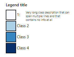
Fig. 51 Example of a categories legend
- svgUtils.graduatedLegend(df, code_column=None, value_column='value', label_column='label', dictnames=None, codes_selected=[], colorlist=['#0d0887', '#46039f', '#7201a8', '#9c179e', '#bd3786', '#d8576b', '#ed7953', '#fb9f3a', '#fdca26', '#f0f921'], stdevnumber=2.0, fill='#f1f1f1', stroke_selected='#00ffff', decimals=2, minallowed_value=None, maxallowed_value=None, hoveronempty=False, legendtitle='', legendunits='', fontsize=20, width=200, height=600, bordercolor='black', textcolor='black', dark=False)[source]
Creation of graduated legend in SVG format. Given a Pandas DataFrame in the same format of the one in input to
interMap.geojsonMap()function, this functions generates an SVG drawing displaying a graduated colors legend.- dfPandas DataFrame
Pandas DataFrame to use for assigning values to features. It has to contain at least a column with numeric values.
- code_columnstr, optional
Name of the column of the df Pandas DataFrame containing the unique code of the features. This column is used to perform the join with the internal attribute of the geojson vector dataset that contains the unique code. If the code_column is None, the code is taken from the index of the DataFrame, (default is None)
- value_columnstr, optional
Name of the column of the Pandas DataFrame containing the values to be assigned to the features using the join on geojson unique codes (default is ‘value’)
- label_columnstr, optional
Name of the column of the Pandas DataFrame containing the label to be assigned to the features using the join on geojson unique codes (default is ‘label’)
- dictnamesdict, optional
Dictionary to convert codes to names when displaying the selection (default is None)
- codes_selectedlist of strings, optional
List of codes of features to display as selected (default is [])
- colorlistlist of colors, optional
List of colors to assign to the country polygons (default is the Plotly px.colors.sequential.Plasma, see Plotly sequential color scales and Plotly qualitative color sequences )
- stdevnumberfloat, optional
The correspondance between the values assigned to features and the colors list is done by calculating a range of values [min,max] to linearly map the values to the colors. This range is defined by calculating the mean and standard deviation of the country values and applying this formula [mean - stdevnumber*stddev, mean + stdevnumber*stddev]. Default is 2.0
- fillstr, optional
Fill color to use for the features that are not joined (default is ‘#f1f1f1’)
- stroke_selectedstr, optional
Color to use for the selected features (default is ‘#00ffff’)
- decimalsint, optional
Number of decimals for the legend numbers display (default is 2)
- minallowed_valuefloat, optional
Minimum value allowed, to force the calculation of the [min,max] range to map the values to the colors
- maxallowed_valuefloat, optional
Maximum value allowed, to force the calculation of the [min,max] range to map the values to the colors
- hoveronemptybool, optional
If True highlights polygon on hover even if no value present in input df for the feature (default is False)
- legendtitlestr, optional
Title to add on top of the legend (default is ‘’). Use ‘
- ‘ to span into more lines.
- legendunitsstr, optional
Units of measure to add to the bottom of the legend (default is ‘’). Use ‘
- ‘ to span into more lines
- fontsizeint, optional
Size in pixels of the font used for texts (default is 20)
- widthint, optional
Width of the SVG drawing in pixels (default is 200)
- heightint, optional
Height of the SVG drawing in pixels (default is 600)
- bordercolorstr, optional
Color for lines and rects of the legend (default is ‘black’)
- textcolorstr, optional
Color for texts of the legend (default is ‘black’)
- darkbool, optional
If True, the bordercolor and textcolor are set to white (default is False)
a string containing SVG text to display the graduated legend
Creation of a SVG drawing to display a graduated legend. Input is prepared in the same way of the example provided for the
interMap.geojsonMap()function:import numpy as np import pandas as pd import plotly.express as px from vois import svgMap, svgUtils countries = svgMap.country_codes # Generate random values and create a dictionary: key=countrycode, value=random in [0.0,100.0] d = dict(zip(countries, list(np.random.uniform(size=len(countries),low=0.0,high=100.0)))) # Create a pandas dataframe from the dictionary df = pd.DataFrame(d.items(), columns=['iso2code', 'value']) svg = svgUtils.graduatedLegend(df, code_column='iso2code', codes_selected=['IT', 'FR', 'CH'], stroke_selected='red', colorlist=px.colors.sequential.Viridis[::-1], stdevnumber=2.0, legendtitle='2020 Total energy consumption', legendunits='KTOE per 100K inhabit.', fontsize=18, width=340, height=600) display(HTML(svg))
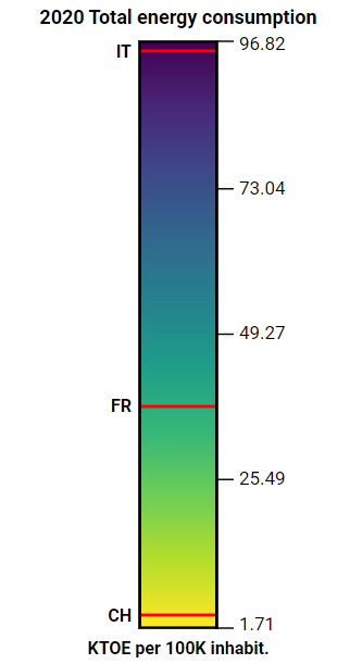
Fig. 52 Example of a graduatedLegend in SVG
- svgUtils.graduatedLegendVWVH(df, code_column=None, value_column='value', label_column='label', codes_selected=[], colorlist=['#0d0887', '#46039f', '#7201a8', '#9c179e', '#bd3786', '#d8576b', '#ed7953', '#fb9f3a', '#fdca26', '#f0f921'], stdevnumber=2.0, fill='#f1f1f1', stroke_selected='#00ffff', decimals=2, minallowed_value=None, maxallowed_value=None, hoveronempty=False, legendtitle='', legendunits='', fontsize=20, width=20.0, height=40.0, bordercolor='black', textcolor='black', dark=False)[source]
Creation of graduated legend in SVG format. Given a Pandas DataFrame in the same format of the one in input to
interMap.geojsonMap()function, this functions generates an SVG drawing displaying a graduated colors legend.- Parameters:
df (Pandas DataFrame) – Pandas DataFrame to use for assigning values to features. It has to contain at least a column with numeric values.
code_column (str, optional) – Name of the column of the df Pandas DataFrame containing the unique code of the features. This column is used to perform the join with the internal attribute of the geojson vector dataset that contains the unique code. If the code_column is None, the code is taken from the index of the DataFrame, (default is None)
value_column (str, optional) – Name of the column of the Pandas DataFrame containing the values to be assigned to the features using the join on geojson unique codes (default is ‘value’)
label_column (str, optional) – Name of the column of the Pandas DataFrame containing the label to be assigned to the features using the join on geojson unique codes (default is ‘label’)
codes_selected (list of strings, optional) – List of codes of features to display as selected (default is [])
colorlist (list of colors, optional) –
List of colors to assign to the country polygons (default is the Plotly px.colors.sequential.Plasma, see Plotly sequential color scales and Plotly qualitative color sequences )
stdevnumber (float, optional) – The correspondance between the values assigned to features and the colors list is done by calculating a range of values [min,max] to linearly map the values to the colors. This range is defined by calculating the mean and standard deviation of the country values and applying this formula [mean - stdevnumber*stddev, mean + stdevnumber*stddev]. Default is 2.0
fill (str, optional) – Fill color to use for the features that are not joined (default is ‘#f1f1f1’)
stroke_selected (str, optional) – Color to use for the border of the selected features (default is ‘#00ffff’)
decimals (int, optional) – Number of decimals for the legend numbers display (default is 2)
minallowed_value (float, optional) – Minimum value allowed, to force the calculation of the [min,max] range to map the values to the colors
maxallowed_value (float, optional) – Maximum value allowed, to force the calculation of the [min,max] range to map the values to the colors
hoveronempty (bool, optional) – If True highlights polygon on hover even if no value present in input df for the feature (default is False)
legendtitle (str, optional) – Title to add on top of the legend (default is ‘’)
legendunits (str, optional) – Units of measure to add to the bottom of the legend (default is ‘’)
fontsize (int, optional) – Size in pixels of the font used for texts (default is 20)
width (float, optional) – Width of the SVG drawing in vw units (default is 20.0)
height (float, optional) – Height of the SVG drawing in vh units (default is 40.0)
bordercolor (str, optional) – Color for lines and rects of the legend (default is ‘black’)
textcolor (str, optional) – Color for texts of the legend (default is ‘black’)
dark (bool, optional) – If True, the bordercolor and textcolor are set to white (default is False)
- Return type:
a string containing SVG text to display the graduated legend
Example
Creation of a SVG drawing to display a graduated legend. Input is prepared in the same way of the example provided for the
interMap.geojsonMap()function:import numpy as np import pandas as pd import plotly.express as px from vois import svgMap, svgUtils countries = svgMap.country_codes # Generate random values and create a dictionary: key=countrycode, value=random in [0.0,100.0] d = dict(zip(countries, list(np.random.uniform(size=len(countries),low=0.0,high=100.0)))) # Create a pandas dataframe from the dictionary df = pd.DataFrame(d.items(), columns=['iso2code', 'value']) svg = svgUtils.graduatedLegend(df, code_column='iso2code', codes_selected=['IT', 'FR', 'CH'], stroke_selected='red', colorlist=px.colors.sequential.Viridis[::-1], stdevnumber=2.0, legendtitle='2020 Total energy consumption', legendunits='KTOE per 100K inhabit.', fontsize=18, width=340, height=600) display(HTML(svg))
Fig. 53 Example of a graduatedLegend in SVG
- svgUtils.svgLogo()[source]
Creation of a simple SVG to display the logo of the European Commission
- Return type:
a string containing a SVG drawing that spans for 68 pixels in width and 44 pixels in height
Example
See example provided for the
svgUtils.svgTitle()functionNote
This function is completely superseeded by the more complete examples of dashboard titles available using the
title.titleorapp.app
- svgUtils.svgTitle(title='Dashboard title', subtitle1='Subtitle1', subtitle2='Subtitle2', xline=290)[source]
Creation of a simple title for a dashboard in SVG format
- Parameters:
title (str, optional) – Title of the dashboard (default is ‘Dashboard title’)
subtitle1 (str, optional) – First line of the subtitle (default is ‘Subtitle1’)
subtitle2 (str, optional) – Second line of the subtitle (default is ‘Subtitle2’)
xline (int, optional) – X position of a vertical line to divide title from subtitles (default is 290)
- Return type:
a string containing a SVG drawing that spans 100% of the width and 46 pixels in height
Example
Example of a title and logo SVG:
from vois import svgUtils
from ipywidgets import HTML, widgets, Layout

outTitle = widgets.Output(layout=Layout(width='99%',                   height='64px'))
outLogo  = widgets.Output(layout=Layout(width='1%', min_width='110px', height='82px'))

outTitle.clear_output()
with outTitle:
    display(HTML(svgUtils.svgTitle()))

outLogo.clear_output()
with outLogo:
    display(HTML(svgUtils.svgLogo()))

display(widgets.HBox([outTitle,outLogo]))

Fig. 54 Example of a simple svgTitle and svgLogo
Note
This function is completely superseeded by the more complete examples of dashboard titles available using the
title.titleorapp.app
textpopup module
Map popup widget to display titles and texts in a geographic position on a ipyleaflet Map.
- class textpopup.textpopup(m, lat=0.0, lon=0.0, titles=[], texts=[], width=200, height=None, autoremovedelay=10.0, titlesbold=[], titlefontsize=12, textsbold=[], textfontsize=12, titlewidth=50, titlecolor='black', textcolor='black', lineheightfactor=1.1, align='center', margin=5)[source]
Widget to vertically display a list of titles and texts strings as a popup on a ipyleaflet Map. Each couple of title and text occupies a row.
- Parameters:
m (instance of ipyleaflet.Map class) – Map to which the popup has to be added
lat (float) – Latitude where the popup has to be displayed (default is 0.0)
lon (float) – Longitude where the popup has to be displayed (default is 0.0)
titles (list of strings) – Strings to be displayed as title of each row (default is [])
texts (list of strings) – Strings to be displayed as the content of each row (default is [])
width (int) – Width of the popup in pixels (default is 200)
height (int) – Height of the popup in pixel (default is None meaning that the height will be automatically calcolated)
autoremovedelay (float) – Time in seconds for automatic remnoving of the popup (default is 0.0 which disables autoremove)
titlesbold (list of strings, optional) – List of titles whose corresponding texts in the left column should be displayed using bold font (default is [])
titlefontsize (int, optional) – Size in pixel of the font used for the titles (default is 12)
textsbold (list of strings, optional) – List of titles whose corresponding texts in the right column should be displayed using bold font (default is [])
textfontsize (int, optional) – Size in pixel of the font used for the texts (default is 12)
titlecolor (str, optional) – Color to use for the titles (default is ‘black’)
textcolor (str, optional) – Color to use for the texts (default is ‘black’)
lineheightfactor (float, optional) – Factor to multiply to the font-size to calculate the height of each row (default is 1.5)
align (str, optional) – Aligment of text inside the popup (default is ‘center’, alternative is ‘left’)
margin (int, optional) – Margin in pixel on each side of the content (default is 5)
Example
Creation and display of a widget to display some textual information:
from ipywidgets import widgets, HTML, CallbackDispatcher
from ipyleaflet import Map
from IPython.display import display

from vois import textpopup

m = Map(center=[43.66737, 12.5504], scroll_wheel_zoom=True, zoom=13)

t = None
def handle_interaction_popup(**kwargs):
    global t

    if kwargs.get('type') == 'click':
        lat = kwargs.get('coordinates')[0]
        lon = kwargs.get('coordinates')[1]

        textpopup.textpopup.removeAll(m)
        t = textpopup.textpopup(m, lat=lat, lon=lon, autoremovedelay=5.0,
                                width=340, height=None, titlewidth=70,
                                titles=['Pixel values', 'Class'],
                                texts=['(120,34,189)', 'Woodland and Shrubland (incl. permanent crops)'],
                                titlesbold=[],
                                titlefontsize=11,
                                textsbold=['Pixel'],
                                textfontsize=11,
                                titlecolor='darkgreen',
                                textcolor='darkred')

m._interaction_callbacks = CallbackDispatcher()
m.on_interaction(handle_interaction_popup)

display(m)
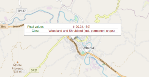
Fig. 55 Map popup widget for displaying textual information.
treemapPlotly module
Utility functions to prepare data for Plotly Treemap, Sunburst and Icicle plots.
- treemapPlotly.createTreemapFromList(nameslist=[], rootName='Root', separator='.', valuefor={})[source]
Preprocessing of a list of strings having a hierarchical structure (defined by a separator, e.g. ‘.’), in view of the display of a Plotly Treemap, Sunburst or Icicle chart. Each node of the tree will have a ‘dimension’ that influences the way to display it (the space occupied, or the size, etc.)
- Parameters:
nameslist (list of strings, optional) – List of strings to preprocess. The hierarchical structure is defined by the separator character. Default is []
rootName (str, optional) – Name to assign to the root node of the hierarchical structure (default is ‘Root’)
separator (str, optional) – Separator character that defines the hierarchical structure (default is ‘.’)
valuefor (dict, optional) – Dictionary to assign a numerical value to each node of the tree (default is {})
- Returns:
a tuple of 3 elements (labels, parents, values)
labels is a list of the names of the nodes
parents is the list of the parents of each of the nodes
values is the list of numerical values assigned to each of the node (and summed up in the parent-son relation)
These 3 lists can be given as input to the plotly.graph_objects.Treemap/Sunburst/Icicle functions
Example
Creation of a Treemap chart in Plotly using numerical data associated to JRC units and directorates:
import plotly.graph_objects as go
from vois import treemapPlotly

valuefor = {'JRC.A.1': 3.0, 'JRC.A.2': 5.0, 'JRC.B.1': 12.0, 'JRC.B.2': 7.0,
            'JRC.B.3': 3.0, 'JRC.C.1': 7.0, 'JRC.C.2': 2.0}

labels, parents, values = treemapPlotly.createTreemapFromList(['JRC.A','JRC.A.1',
                                                               'JRC.A.2','JRC.B.1',
                                                               'JRC.B.2','JRC.B.3',
                                                               'JRC.C.1','JRC.C.2',],
                                                              rootName='JRC',
                                                              valuefor=valuefor)

fig = go.Figure()
fig.add_trace(go.Treemap(ids=labels, labels=labels, parents=parents, values=values,
                         branchvalues='total', maxdepth=3, root_color="lightgrey"))
fig.update_layout(margin=dict(t=38, l=0, r=0, b=10), height=400,
                  hoverlabel=dict(bgcolor="#eee", align="left"),
                  title={'text': "JRC units", 'y':0.96, 'x':0.5,
                         'xanchor': 'center', 'yanchor': 'top'})

fig.show()
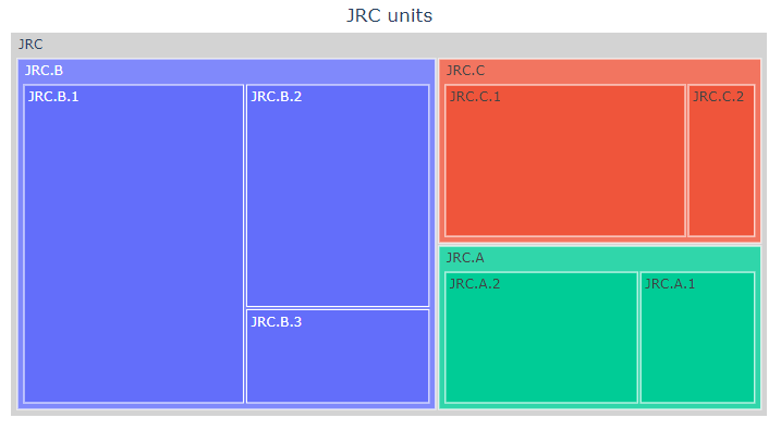
Fig. 56 Display of a Plotly Treemap extracted from a list of strings separated by ‘.’
urlOpen module
Utility functions to open a web page.
- urlOpen.urlOpen(url, output, target='_blank')[source]
Opean a web page in another tab of the browser
- Parameters:
url (str) – URL of the page to open
output (instance of ipywidgets.Output() class) – Output widget where the javascript code to open the new page is executed
target (str, optional) – Target of the open operation (default is ‘_blank’ which means that the page will be opened in a new browser’s tab)
Example
Open Google page in another tab of the browser:
from vois import urlOpen
from ipywidgets import widgets, Layout
from IPython.display import display

output = widgets.Output(layout=Layout(width='0px', height='0px'))
display(output)

urlOpen.urlOpen('https://www.google.com', output, target='_blank')
Note
If the dashboard is created using the
app.appclass, it is preferable to use the functionapp.app.urlOpen()that doesn’t need the output parameter and uses the Output widget created inside the app instance itself (and invisible to the users)
urlUpdate module
Utility functions to update the URL of the page that launched the dashboard.
- urlUpdate.urlUpdate(url, output)[source]
Update the URL visualized in the top bar of the browser.
- Parameters:
url (str) – Partial url to add to the current browser’s page key/values
Example
Add a key/value pair to the current browser URL:
from vois import urlUpdate
from ipywidgets import widgets, Layout
from IPython.display import display

output = widgets.Output(layout=Layout(width='0px', height='0px'))
display(output)

urlUpdate.urlUpdate('?test=3', output)
Note
If the dashboard is created using the
app.appclass, it is preferable to use the functionapp.app.urlUpdate()that doesn’t need the output parameter and uses the Output widget created inside the app instance itself (and invisible to the users)