Vuetify modules
Vuetify modules of vois library contain classes that simplify the usage of ipyvuetify widgets inside a Jupyter notebook or a Voilà application.

app class
basemaps widget
Widget to select the basemap to visualise on a ipyleaflet Map
- class basemaps.basemaps(m, color='#f8bd1a', dark=False, width=320, height=650, addBDAPbasemaps=True, removeBasemaps=[], rootName='Basemaps', onchange=None)[source]
Treeview widget to select a basemap for an ipyleaflet map.
- Parameters:
m (ipyleaflet.Map instance) – Map instance on which the selected basemap has to be set as backdrop layer
color (str, optional) – Color to use for the widget (default is settings.color_first)
dark (bool, optional) – If True, the widget will have a dark background (default is settings.dark_mode)
width (int, optional) – Width of the widget in pixels (default is 320)
height (int, optional) – Height of the widget in pixels (default is 650)
addBDAPbasemaps (bool, optional) – If True the treeview will contain also some BDAP layers selectable as basemaps (default is True)
removeBasemaps (list of str, optional) – List of basemaps names to be removed from the widget (default is [])
rootName (str, optional) – Name to use as the root node of the basemaps treeview (default is ‘Basemaps’)
onchange (function, optional) – Python function to call when the user selects a different basemap. The function will receive no parameters. (default is None)
Example
Creation of a basemap selection widget:
from jeodpp import inter, imap
from ipywidgets import widgets, Layout

from vois.vuetify import basemaps

height = 650

m = imap.Map(layout=Layout(height='%dpx'%height))

b = basemaps.basemaps(m, height=height, dark=False)

display(widgets.HBox([b.draw(),m]))
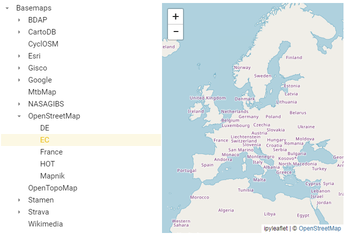
Fig. 57 Example of a basemaps selection widget
- property current_layer
Get the currently select layer (instance of ipyleaflet.leaflet.TileLayer class or ipyleaflet.leaflet.LayerGroup class)
- draw()[source]
Returns the ipyvuetify object to display (the internal v.Card containing the treeview)
- property value
Get/Set the active basemap name.
- Returns:
name – Name of the basemap
- Return type:
str
Example
Programmatically select one of the basemaps and print the value selected:
b.value = 'Esri.WorldImagery'
print(b.value)
Button widget
Button widget to call a python function when clicked.
- class Button.Button(*args: t.Any, **kwargs: t.Any)[source]
Button widget to call a python function when clicked.
- Parameters:
text (str) – Test string to be displayed on the button widget
on_click (function, optional) – Python function to call when the user clicks on the button. The function will receive as parameter the value of the argument (default is None)
on_dblclick (function, optional) – Python function to call when the user double-clicks on the button. The function will receive as parameter the value of the argument (default is None)
argument (any, optional) – Argument to be passed to the onclick function when user click on the label (default is None)
width (int, optional) – Width of the button widget in pixels (default is 100)
height (int, optional) – Height of the button widget in pixels (default is 36)
selected (bool, optional) – Flag to show the button as selected (default is False)
disabled (bool, optional) – Flag to show the button as disabled (default is False)
tooltip (str, optional) – Tooltip text to show when the user hovers on the button (default is ‘’)
large (bool, optional) – Flag that sets the large version of the button (default is False)
x_large (bool, optional) – Flag that sets the xlarge version of the button (default is False)
small (bool, optional) – Flag that sets the small version of the button (default is False)
x_small (bool, optional) – Flag that sets the xsmall version of the button (default is False)
outlined (bool, optional) – Flag to show the button as outlined (default is False)
text_weight (int, optional) – Weight of the text to be shown in the label (default is 500, Bold is any value greater or equal to 500)
href (str, optional) – URL to open when the button is clicked (default is None)
target (str, optional) – Designates the target attribute (where the URL page is opened, for instance: ‘_blank’ to open it in a new browser tab). This should only be applied when using the href parameter (default is None)
only_text (bool, optional) – If True, the button will contain only the text (default is False)
text_color (str, optional) – Color used for the button text (default is None)
icon (str, optional) – Name of the icon to display aside the text of the label (default is None)
icon_large (bool, optional) – Flag that sets the large version of the icon (default is False)
icon_small (bool, optional) – Flag that sets the small version of the icon (default is False)
icon_left (bool, optional) – Flag that sets the position of the icon to the left of the text of the label (default is False)
icon_color (str, optional) – Color of the icon (default is ‘black’ if settings.dark_mode is False and ‘white if settings.dark_mode is True)
auto_select (bool, optional) – If True, the button becomes selected when clicked (default is False)
dark (bool, optional) – Flag to invert the text and backcolor (default is the value of settings.dark_mode)
rounded (bool, optional) – Flag to display the button with rounded corners (default is the value of settings.button_rounded)
tile (bool, optional) – Flag to remove the button small border (default is False)
color_selected (str, optional) – Color used for the button when it is selected (default is settings.color_first)
color_unselected (str, optional) – Color used for the button when it is not selected (default is settings.color_second)
Note
All the icons from https://materialdesignicons.com/ site can be used, just by prepending ‘mdi-’ to their name.
All the free icons from https://fontawesome.com/ site can be used, just by prepending ‘fa-’ to their name.
Example
Creation and display of a some button widgets playing with the parameters:
from vois.vuetify import settings, Button

def onclick(arg=None):
    if arg==1: b1.selected = not b1.selected
    if arg==2: b2.selected = not b2.selected
    else:      b3.selected = not b3.selected

b1 = Button('Test button 1', text_weight=300, on_click=onclick, argument=1,
            width=150, height=36,
            tooltip='Tooltip for button 1', selected=False, rounded=True,
            icon='mdi-car-light-high', iconColor='black')

b2 = Button('Test button 2', text_weight=450, on_click=onclick, argument=2,
            width=150, height=48,
            tooltip='Tooltip for button 2', selected=True, rounded=False)

b3 = Button('Test button 3', text_weight=450, on_click=onclick, argument=3,
            width=150, height=38,
            text_color=settings.color_first,
            tooltip='Tooltip for button 3', outlined=True, rounded=True)

b4 = Button('Contacts', only_text=True, text_color=settings.color_first,
            width=150, height=28,
            href='https://ec.europa.eu/info/contact_en', target="_blank",
            tooltip='Open a URL')

display(b1)
display(b2)
display(b3)
display(b4)
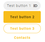
Fig. 58 Example of a 4 button widgets with different display modes.
- property color_selected
Get/Set the color of the button when it is in the selected state.
- Returns:
c – widget color
- Return type:
str
Example
Programmatically change the widget color:
s.color_selected = '#00FF00'
print(s.color_selected)
- property color_unselected
Get/Set the color of the button when it is in the unselected state.
- Returns:
c – widget color
- Return type:
str
Example
Programmatically change the widget color:
s.color_unselected = '#00FF00'
print(s.color_unselected)
- property disabled
Get/Set the disabled state of the button widget.
- Returns:
disabled status – True if the button is disabled, False otherwise
- Return type:
bool
- property selected
Get/Set the selected state of the button widget.
- Returns:
selected status – True if the button is selected, False otherwise
- Return type:
bool
Example
Programmatically select a button:
b.selected = True
print(b.selected)
- setIcon(iconname)[source]
Change the icon for the button
Example
Creation of a button and programmatically change its icon:
from vois.vuetify import settings, button

b = Button('Test button', text_weight=450, width=150, height=46,
           selected=True, rounded=True,
           icon='mdi-menu-open', icon_color='black', icon_large=True)
display(b.draw())
b.setIcon('mdi-menu')
- setText(newtext: str)[source]
Change the text for the button
Example
Creation of a button and programmatically change its text:
from vois.vuetify import settings, Button

b = Button('Test button', text_weight=450, width=250, height=46,
           selected=True, rounded=True)
display(b.draw())
b.setText('New button text')
card widget
Simple card with title, subtitle and image.
- class card.card(*args: t.Any, **kwargs: t.Any)[source]
Simple card displaying title, subtitle and an image.
- Parameters:
width (str, optional) – Width of the card (default is ‘400px’)
color (str, optional) – Background color of the card (default is ‘white’)
dark (bool, optional) – If True the title and subtitle texts are displayed in white color, if False they are displayed in black (default is False)
ripple (bool, optional) – If True the click on the card is highlighted (default is False)
elevation (int, optional) – Elevation of the card over the background of the page (default is 3)
title (str, optional) – Title of the card (default is ‘Title’)
subtitle (str, optional) – Subtitle of the card (default is ‘Subtitle’)
icon (str, optional) – URL of the image to display as an icon before the card title (default is ‘’)
iconsize (str, optional) – Size of the area where the icon is displayed (default is ‘32px’)
image (str, optional) – URL of the image to display in the right side of the card (default is ‘’)
imagesize (str, optional) – Size of the area where the image is displayed (default is ‘190px’)
on_click (function, optional) – Python function to call when the user clicks on the card. The function will receive no parameters. (default is None)
argument (any, optional) – Argument to pass to the on_click python function (default is None)
responsive (bool, optional) – If True, the font size is automatically changed according to the page size (default is False)
fontsizemultiplier (float, optional) – Multiply factor for changing the standard size of the font used for title and subtitle (default is 1.0)
backgroundimageurl (str, optional) – URL of the optional image to display as background of the card (default is ‘’)
tooltip (str, optional) – Text to display as tooltip of the whole card (default is ‘’)
titletooltip (str, optional) – Text to display as tooltip of the card title (default is ‘’)
textcolor (str, optional) – Color of the text (default is ‘black’)
titleweight (int, optional) – Font weight for the title (default is 700)
subtitleweight (int, optional) – Font weight for the subtitle (default is 400)
Example
Creation of a card to display text and an image:
from vois.vuetify import card
from ipywidgets import widgets
from IPython.display import display

output = widgets.Output()

def on_click():
    with output:
        print('clicked!')

subtitle = 'Lorem ipsum dolor sit amet, consectetur adipiscing elit, sed do eiusmod tempor incididunt ut labore et dolore magna aliqua. Ut enim ad minim veniam, quis nostrud exercitation ullamco laboris nisi...'
width = 600

c = card.card(elevation=5, width='600px', title='Sample dataset', subtitle=subtitle,
              image='https://cdn.vuetifyjs.com/images/cards/halcyon.png', on_click=on_click)

display(c)
display(output)
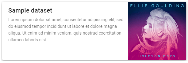
Fig. 59 Example of a card with text and an image
cardsGrid widget
Cards with title, subtitle and image displayed in rows and columns
- class cardsGrid.cardsGrid(*args: t.Any, **kwargs: t.Any)[source]
Cards with title, subtitle and image displayed in a grid of rows and columns.
- Parameters:
cards (list of json element, one for each card to display, optional) – Each of the json elements must have this structure: { “title”: “”, “subtitle”: “”, “image”: “”}, optional tags are “color”, “imagesize”, “icon” and “iconsize”, “titletooltip”
width (str, optional) – Width of the cards (default is ‘400px’)
height (str, optional) – Heigth of the cards (default is ‘’ which means that each card has its own height defined by its content)
cols (int, optional) – Horizontal column span [1,12] for each of the card (default is 6)
color (str, optional) – Background color of the cards (default is ‘white’)
dark (bool, optional) – If True the title and subtitle texts are displayed in white color, if False they are displayed in black (default is False)
ripple (bool, optional) – If True the click on the card is highlighted (default is False)
iconsize (str, optional) – Size of the area where the icon is displayed (default is ‘32px’)
imagesize (str, optional) – Size of the area where the image is displayed (default is ‘190px’)
on_click (function, optional) – Python function to call when the user clicks on the card. The function will receive as parameter the index of the clicked card. (default is None)
responsive (bool, optional) – If True, the font size is automatically changed according to the page size (default is False)
fontsizemultiplier (float, optional) – Multiply factor for changing the standard size of the font used for title and subtitle (default is 1.0)
tooltipwidth (str, optional) – Max width of the tooltip window to open on hover on the cards title (default is ‘600px’)
Example
Creation of a cards grid to display text and an image:
from vois.vuetify import cardsGrid
from ipywidgets import widgets
from IPython.display import display

output = widgets.Output()

def on_click(index):
    with output:
        print(index)

cards = [
   { "title": "title0", "subtitle": "subtitle0", "image": "https://cdn.vuetifyjs.com/images/cards/sunshine.jpg", "titletooltip": "Example of card title tooltip" },
   { "title": "title1", "subtitle": "subtitle1", "image": "https://cdn.vuetifyjs.com/images/cards/road.jpg" },
   { "title": "title2", "subtitle": "subtitle2", "image": "https://cdn.vuetifyjs.com/images/cards/plane.jpg" },
   { "title": "title3", "subtitle": "subtitle3", "image": "https://cdn.vuetifyjs.com/images/cards/house.jpg" }
]

g = cardsGrid.cardsGrid(cards=cards, cols=6, width='350px', imagesize='200px', on_click=on_click)

display(g)
display(output)
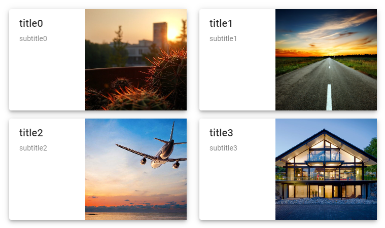
Fig. 60 Example of a cardsGrid to display multiple cards containing texts and an images
ColorPicker widget
Input widget to select a color
- class ColorPicker.ColorPicker(*args: t.Any, **kwargs: t.Any)[source]
Input widget to select a color.
- Parameters:
color (str, optional) – Initial color selected on the widget expressed in hexadecimal format ‘#RRGGBB’ (default is ‘#FF0000’)
dark (bool, optional) – If True, the popup color selection will have a dark background (default is settings.dark_mode)
dark_text (bool, optional) – If True, the text on the colored button is displayed in white, if False in black. If dark_text is None, the color of the text is automatically selected based on the currently selected color (default is None)
width (int, optional) – Width of the widget in pixels (default is 40)
height (int, optional) – Height of the widget in pixels (default is 30)
rounded (bool, optional) – If True the color widget is displayed as a round button (default is False)
canvas_height (int, optional) – Height of the canvas displayed on top of the popup window to select the colors (default is True)
show_canvas (bool, optional) – If True the popup window will show the color canvas (default is True)
show_mode_switch (bool, optional) – If True the popup window will show mode switch control among RGB, HSL and HAX (default is True)
show_inputs (bool, optional) – If True the popup window will show the input field for the color components (default is True)
show_swatches (bool, optional) – If True the popup window will show the color swatches (default is True)
swatches_max_height (int, optional) – Height in pixels of the swatches area in the popup window (default is 164)
text (str, optional) – Text to display in the color button (default is ‘’)
text_weight (int, optional) – Weight of the text to be shown in the button (default is 400, Bold is any value greater or equal to 500)
on_change (function, optional) – Python function to call when the user selects a different color. The function will receive the argument parameter. If the argument is None, the function will receive no parameters. (default is None)
argument (any, optional) – Argument to be passed to the onchange function (default is None)
offset_x (bool, optional) – If True the popup window will be opened on the right of the color button (default is False)
offset_y (bool, optional) – If True the popup window will be opened on the bottom of the color button (default is True)
disabled (bool, optional) – True if the selection of the color is disabled, False otherwise (default is False)
color_theory_popup (bool, optional) – If True a popup window (self.ctpopup) is created to show the complementary, analogous, etc.. colors on hover (default is False)
Example
Creation of a color picker widget to select a color:
from vois.vuetify import ColorPicker
from ipywidgets import widgets
from IPython.display import display

output = widgets.Output()

def on_change():
    with output:
        print('Changed to', c.color)

c = ColorPicker(color='#00AAFF',
                width=30, height=30,
                rounded=False,
                on_change=on_change,
                offset_x=True,
                offset_y=False)

display(c)
display(output)
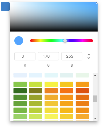
Fig. 61 Example of a colorPicker to select a color
- property color
Get/Set the selected color.
- Returns:
c – color currently selected
- Return type:
str
Example
Programmatically change the color:
picker.color = '#00FF00'
print(picker.color)
- property dark_text
Get/Set the dark flag for the button that displayes the selected color. If True, the text on the colored button is displayed in white, if False in black. If dark_text is None, the color of the text is automatically selected based on the currently selected color
- Returns:
flag – If True, the text on the colored button is displayed in white, if False in black. If dark_text is None, the color of the text is automatically selected based on the currently selected color
- Return type:
bool
Example
Programmatically change the dark_text property:
picker.dark_text = True
print(picker.dark_text)
- property disabled
Get/Set the disabled state of the widget.
- Returns:
flag – True if the widget is disabled, False otherwise
- Return type:
bool
Example
Programmatically change the disabled state:
picker.disabled = True
print(picker.disabled)
datatable widget
Display of a Pandas DataFrame in a data-table widget.
- class datatable.datatable(*args: t.Any, **kwargs: t.Any)[source]
Display of a Pandas DataFrame in a data-table widget.
- Parameters:
data (Pandas DataFrame, optional) – Pandas DataFrame to be displayed (default is pd.DataFrame() empty DataFrame)
height (str, optional) – Height of the data-table widget (default is ‘400px’)
on_click (function, optional) – Python function to call when the user clicks on one of the rows of the data-table. The function will receive a parameter of type dict containing all the column names as keys and the clicked row data as values
color (str, optional) – Color to use for the display of alert and warning messages (for instance if no records are present in input DataFrame) (default is ‘error’)
dark (bool, optional) – If True, the error and warning messages are displayed in white color, if False they are displayed in black (default is False)
searchshow (bool, optional) – If True, on top of the table a search field will be displayed, allowing for search (default is False)
search (str, optional) – Initial search string to be displayed in the search field (default is ‘’). If searchshow is False, this argument will not be used
title (str, optional) – In case searchshow is True, a Title can be shown on top of the datatable (default is ‘’)
icon (str, optional) – In case searchshow is True, an icon can be shown on the right of the datatable title (default is ‘’)
icon_tooltip (str, optional) – Tooltip string to be used for the icon (default is ‘’)
icon_color (str, optional) – Color of the icon (default is ‘grey’)
icon_disabled (bool, optional) – If True, the icon will be disabled (default is False)
font_size (str, optional) – Font size to use for the rows and headers of the datatable (default is ‘14px’)
font_size_title (str, optional) – Font size to use for the title of the datatable (default is ‘16px’)
on_icon (function, optional) – Python function to call when the user clicks on the icon on the top of the data-table. The function will receive no parameters
unsortable_columns (list of str, optional) – List of names of columns that must not be sortable in the datatable (please note that the DataFrame column names will be displayed in capital letters in the datatable: use in this list the original column names of the DataFrame and not the capitalized names)
Example
Creation of a Pandas DataFrame from the ‘Our World In Data’ dataset on Covid-19 daily data and display of last 100 days for Italy:
from vois.vuetify import datatable
import pandas as pd
from ipywidgets import widgets
from IPython.display import display

output = widgets.Output()

df = pd.read_csv('https://raw.githubusercontent.com/owid/covid-19-data/master/public/data/owid-covid-data.csv')

def on_click(data):
    output.clear_output()
    with output:
        print(data)

df = df[df['location']=='Italy']
d = datatable.datatable(data=df.tail(100), height='500px', on_click=on_click)

display(d)
display(output)
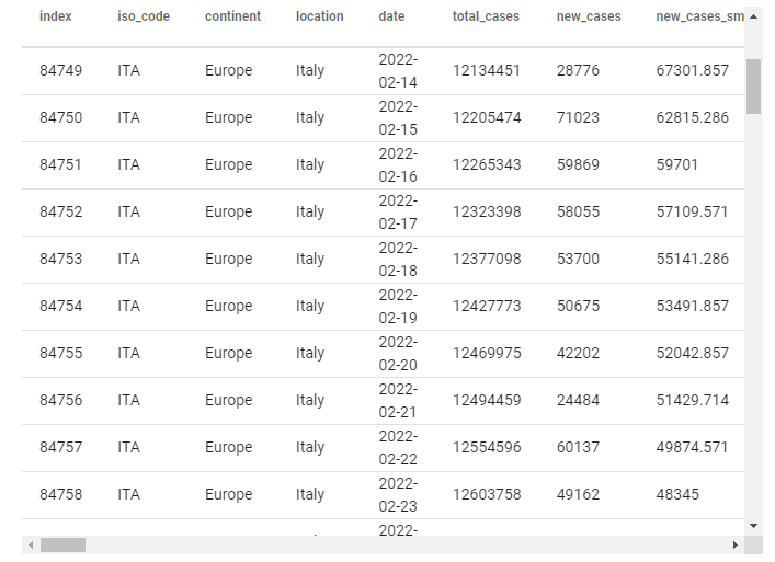
Fig. 62 Last 100 days of Covid-19 data on Italy displayed in a datatable widget
DatePicker widget
Input widget to select a date
- class DatePicker.DatePicker(*args: t.Any, **kwargs: t.Any)[source]
Input widget to select a date.
- Parameters:
date (str, optional) – Initial date selected on the input widget expressed in format ‘YYYY-MM-DD’ (default is None, corresponding to the today date)
label (str, optional) – Label to be displayed inside the widget (default is ‘’)
dark (bool, optional) – If True, the popup date selection will have a dark background (default is settings.dark_mode)
width (int, optional) – Width of the widget in pixels (default is 88)
color (str, optional) – Color to use for the widget and the header of the popup window (default is settings.color_first)
show_week (bool, optional) – If True the popup window will also show number of the week (default is False)
on_change (function, optional) – Python function to call when the user selects a date. The function will receive no parameters. (default is None)
offset_x (bool, optional) – If True the popup window will be opened on the right of the input field (default is False)
offset_y (bool, optional) – If True the popup window will be opened on the bottom of the input field (default is True)
disabled (bool, optional) – True if the selection of the date is disabled, False otherwise (default is False)
min_date (str, optional) – Minimum selectable date in format ‘YYYY-MM-DD’ (default is None)
max_date (str, optional) – Maximum selectable date in format ‘YYYY-MM-DD’ (default is None)
Example
Creation of a date picker widget:
from vois.vuetify import DatePicker
from ipywidgets import widgets
from IPython.display import display

output = widgets.Output()

def onchange():
    with output:
        print('Changed to', d.date)

d = DatePicker(
    date=None,
    label='Start date',
    offset_x=True,
    offset_y=False,
    onchange=onchange)

display(d)
display(output)
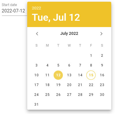
Fig. 63 Example of a datePicker
- property date
Get/Set the selected date.
- Returns:
d – date currently selected in the format ‘YYYY-MM-DD’
- Return type:
str
Example
Programmatically change the date:
picker.date = '2022-07-15'
print(picker.date)
- property disabled
Get/Set the disabled state of the widget.
- Returns:
flag – True if the widget is disabled, False otherwise
- Return type:
bool
Example
Programmatically change the date:
picker.disabled = True
print(picker.disabled)
DayCalendar widget
Calendar widget showing days with events
- class DayCalendar.DayCalendar(*args: t.Any, **kwargs: t.Any)[source]
Input widget to display a daily calendar for a range of dates and allows for highlighting some of the days and manages the click on the days.
- Parameters:
start (str or datetime or date instance, optional) – Initial date of the calendar as a string in format ‘YYYY-MM-DD’ or as an instance of datetime.datetime or datetime.date (default is today date minus one month)
end (str or datetime or date instance, optional) – Final date of the calendar as a string in format ‘YYYY-MM-DD’ or as an instance of datetime.datetime or datetime.date (default is today)
color (str, optional) – Color to use for the highlighting of days in the calendar (default is settings.color_first)
dark (bool, optional) – If True, the calendar will have a dark background (default is settings.dark_mode)
days (list of str, optional) – List of days to be highlighted as strings in “YYYY-MM-DD” format (default is []). The list can contain repeated days (see show_count below).
show_count (bool, optional) – If True, the event bar will show the number of events on each of the highlighted days (default is False)
width (int, optional) – Width of the widget in pixels (default is 340)
height (int, optional) – Height of the widget in pixels (default is None). If None is passed, the height will be calculated depending on the range of dates defined by start and end parameters.
on_click (function, optional) – Python function to call when the user clicks on one day of the calendar. The function will receive as parameter a string in “YYYY-MM-DD” format. (default is None)
_event (on_click) – Python function to call when the user clicks on the highlighting bar of one day of the calendar. The function will receive as parameter a string in “YYYY-MM-DD” format. (default is None)
Example
Creation of a date picker widget:
from vois.vuetify import dayCalendar
from ipywidgets import widgets
from IPython.display import display

output = widgets.Output()

def on_click(day):
    with output:
        print('Clicked on ', day)

c = dayCalendar.dayCalendar(start='2023-10-01', end='2023-10-31',
                            days=['2023-10-10', '2023-10-20'],
                            on_click=on_click)

display(c.draw())
display(output)
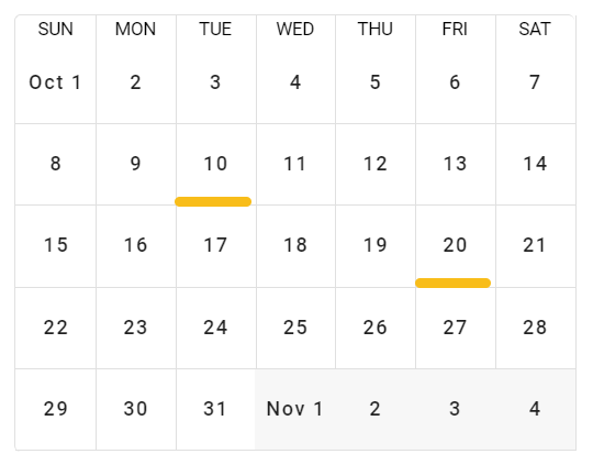
Fig. 64 Example of a dayCalendar
- property color
Get/Set the color of the highlighted days
- Returns:
color – Color of the highlighted days in the calendar
- Return type:
str
Example
Programmatically change the color:
cal.color = 'red'
print(cal.color)
- property days
Get/Set the highlighted days
- Returns:
listfodays – List of days currently highlighted in the calendar
- Return type:
list of strings in “YYYY-MM-DD” format
Example
Programmatically change the highlighted days:
cal.days = ['2023-10-15', '2023-10-25']
print(cal.days)
dialogGeneric widget
Generic modal dialog-box to ask input from the user.
- class dialogGeneric.dialogGeneric(title='', text='', color='#f8bd1a', dark=False, show=False, content=[], width=500, fullscreen=False, persistent=False, no_click_animation=False, addclosebuttons=True, addokcancelbuttons=False, on_ok=None, on_cancel=None, on_close=None, transition='dialog-fade-transition', output=None, titleheight='dense', customclass='', custom_icon='', custom_tooltip='', custom_icon_onclick=None)[source]
Generic modal dialog-box to ask input from the user.
- Parameters:
title (str, optional) – Title of the dialog-box to be displayed in the top toolbar (default is ‘’)
text (str, optional) – Text to display on top of the dialog-box body (default is ‘’)
color (str, optional) – Color of the title bar of the dialog (default is settings.color_first)
dark (bool, optional) – Flag that controls the color of the text in foreground (if True, the text will be displayed in white, elsewhere in black)
show (bool, optional) – Flag to immediately show the dialog-box upon creation (default is False)
content (list of ipyvuetify widgets, optional) – List of ipyvuietify widgets to be displayed in the body of the dialog-box (default is [])
width (int or str, optional) – Width of the dialog-box. If an integer is passed the width is intended in pixels. Default is 500 pixels
fullscreen (bool, optional) – If True, the dialog-box is opened in fullscreen mode (default is False)
persistent (bool, optional) – If True, clicking outside of the dialog or pressing esc key will not deactivate it (default is False)
no_click_animation (bool, optional) – If True, disables the bounce effect when clicking outside of a dialog’s content when using the persistent property (default is False)
addclosebuttons (bool, optional) – If True, the dialog will have a ‘close’ button in the top toolbar (default is True)
addokcancelbuttons (bool, optional) – If True, the dialog will have ‘ok’ and ‘cancel’ buttons in the bottom row (default is False)
on_ok (function, optional) – Python function to call when the user clicks on the OK button. The function will receive no parameters (default is None)
on_cancel (function, optional) – Python function to call when the user clicks on the CANCEL button. The function will receive no parameters (default is None)
on_close (function, optional) – Python function to call when the user clicks on the CLOSE button. The function will receive no parameters (default is None)
transition (str, optional) – Transition to use for the dialog display and close (default is ‘dialog-fade-transition’. See: https://vuetifyjs.com/en/styles/transitions/ for a list of available transitions (substitute ‘v-’ with ‘dialog-‘’)
output (ipywidgets.Output, optional) – Output widget on which the widget has to be displayed
titleheight (str, optional) – Height of the title toolbar. It can be: ‘prominent’, ‘dense’, ‘extended’ or a value in pixels (default is ‘dense’)
custom_icon (str, optional) – Name of the optional icon to display in the top toolbar (default is ‘’)
custom_tooltip (str, optional) – Tooltip to display when hovering on the custom icon in the top toolbar (default is ‘’)
custom_icon_onclick (function, optional) – Python function to call when the user clicks on the custom icon on the topbar. The function will receive no parameters (default is None)
Example
Creation and display of a modal dialog-box containing a switch widget:
from vois.vuetify import dialogGeneric, switch
from ipywidgets import widgets
from IPython.display import display

output = widgets.Output()
display(output)

def on_s_change(value):
    with output:
        print(value)

s = switch.switch(True, 'PNG format', onchange=on_s_change)

dlg = dialogGeneric.dialogGeneric(title='Settings',
                                  text='Please select the format for download:',
                                  show=True, addclosebuttons=True, width=600,
                                  fullscreen=False, content=[s.draw()], output=output)
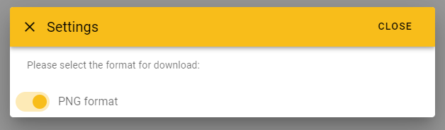
Fig. 65 Example of a dialogGeneric containing a switch widget.
- property okdisabled
Get/Set the disabled status of the ok button.
- Returns:
flag – True if the ok button is disabled, False otherwise
- Return type:
bool
Example
Programmatically set the disabled status and print it:
dlg.okdisabled = True
print(dlg.okdisabled)
dialogMessage widget
Dialog-box to display a message for the user.
- class dialogMessage.dialogMessage(*args, **kwargs)[source]
Dialog-box to display a message for the user.
Derived class from dialogGeneric.dialogGeneric.
- Parameters:
title (str, optional) – Title of the dialog-box to be displayed in the top toolbar (default is ‘’)
text (str, optional) – Text to display on top of the dialog-box body (default is ‘’)
dark (bool, optional) – Flag that controls the color of the text in foreground (if True, the text will be displayed in white, elsewhere in black)
show (bool, optional) – Flag to immediately show the dialog-box upon creation (default is False)
width (int or str, optional) – Width of the dialog-box. If an integer is passed the width is intended in pixels. Default is 500 pixels
addclosebuttons (bool, optional) – If True, the dialog will have a ‘close’ button in the top toolbar (default is True)
transition (str, optional) – Transition to use for the dialog display and close (default is ‘dialog-fade-transition’). See: https://vuetifyjs.com/en/styles/transitions/ for a list of available transitions (substitute ‘v-’ with ‘dialog-‘)
output (ipywidgets.Output, optional) – Output widget on which the widget has to be displayed
titleheight (str, optional) – Height of the title toolbar. It can be: ‘prominent’, ‘dense’, ‘extended’ or a value in pixels (default is ‘dense’)
Example
Creation and display of a modal dialog-box containing an error message:
from vois.vuetify import dialogMessage
from ipywidgets import widgets
from IPython.display import display

output = widgets.Output()
display(output)

e = dialogMessage.dialogMessage(title='Error',
                                text='''Sorry but the task could not be completed<br>
because there are errors in the code to save in PNG format''',
                                addclosebuttons=False,
                                show=True, width=450, output=output)
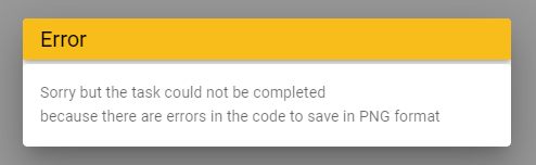
Fig. 66 Example of a dialogMessage to display an error message to the user.
- close(*args)
Close the dialog.
- property okdisabled
Get/Set the disabled status of the ok button.
- Returns:
flag – True if the ok button is disabled, False otherwise
- Return type:
bool
Example
Programmatically set the disabled status and print it:
dlg.okdisabled = True
print(dlg.okdisabled)
- show()
Open the dialog.
dialogWait widget
Dialog-box to display a message to the user during a lenghty operation.
- class dialogWait.dialogWait(*args: t.Any, **kwargs: t.Any)[source]
Dialog-box to display a message to the user during a lenghty operation.
- Parameters:
text (str, optional) – Text to display on top of the dialog-box body (default is ‘’)
indeterminate (bool, optional) – If True the progress bar will constantly animate (to be used when completion progress is unknown). Default is True. If set to False, setting the value property of the dialog (e.g.: dlg.value = 30) to the percentage will change the progress bar.
height (int, optional) – Height of the progress bar in pixels (default is 4)
linecolor (str, optional) – Color of the progress bar (default is None, meaning that the progress bar will be white or black depending on settings.dark_mode)
showtext (bool, optional) – If True the percentage text will be displayed at the center of the progress bar (default is False)
textcolor (str, optional) – Color of the percentage text displayed if the showtext parameter is True (default is ‘#cccccc’)
output (ipywidgets.Output, optional) – Output widget on which the widget has to be displayed
Example
Creation and display of dialogWait during a lenghty operation:
from vois.vuetify import dialogWait
from ipywidgets import widgets
from IPython.display import display

output = widgets.Output()
display(output)

dlg = dialogWait.dialogWait(text='Please wait for processing to terminate...',
                            output=output)
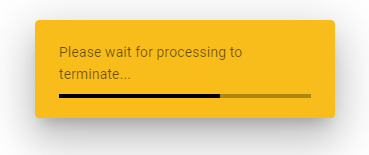
Fig. 67 Example of a dialogWait opened during a lenghty operation.
dialogYesNo widget
Dialog-box to ask a yes-no question to the user.
- class dialogYesNo.dialogYesNo(on_yes=None, on_no=None, *args, **kwargs)[source]
Dialog-box to ask a yes-no question to the user.
Derived class from dialogGeneric.dialogGeneric.
- Parameters:
title (str, optional) – Title of the dialog-box to be displayed in the top toolbar (default is ‘’)
dark (bool, optional) – Flag that controls the color of the text in foreground (if True, the text will be displayed in white, elsewhere in black)
show (bool, optional) – Flag to immediately show the dialog-box upon creation (default is False)
width (int or str, optional) – Width of the dialog-box. If an integer is passed the width is intended in pixels. Default is 500 pixels
addclosebuttons (bool, optional) – If True, the dialog will have a ‘close’ button in the top toolbar (default is True)
transition (str, optional) – Transition to use for the dialog display and close (default is ‘dialog-fade-transition’. See: https://vuetifyjs.com/en/styles/transitions/ for a list of available transitions (substitute ‘v-’ with ‘dialog-‘’)
output (ipywidgets.Output, optional) – Output widget on which the widget has to be displayed
titleheight (str, optional) – Height of the title toolbar. It can be: ‘prominent’, ‘dense’, ‘extended’ or a value in pixels (default is ‘dense’)
on_yes (function, optional) – Python function to call when the user clicks on the YES button. The function will receive no parameters (default is None)
on_no (function, optional) – Python function to call when the user clicks on the NO button. The function will receive no parameters (default is None)
Example
Creation and display of a Yes-No dialog box:
from vois.vuetify import dialogYesNo
from ipywidgets import widgets
from IPython.display import display

output = widgets.Output()
display(output)

def on_yes():
    with output:
        print('YES')

def on_no():
    with output:
        print('NO')

dlg = dialogYesNo.dialogYesNo(title='Question',
                              text='Confirm removal of the selected file?',
                              titleheight=40, width=400, output=output,
                              show=True, transition='dialog-bottom-transition',
                              on_yes=on_yes, on_no=on_no)
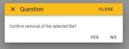
Fig. 68 Example of a dialogYesNo to ask a yes-no question to the user.
- close(*args)
Close the dialog.
- property okdisabled
Get/Set the disabled status of the ok button.
- Returns:
flag – True if the ok button is disabled, False otherwise
- Return type:
bool
Example
Programmatically set the disabled status and print it:
dlg.okdisabled = True
print(dlg.okdisabled)
- show()
Open the dialog.
fab widget
footer widget
Footer bar to be displayed at the bottom of a Voilà dashboard.
Footer bar to be displayed at the bottom of a Voilà dashboard.
- Parameters:
text (str, optional) – Text message to display in the bottom line of the footer bar (default is ‘’)
copyright (bool, optional) – Flag to display a copyright symbol in the bottom line of the footer bar (default is False)
buttons (list of strings, optional) – List of strings to use for adding a row of buttons (default is []])
color (str, optional) – Background color of the title bar (default is the main color defined in the settings.py module)
dark (bool, optional) – Flag that controls the color of the text in foreground: if True, the text will be displayed in white, elsewhere in black (default is the value of settings.dark_mode)
height (int or float or str optional) – Height of the footer bar. If an integer or a float is passed, the height is intended in pixels units, otherwise a string containing the units must be passed (example: ‘4vh’). Default is 68 for 68 pixels
marginy (int, optional) – Vertical displace of the first row of the bar from the top (default is 2)
onclick (function, optional) – Python function to call when the user clicks on one of the buttons. The function will receive a parameter of type str containing the text of the clicked button
output (ipywidgets.Output, optional) – Output widget on which the footer bar has to be displayed
minipanelicons (list of strings, optional) – Names of optional icons to display in the minipanel at the left side of the footer bar
minipaneltooltips (list of strings, optional) – Tooltips of optional icons to display in the minipanel at the left side of the footer bar
minipanelopen (bool, optional) – If True the minipanel is initially displayed already opened (default is False)
minipanellarge (bool, optional) – If True the icons in theminipanel are displayed with greater dimension (default is True)
minipanelbuttontooltip (str, optional) – Text of the tooltip to show when hover on the minipanel open icon (default is ‘Additional functions’)
minipanelbuttoncolor (str, optional) – Color of the icon that opens/closes the minipanel (default is the textcolor_notdark defined in the settings.py module)
minipaneliconscolor (str, optional) – Color of the icons inside the minipanel (default is the textcolor_notdark defined in the settings.py module)
footercredits (str, optional) – Text for footer credits button (default is ‘’)
footercreditstooltip (str, optional) – Tooltip for the footer credits button (default is ‘’)
onclickcredits (function, optional) – Python function to call when the user clicks on the credits button. The function will be called with 0 parameters
onclickminipanel (function, optional) – Python function to call when the user clicks on one of the icons of the minipanel. The function will receive a parameter of type int containing the index of the clicked icon in the range from 0 to len(minipanelicons)-1
Example
Creation and display of a footer bar:
from vois.vuetify import footer
from ipywidgets import widgets
from IPython.display import display
from datetime import datetime

output = widgets.Output()
display(output)

def onclick(arg):
    with output:
        print(arg)

def onclickminipanel(index):
    with output:
        print(index)

def onclickcredits():
    with output:
        print('CREDITS')

f = footer.footer(text='%d - Joint Research Centre'%(datetime.now().year), color='lightgrey',
                  minipanelicons=['fa-truck', 'mdi-heart', 'mdi-magnify'],
                  minipaneltooltips=['Function 1', 'Function 2', 'Function 3'],
                  minipanellarge=True, minipanelopen=True,
                  onclickminipanel=onclickminipanel,
                  footercredits='Data credits',
                  footercreditstooltip='Eurostat - European Commission',
                  onclickcredits=onclickcredits,
                  buttons=['Home', 'About Us', 'Services', 'Contact Us'],
                  height=68, marginy=2,
                  onclick=onclick,
                  output=output)
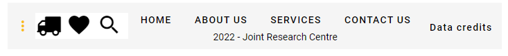
Fig. 69 Footer bar with buttons and minipanel.
Note
The footer component is used inside the
app.appclass. If the main interface of a dashboard is created using an instance of theapp.appclass, the parameters for customising the footer bar can be passed in the construction of the app instance.Returns the ipyvuetify object to display (the internal v.Html which has a v.Footer as its only child)
iconButton widget
Button displaying an icon.
- class iconButton.iconButton(icon='mdi-alert-outline', tooltip='', color='#f8bd1a', outlined=False, rounded=True, width=None, large=False, small=False, x_large=False, x_small=False, margins='pa-0 ma-0', onclick=None, argument=None, disabled=False)[source]
Button displaying an icon.
- Parameters:
icon (str, optional) – Icon to display inside the button (default is ‘mdi-alert-outline’)
tooltip (str, optional) – Tooltip text for the button (default is ‘’)
color (str, optional) – Color used for the widget (default is the color_first defined in the settings.py module)
outlined (bool, optional) – If True applies a thin border to the button (default is False)
rounded (bool, optional) – If True the shape of the button is rounded (default is True)
width (str, optional) – Width of the widget (default is None)
large (bool, optional) – If True makes the button large (default is False)
small (bool, optional) – If True makes the button small (default is False)
x_large (bool, optional) – If True makes the button extra-large (default is False)
x_small (bool, optional) – If True makes the button extra-small (default is False)
margins (str, optional) – Marging apply to the button (default is ‘pa-0 ma-0’)
onclick (function, optional) – Python function to call when the user clicks on the button. The function will receive no parameters
argument (any, optional) – Argument to be passed to the onclick funtion (default is None)
disabled (bool, optional) – If True the button will be disabled (default is False)
Example
Creation and display of an icon button which changes color and tooltip on click:
from vois.vuetify import iconButton
from IPython.display import display

def onclick():
    if b.color == 'red':
        b.color = 'amber'
        b.tooltip = 'Click to make the icon red'
    else:
        b.color = 'red'
        b.tooltip = 'Click to make the icon yellow'

b = iconButton.iconButton(onclick=onclick, tooltip='Initial tooltip', x_large=True)
display(b.draw())
- property color
Get/Set the color of the button.
- property disabled
Get/Set the disabled state of the button.
- property icon
Get/Set the icon of the button.
- property tooltip
Get/Set the tooltip of the button.
IconClipboard widget
IconButton to copy text to the clipboard.
- class IconClipboard.IconClipboard(*args: t.Any, **kwargs: t.Any)[source]
IconButton to copy text to the clipboard.
- Parameters:
output (ipywidgets.Output) – Output widget to be used to execute javacript code to copy the text to the clipboard
text (str, optional) – Text to be copied to the clipboard (default is ‘’, it can be changed using the ‘text’ property)
color (str, optional) – Color used for the widget (default is the color_first defined in the settings.py module)
outlined (bool, optional) – If True applies a thin border to the button (default is False)
rounded (bool, optional) – If True the shape of the button is rounded (default is True)
width (str, optional) – Width of the widget (default is None)
large (bool, optional) – If True makes the button large (default is False)
small (bool, optional) – If True makes the button small (default is False)
x_large (bool, optional) – If True makes the button extra-large (default is False)
x_small (bool, optional) – If True makes the button extra-small (default is False)
margins (str, optional) – Marging apply to the button (default is ‘pa-0 ma-0’)
tooltip (str, optional) – Tooltip text for the button (default is ‘Click to copy text to the clipboard’)
Example
Creation and display of an icon button to copy some text content to the clipboard:
from vois.vuetify import IconClipboard
from IPython.display import display

b = IconClipboard()
display(b)

b.text = 'Text to copy to the clipboard'
Label widget
Label widget to display a text with an optional icon.
- class Label.Label(*args: t.Any, **kwargs: t.Any)[source]
Label widget to display a text with an optional icon.
- Parameters:
text (str) – Test string to be displayed on the label widget
onclick (function, optional) – Python function to call when the user clicks on the label. The function will receive as parameter the value of the argument (default is None)
argument (any, optional) – Argument to be passed to the onclick function when user click on the label (default is None)
disabled (bool, optional) – Flag to show the label as disabled (default is False)
text_weight (int, optional) – Weight of the text to be shown in the label (default is 350, Bold is any value greater or equal to 500)
height (int, optional) – Height of the label widget in pixels (default is 20)
margins (int, optional) – Dimension of the margins on all directions (default is 0)
margin_top (int, optional) – Dimension of the margin on top of the label (default is None)
icon (str, optional) – Name of the icon to display aside the text of the label (default is None)
icon_large (bool, optional) – Flag that sets the large version of the icon (default is False)
icon_small (bool, optional) – Flag that sets the small version of the icon (default is False)
icon_left (bool, optional) – Flag that sets the position of the icon to the left of the text of the label (default is False)
icon_color (str, optional) – Color of the icon (default is ‘black’)
tooltip_text (str, optional) – Tooltip string to display when the user hovers on the label (default is None)
text_color (str, optional) – Color used for the label text
back_color (str, optional) – Color used for the background of the label
dark (bool, optional) – Flag to invert the text and back_color (default is the value of settings.dark_mode)
Note
All the icons from https://materialdesignicons.com/ site can be used, just by prepending ‘mdi-’ to their name.
All the free icons from https://fontawesome.com/ site can be used, just by prepending ‘fa-’ to their name.
Example
Creation and display of a label widget containing an icon:
from vois.vuetify import Label

lab = Label('Test label', text_weight=300, margins=2,
              icon='mdi-car-light-high', icon_color='red',
              icon_large=True, height=22)

display(lab)
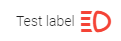
Fig. 70 Example of a label widget with text and an icon.
- property text
Get/Set the label text.
- Returns:
text – Text currently shown in the label
- Return type:
str
Example
Programmatically set the label text (needs a re-display to be visible!):
lab.text = 'New text for the label'
display(lab.draw())
print(lab.text)
layers widget
mainPage widget
Initial page for an application
- class mainPage.mainPage(title='Application main title', subtitle='Subtitle to be shown below the main title', titlesizepercent=100, subtitlesizepercent=100, applogo_url='https://jeodpp.jrc.ec.europa.eu/services/shared/pngs/sampleapplogo.png', applogo_widthpercent=20.0, credits='Unit T.4, Data Visualisation Team', creditslogo_url='https://jeodpp.jrc.ec.europa.eu/services/shared/pngs/TransparentJRC.png', text_color='#0e446e', background_image=22, background_filter='', vois_show=True, vois_opacity=0.1, titlebox_widthpercent=40.0, titlebox_heightpercent=24.0, titlebox_toppercent=12.0, titlebox_opacity=0.4, titlebox_border=2, titleshadow=True, titleshadow_color='#ffffff', buttonbox_widthpercent=80.0, buttonbox_heightpercent=50.0, buttonbox_toppercent=43.0, creditbox_widthpercent=80.0, creditbox_heightpercent=25.0, creditbox_toppercent=74.0, creditbox_opacity=0.0, button_widthpercent=22.0, button_heightpercent=10.0, button_elevation=6, button_opacity=0.5, button_titlesize='2.0vh', button_subtitlesize='1.2vh', button_radius='0px', disclaimer='The contents of this viewer are intended solely for the use of the Commission and may not be reproduced, distributed, or communicated outside the Commission in any format without explicit prior written consent')[source]
Initial page of an application. The page contains a box for the title/subtitle/logo of the application, a box containing one or more buttons, each of them calling a callback function, and a box containing credits information. All these boxes are horizontally centered inside the page, while their vertical position can be customized (by default the title is on top, the buttons in central position and the credit box is at the bottom of the page).
- Parameters:
title (str, optional) – Title of the page (default is ‘Application main title’)
subtitle (str, optional) – Subtitle of the page (default is ‘Subtitle to be displayed below the main title’)
applogo_url (str, optional) – Url of the application logo (default is a sample logo)
applogo_widthpercent (float, optional) – Width of the area where the application logo is displayed in percentage of the screen (default is 20.0)
titlesizepercent (int, optional) – Font size used for the main page title, in percentage compared to the standard dimension (default is 100, change to e.g. 80 for a smaller font, 120 for a bigger one)
subtitlesizepercent (int, optional) – Font size used for the main page subtitle, in percentage compared to the standard dimension (default is 100, change to e.g. 80 for a smaller font, 120 for a bigger one)
credits (str, optional) – Credits string to display inside the credit box on the bottom of the page (default is ‘Unit T.4, Data Visualisation Team’)
creditslogo_url (str, optional) – Url of the image to display inside the credit box on the bottom of the page (default is ‘https://jeodpp.jrc.ec.europa.eu/services/shared/pngs/TransparentJRC.png’)
text_color (str, optional) – Color to use for text (title, subtitle, credits, buttons text, etc.). Default is ‘#0e446e’.
background_image (str or int, optional) – Image to use as fullscreen background. If an integer in the range [0,59] is passed, one of the sixty predefined wallpapers is used, otherwise any image URL can be used (default is 22)
background_filter (str, optional) – CSS image filter to apply to the background image (default is ‘’). See https://developer.mozilla.org/en-US/docs/Web/CSS/filter for a list of available filters.
vois_show (bool, optional) – Is True, a credit to the vois library is displayed in the top-right side of the page (default is True)
vois_opacity (float, optional) – Opacity to apply to the vois logo, in case vois_show is set to True (default is 0.1)
titlebox_widthpercent (float, optional) – Width of the top box containing the title, in percentage of the screen width. Default is 40.0.
titlebox_heightpercent (float, optional) – Height of the box containing the title, in percentage of the screen height. Default is 24.0.
titlebox_toppercent (float, optional) – Top position of the box containing the title, in percentage of the screen height, measured from the top of the page. Default is 12.0.
titlebox_opacity (float, optional) – Opacity to apply to the box containing the title (default is 0.4)
titlebox_border (int, optional) – Border width in pixels of the box containing the title (default is 2)
buttonbox_widthpercent (float, optional) – Width of the box containing the buttons, in percentage of the screen width. Default is 80.0.
buttonbox_heightpercent (float, optional) – Height of the box containing the buttons, in percentage of the screen height. Default is 50.0.
buttonbox_toppercent (float, optional) – Top position of the box containing the buttons, in percentage of the screen height, measured from the top of the page. Default is 43.0.
creditbox_widthpercent (float, optional) – Width of the box containing the credits, in percentage of the screen width. Default is 80.0.
creditbox_heightpercent (float, optional) – Height of the box containing the credits, in percentage of the screen height. Default is 25.0.
creditbox_toppercent (float, optional) – Top position of the box containing the credits, in percentage of the screen height, measured from the top of the page. Default is 74.0.
creditbox_opacity (float, optional) – Opacity to apply to the box containing the credits (default is 0.0)
button_widthpercent (float, optional) – Width of each of the buttons, in percentage of the screen width. Default is 22.0.
button_heightpercent (float, optional) – Height of each of the buttons, in percentage of the screen height. Default is 10.0.
button_elevation (int, optional) – Elevation in pixels to apply to the buttons (default is 6)
button_opacity (float, optional) – Opacity to apply to the buttons (default is 0.5)
button_titlesize (str, optional) – Font size to use for the buttons title (default is ‘2.0vh’)
button_subtitlesize (str, optional) – Font size to use for the buttons subtitle (default is ‘1.2vh’)
button_radius (str, optional) – Border radius for the buttons area (default is ‘0px’ which means completely squared buttons)
disclaimer (str, optional) – Text to display at the bottom of the creditbox (default is the empty string)
Examples
Creation of a main page with 6 buttons displaying random images from https://picsum.photos/:
from vois.vuetify import mainPage
from random import randrange

def onclick1():
    print("Clicked Function 1")

m = mainPage.mainPage(title='mainPage demo',
                      subtitle='Showcase how easy is to create a front page for an app',
                      credits="vois library development team",
                      titlebox_widthpercent=50, titlebox_opacity=0.2, titlebox_border=0,
                      vois_show=True, vois_opacity=0.1,
                      button_widthpercent=23, button_heightpercent=14, button_elevation=16, button_opacity=0.6,
                      background_image=55,
                      background_filter='blur(2px) brightness(1.2) contrast(0.7) sepia(0.05) saturate(1.2)',
                      creditbox_opacity=0,
                      text_color='#222222')

m.addButton('Function 1',
            subtitle='Launch calculation of ...',
            tooltip='Tooltip text to display on hover',
            image='https://picsum.photos/seed/%d/200/200'%randrange(1000),
            onclick=onclick1)

for i in range(2,7): m.addButton('Function %d'%i, image='https://picsum.photos/seed/%d/200/200'%randrange(1000))

m.open()
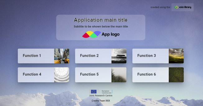
Fig. 71 Example of a mainPage
- addButton(title, subtitle='', tooltip='', image='', onclick=None, argument=None)[source]
Add a button to the page
- Parameters:
title (str) – Title of the button
subtitle (str, optional) – Subtitle of the button (default is ‘’)
tooltip (str, optional) – Tooltip to show when hovering the button title (default is ‘’)
image (str, optional) – Image to show on the right side of the button (default is ‘’)
onclick (function, optional) – Python function to call when the user clicks on the button. The function will receive the argument value as parameter if it is not None, otherwise it will be calle with no parameters. Default is None
argument (any, optional) – Argument to pass to the onclick python function (default is None)
menu widget
Menu widget opened on hover on a button.
Menu widget opened on hover on a button.
- Parameters:
index (int) – Index of the option initially selected (from 0 to len(labels)-1)
title (str) – Title string to display in the button
labels (list of strings) – Strings to be displayed as options in the menu widget
color (str, optional) – Color used for the widget (default is the color_first defined in the settings.py module)
onchange (function, optional) – Python function to call when the user selects one of the values in the list. The function will receive a single parameter, containing the index of the selected option in the range from 0 to len(labels)-1
width (int, optional) – Width of the button in pixels (default is 150 pixels)
highliteselection (bool, optional) – If True, the menu will show the selected option in bold (default is True)
Example
Creation and display of a menu widget to select among three options:
from vois.vuetify import menu
from ipywidgets import widgets
from IPython.display import display

output = widgets.Output()

def onchange(value):
    with output:
        print(value)

m = menu.menu(0, 'Hover to select',
              ['Option 0', 'Option 1', 'Option 2'],
              onchange=onchange, highliteselection=True)

display(m.draw())
display(output)
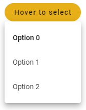
Fig. 72 Example of a menu widget to select from three options.
Returns the ipyvuetify object to display (the internal v.Menu widget)
Get/Set the active option index.
- Returns:
index – Index of the selected option (from 0 to len(labels)-1)
- Return type:
int
Example
Programmatically select one of the options and print the index of the selected option:
m.value = 2
print(m.value)
MultiSwitch widget
Widget to select independent options using a list of buttons displayed horizontally or vertically.
- class MultiSwitch.MultiSwitch(*args: t.Any, **kwargs: t.Any)[source]
Widget to select independent options using a list of buttons displayed horizontally or vertically.
- Parameters:
values (list of bool) – Initial state of the buttons representing the independent options
labels (list of strings) – Strings to be displayed as text of the options
tooltips (list of strings, optional) – Tooltip text for the options
color (str, optional) – Color used for the widget (default is the color_first defined in the settings.py module)
dark (bool, optional) – Flag to invert the text and backcolor (default is the value of settings.dark_mode)
on_change (function, optional) – Python function to call when the user clicks on one of the buttons. The function will receive a parameter of list containing the status of all the buttons, from 0 to len(labels)-1
row (bool, optional) – Flag to display the buttons horizontally or vertically (default is True)
width (int, optional) – Width in pixels of the buttons (default is 150)
height (int, optional) – Height in pixels of the buttons (default is 36)
justify (str, optional) – In case of horizontal placement, applies the justify-content css property. Available options are: start, center, end, space-between and space-around.
rounded (bool, optional) – Flag to display the buttons with a rounded shape (default is the button_rounded flag defined in the settings.py module)
outlined (bool, optional) – Flag to display the buttons as outlined (default is True)
color_selected (str, optional) – Color used for the buttons when they are selected (default is settings.color_first)
color_unselected (str, optional) – Color used for the buttons when they are not selected (default is settings.color_second)
manage_dbl_click (bool, optional) – If True the dblclick event is managed to select a single button of the multi-switch (default is False)
padding_row (int, optional) – Horizontal padding among toggle buttons (1 unit means 4 pixels). Default is 1
padding_col (int, optional) – Vertical padding among toggle buttons (1 unit means 4 pixels). Default is 2
tile (bool, optional) – Flag to remove the buttons small border (default is False)
large (bool, optional) – Flag that sets the large version of the button (default is False)
x_large (bool, optional) – Flag that sets the x_large version of the button (default is False)
small (bool, optional) – Flag that sets the small version of the button (default is False)
x_small (bool, optional) – Flag that sets the x_small version of the button (default is False)
Example
Creation and display of a widget for the selection of 3 independent options:
from vois.vuetify import MultiSwitch
from ipywidgets import widgets
from IPython.display import display

output = widgets.Output()

def on_change(values):
    with output:
        print(values)

m = MultiSwitch([False, True, False], ['Option 1', 'Option 2', 'Option 3'],
                            tooltips=['Tooltip for option 1'],
                            on_change=on_change, row=False, width=150, rounded=False, outlined=True,
                            color_selected='#FFA300', color_unselected='#aaaaaa')

display(m)
display(output)
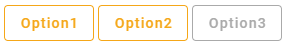
Fig. 73 multiSwitch widget for selecting independent options using buttons.
- property value
Get/Set the status of the multiSwitch buttons.
- Returns:
flags – Selected status of all the options
- Return type:
list of booleans
Example
Programmatically set the options and print the status of the multiSwitch buttons:
t.value = [False, True, True]
print(t.value)
page widget
Fullscreen page
- class page.page(appname, title, output, onclose=None, titlecolor='#f8bd1a', titledark=True, titleheight=54, titleimageurl='', footercolor='#efefef', footerdark=False, footerheight=30, logoappurl='', logowidth=40, on_logoapp=None, copyrighttext='', show_back=True, left_back=False, show_help=True, on_help=None, logocreditsurl='', creditswidth=120, show_credits=True, on_credits=None, transition='dialog-bottom-transition', persistent=False)[source]
Fullsceen page with title and footer bar.
- Parameters:
appname (str) – Name of the application. It will be displayed on the left side of the title bar
title (str) – Title of the page
output (instance of widgets.Output() class) – Output widget to be used for the opening of the fullscreen dialog that implements the page
onclose (function, optional) – Python function to call when the user closes the page. The function will receive no parameters (default is None)
titlecolor (str, optional) – Color to use for the title bar background (default is settings.color_first)
titledark (bool, optional) – If True the text on the title bar will be displayed in white, otherwise in black color (defaul is True)
titleheight (int, optional) – Height of the title bar in pixels (default is 54)
titleimageurl (str, optional) – String containing the url of the title bar backbround image (default is ‘’)
footercolor (str, optional) – Color to use fir the footer bar background (default is settings.color_second)
footerdark (bool, optional) – If True the text on the footer bar will be displayed in white, otherwise in black color (defaul is False)
footerheight (int, optional) – Height of the footer bar in pixels (default is 30)
logoappurl (str, optional) – String containing the url of the application logo, to be displayed on the left side of the title bar (default is ‘’)
logowidth (int, optional) – Width in pixels of the application logo button (default is 40)
on_logoapp (function, optional) – Python function to call when the user clicks on the pplication logo. The function will receive no parameters (default is None)
copyrighttext (str, optional) – Text to display as copyright message on the footer bar (default is ‘’)
show_back (bool, optional) – If True a “back” button is displayed in the title bar (default is True)
left_back (bool, optional) – If True the “back” button is displayed on the left side of the title bar (default is False)
show_help (bool, optional) – If True a “help” button is displayed on the right side of the title bar (default is True)
on_help (function, optional) – Python function to call when the user clicks the help button. The function will receive no parameters (default is None)
logocreditsurl (str, optional) – String containing the url of the credits logo, to be displayed on the right side of the title bar (default is ‘’). If no url is passed, the logo of the European Commission is displayed
show_credits (bool, optional) – If True a “credits” button is displayed on the right side of the title bar (default is True)
on_credits (function, optional) – Python function to call when the user clicks the credits button. The function will receive no parameters (default is None)
transition (str, optional) – Transition to be used for display and hide of the page (default is ‘dialog-bottom-transition’). See: https://vuetifyjs.com/en/styles/transitions/ for a list of available transitions (substitute ‘v-’ with ‘dialog-‘)
persistent (bool, optional) – If True the page will be persistent and not close at the hitting of the “ESC” key (default is False)
Examples
Creation of an example page:
from vois.vuetify import page
from ipywidgets import widgets
from IPython.display import display

output = widgets.Output()
display(output)

def onclose():
    pass

def on_click():
    pass

p = page.page('Application XYZ', 'Map page', output, onclose=onclose,
              titlecolor='#008800', titledark=True,
              footercolor='#cccccc', footerdark=False,
              logoappurl='https://jeodpp.jrc.ec.europa.eu/services/shared/pngs/BDAP_Logo1024transparent.png',
              on_logoapp=on_click, copyrighttext='European Commission - Joint Research Centre',
              show_back=True, show_help=True, on_help=on_click,
              show_credits=True, on_credits=on_click)

card = p.create()
card.children = []
p.open()
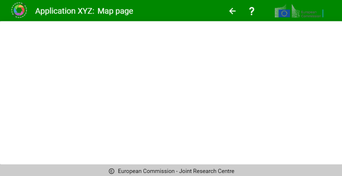
Fig. 74 Example of a page
- property appname
Get/Set the name of the application (displayed on the left side of the title bar)
- Returns:
name – Name of the application
- Return type:
str
Example
Programmatically change the name of the application:
p.appname = 'New app name'
print(p.appname)
- property copyrighttext
Get/Set the copyright text to display on the footer bar
- Returns:
text – Text to display as copyright message on the footer bar
- Return type:
str
Example
Programmatically change the copyright text:
p.copyrighttext = 'Founded by EU'
print(p.copyrighttext)
- property creditswidth
Get/Set the width of the application credits button in the title bar
- Returns:
width – Width of the application credits button in pixels
- Return type:
int
Example
Programmatically change the application credits button width:
p.creditswidth = 20
print(p.creditswidth)
Get/Set the color of the footer bar
- Returns:
color – Color of the footer bar
- Return type:
str
Example
Programmatically change the color:
p.footercolor = 'red'
print(p.footercolor)
Get/Set the text color of the footer bar
- Returns:
flag – If True the text on the footer bar will be displayed in white, otherwise in black color
- Return type:
bool
Example
Programmatically change the text color:
p.footerdark = True
print(p.footerdark)
Get/Set the height of the footer bar
- Returns:
height – Height of the footer bar in pixels
- Return type:
int
Example
Programmatically change the footer bar height:
p.footerheight = 20
print(p.footerheight)
- property left_back
Get/Set the flag that controls the position of the back button in the title bar
- Returns:
flag – If True the “back” button is displayed on the left side of the title bar
- Return type:
bool
Example
Programmatically change the position of the back button in the title bar:
p.left_back = False
print(p.left_back)
- property logoappurl
Get/Set the image to display as the application logo on the left side of the title bar
- Returns:
imageurl – String containing the url of application logo image
- Return type:
str
Example
Programmatically change the application logo in the title bar:
p.logoappurl = 'data:image/png;base64,...'
print(p.logoappurl)
- property logocreditsurl
Get/Set the image to display as the application credits on the right side of the title bar
- Returns:
imageurl – String containing the url of application credits image
- Return type:
str
Example
Programmatically change the application credits in the title bar:
p.logocreditsurl = 'data:image/png;base64,...'
print(p.logocreditsurl)
- property logowidth
Get/Set the width of the application logo button in the title bar
- Returns:
width – Width of the application logo button in pixels
- Return type:
int
Example
Programmatically change the application logo button width:
p.logowidth = 20
print(p.logowidth)
- property show_back
Show or hide the back button in the title bar
- Returns:
flag – If True a “back” button is displayed in the title bar
- Return type:
bool
Example
Programmatically change the presence of the back button in the title bar:
p.show_back = False
print(p.show_back)
- property show_credits
Show or hide the credits image in the title bar
- Returns:
flag – If True a “credits” button with an image is displayed in the title bar
- Return type:
bool
Example
Programmatically change the presence of the credits button in the title bar:
p.show_credits = False
print(p.show_credits)
- property show_help
Show or hide the help button in the title bar
- Returns:
flag – If True a “help” button is displayed in the title bar
- Return type:
bool
Example
Programmatically change the presence of the help button in the title bar:
p.show_help = False
print(p.show_help)
- property state
Get/Set the multiple properties of the page
- Returns:
statusdict – Dictionary containing one or more properties
- Return type:
dict
Example
Programmatically set some of the properties of a page:
p.state = {'transition': 'dialog-top-transition', 'title': 'new title'}
print(p.state)
- property title
Get/Set the title of the page (displayed on the left side of the title bar)
- Returns:
title – Title of the page
- Return type:
str
Example
Programmatically change the title of the page:
p.title = 'New title'
print(p.title)
- property titlecolor
Get/Set the color of the title bar
- Returns:
color – Color of the title bar
- Return type:
str
Example
Programmatically change the color:
p.titlecolor = 'red'
print(p.titlecolor)
- property titledark
Get/Set the text color of the title bar
- Returns:
flag – If True the text on the title bar will be displayed in white, otherwise in black color
- Return type:
bool
Example
Programmatically change the text color:
p.titledark = True
print(p.titledark)
- property titleheight
Get/Set the height of the title bar
- Returns:
height – Height of the title bar in pixels
- Return type:
int
Example
Programmatically change the title bar height:
p.titleheight = 80
print(p.titleheight)
- property titleimageurl
Get/Set the image to display on the title bar
- Returns:
imageurl – String containing the url of the title bar backbround image
- Return type:
str
Example
Programmatically change the title bar background image:
p.titleimageurl = 'https://.....'
print(p.titleimageurl)
- property transition
‘dialog-bottom-transition’, ‘dialog-top-transition’ or ‘dialog-transition’
- Returns:
mode – Transition mode, one of ‘dialog-bottom-transition’, ‘dialog-top-transition’ or ‘dialog-transition’
- Return type:
str
Example
Programmatically change the transition mode:
p.transition = 'dialog-transition'
print(p.transition)
- Type:
Get/Set the transition mode to use for the opening of the page. Possible values are
paletteEditor widget
palettePicker widget
Selection of a palette of colors
- class palettePicker.palettePicker(family='sequential', label='', interpolate=True, width=400, height=34, custompalettes=[], clearable=True, color=None, onchange=None)[source]
Selection of a palette of colors.
- Parameters:
family (str, optional) – Family of the palette, one of these values: [‘carto’, ‘cmocean’, ‘cyclical’, ‘diverging’, ‘plotlyjs’, ‘qualitative’, ‘sequential’, ‘custom’]. If family is ‘custom’ the user of the widget has to pass the list of palettes to display (default is ‘sequential’)
custompalettes (list of dicts containing tags: "name" and "colors", optional) – Custom palette to be selected when the family is ‘custom’ (default is [])
label (str, optional) – Label to display inside the selection widget (default is ‘’)
interpolate (bool, optional) – If True the colors are displayed as interpolated (default is True)
width (int, optional) – Width of the widget in pixels (default is 400)
height (int, optional) – Height of the widget in pixels (default is 34)
clearable (Bool, optional) – If True the selection widget will show a -x- button to clear the selection (default is True)
color (str, optional) – Color of the selection widget (default is settings.color_first)
onchange (function, optional) – Python function to call when the user selects one of the palettes. The function will receive no parameters (default is None)
Examples
Creation of a simple selection widget for the palettes:
from vois.vuetify import palettePicker
from ipywidgets import widgets
from IPython.display import display

output = widgets.Output()

def onchange():
    with output:
        print('changed!')

p = palettePicker.palettePicker(onchange=onchange)

display(p.draw())
display(output)
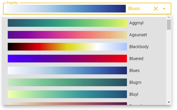
Fig. 75 Example of a simple palette picker
Creation of a complex selection widget for the palettes that manages all the palette families:
from vois.vuetify import palettePicker, selectSingle, switch
import ipyvuetify as v
from ipywidgets import widgets
from IPython.display import display

output = widgets.Output()

# Utility: convert three integers to '#RRGGBB'
def RGB(r,g,b):
    return '#{:02X}{:02X}{:02X}'.format(r, g, b)

# Custom palettes
custompalettes = [
    { "name": "Simple",
      "colors": ['#000000', '#FF0000', '#00FF00', '#0000FF',
                 '#FFFF00', '#FF00FF', '#00FFFF', '#FFFFFF']},

    { "name": "Dem",
      "colors": [RGB(255,255,170), RGB( 39,168, 39),
                 RGB( 11,128, 64), RGB(255,255,  0),
                 RGB(255,186,  3), RGB(158, 30,  2),
                 RGB(110, 40, 10), RGB(138, 94, 66),
                 RGB(255,255,255)]},

    { "name": "NDVI",
      "colors": [RGB(120,69,25),   RGB(255,178,74),
                 RGB(255,237,166), RGB(173,232,94),
                 RGB(135,181,64),  RGB(3,156,0),
                 RGB(1,100,0),     RGB(1,80,0)]}
]

families = ['carto', 'cmocean', 'cyclical', 'diverging',
            'plotlyjs', 'qualitative', 'sequential', 'custom']

family      = 'sequential'
interpolate = True

p = None
def onchangePalette():
    if not p is None:
        with output:
            print("Palette changed to", p.value, p.colors)


def onchangeFamily():
    global family, interpolate
    family = sel.value
    if family == 'carto' or family == 'qualitative':
        interpolate = False
        sw.value = interpolate
    else:
        interpolate = True
        sw.value = interpolate
    p.updatePalettes(family,interpolate)


def onchangeInterpolate(flag):
    global interpolate
    interpolate = flag
    p.updatePalettes(family,interpolate)


sel = selectSingle.selectSingle('Family:', families, selection=family,
                                width=160, onchange=onchangeFamily,
                                marginy=1, clearable=False)
sw  = switch.switch(interpolate, "Interpolate",
                    onchange=onchangeInterpolate)

p = palettePicker.palettePicker(family=family, custompalettes=custompalettes,
                                label='Palette:', height=26, onchange=onchangePalette)

spacer = v.Html(tag='div',children=[' '], style_='width: 10px;')

display(widgets.HBox([sel.draw(), spacer, p.draw(), spacer, sw.draw()]))
display(output)
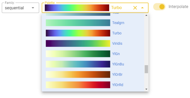
Fig. 76 Example of a palette picker that also manages the palette families
- property color
Get/Set the widget color.
- Returns:
c – widget color
- Return type:
str
Example
Programmatically change the widget color:
s.color = '#00FF00'
print(s.color)
- property colors
Get the colors of the selected palette.
- Returns:
colorlist – List of colors of the selected palette
- Return type:
list of strings in ‘#RRGGBB’ format
Example
Get the selected palette colors:
print(picker.colors)
- updatePalettes(family='sequential', interpolate=True)[source]
Update the displayed palette by changing family and/or interpolation flag
- Parameters:
family (str, optional) – Family of the palette, one of these values: [‘carto’, ‘cmocean’, ‘cyclical’, ‘diverging’, ‘plotlyjs’, ‘qualitative’, ‘sequential’] (default is ‘sequential’)
interpolate (bool, optional) – If True the colors are displayed as interpolated (default is True)
- property value
Get/Set name of the selected palette.
- Returns:
name – Name of the currently selected palette
- Return type:
str
Example
Set and then get the current palette name:
picker.value = 'Viridis'
print(picker.value)
palettePickerEx widget
Extended selection of a palette of different families (sequential, divergent, etc.)
- class palettePickerEx.palettePickerEx(family='sequential', value='Viridis', interpolate=True, show_interpolate_switch=True, onchange=None, width=400, clearable=True, color=None, horizontal=False, show_opacity_slider=True, onchangeOpacity=None)[source]
Advanced selection of a palette of colors managing all the palette families and the interpolate flag
- Parameters:
family (str, optional) – Family of the palette, one of these values: [‘carto’, ‘cmocean’, ‘cyclical’, ‘diverging’, ‘plotlyjs’, ‘qualitative’, ‘sequential’, ‘custom’] (default is ‘sequential’)
value (str, optional) – Name of the initially selected palette (default is ‘Viridis’)
interpolate (bool, optional) – If True the colors are displayed as interpolated (default is True)
show_interpolate_switch (bool, optional) – If True an interpolate switch is shown to enable or disable the interpolated display of the selected palette (default is True)
width (int, optional) – Width of the widget in pixels (default is 400)
clearable (bool, optional) – If True the dwopdown list of palettes will allow for no selection (default is True)
color (str, optional) – Color of the selection widget (default is settings.color_first)
horizontal (bool, optional) – If True, the family and palette selection widgets are positioned on the same horizontal line (default is False)
onchange (function, optional) – Python function to call when the user selects one of the palettes. The function will pass as parameters the list of colors and the interpolate flag (default is None)
show_opacity_slider (bool, optional) – If True an slider to select opacity is shown (default is False)
onchangeOpacity (function, optional) – Python function to call when the user changes the opacity. The function will as parameter the selected opacity in [0.0,1.0] (default is None)
Examples
Creation of a selection widget for the palettes managing all the families:
from vois.vuetify import palettePickerEx
from ipywidgets import widgets
from IPython.display import display

output = widgets.Output()

def onchange(colors, interpolate):
    with output:
        print(colors, interpolate)

p = palettePickerEx.palettePickerEx(onchange=onchange)

display(p.draw())
display(output)
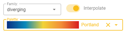
Fig. 77 Example of an extended palette picker managing all the palette families and the interpolate flag
- property color
Get/Set the widget color.
- Returns:
c – widget color
- Return type:
str
Example
Programmatically change the widget color:
s.color = '#00FF00'
print(s.color)
- property colors
Get the colors of the selected palette.
- Returns:
colorlist – List of colors of the selected palette
- Return type:
list of strings in ‘#RRGGBB’ format
Example
Get the selected palette colors:
print(picker.colors)
- property familyname
Get/Set name of the selected family.
- Returns:
name – Name of the currently selected family
- Return type:
str
Example
Set and then get the current palette family:
picker.familyname = 'qualitative'
print(picker.familyname)
- property opacity
Get/Set the opacity value.
- Returns:
opacity – Current value of opacity in thenrange [0.0,1.0]
- Return type:
float
Example
Set and then get the opacity:
picker.opacity = 0.5
print(picker.opacity)
- property value
Get/Set name of the selected palette.
- Returns:
name – Name of the currently selected palette
- Return type:
str
Example
Set and then get the current palette name:
picker.value = 'Viridis'
print(picker.value)
popup widget
Popup window opened at hover on a button.
- class popup.popup(widget, buttontext, buttonwidth=140, buttonheight=40, icon=None, icon_small=True, icon_large=False, margins=0, margintop=None, color='#f8bd1a', rounded=True, outlined=True, text=False, popupwidth=160, popupheight=250, open_on_hover=True, close_on_click=True, close_on_content_click=True, title='', show_close_button=False, on_input=None)[source]
Popup window opened at hover on a button
- Parameters:
widget (any widget) – Widget to be displayed inside the popup menu
buttontext (str) – Text to display inside the button
buttonwidth (int, optional) – Width of the button in pixels (default is 140)
buttonheight (int, optional) – Height of the button in pixels (default is 40)
icon (str, optional) – Name of the icon to be displayed inside the button (default is None)
icon_small (bool, optional) – If True the icon will be small (default is True)
icon_large (bool, optional) – If True the icon will be small (default is False)
margins (int, optional) – Dimension of the margins on all directions (default is 0)
margintop (int, optional) – Dimension of the margin on top of the label (default is None)
color (str, optional) – Color used for the button (default is the color_first defined in the settings.py module)
rounded (bool, optional) – If True the button will be rounded (default is the button_rounded defined in the settings.py module)
outlined (bool, optional) – If True the button will be outlined (default is True)
text (bool, optional) – If True the button will display only the text and/or the icon, with no background (default is False)
popupwidth (int, optional) – Width of the popup window in pixels (default is 160). The popup cannot have a width smaller than the width of the button
popupheight (int, optional) – Height of the popup window in pixels (default is 250)
open_on_hover (bool, optional) – If True the popup opens/closes when hovering the button, otherwise it opens/closes on click on the button (default is True)
close_on_click (bool, optional) – Designates if popup should close on outside click (default is True)
close_on_content_click (bool, optional) – Designates if popup should close when its content is clicked (default is True)
title (str, optional) – Text to add at the top of the popup (default is ‘’)
show_close_button (bool, optional) – If True a close icon button is displayed on the top-right side of the popup to ease the closing of the popup (default is False). It can be useful mainly when close_on_click is set to False.
on_input (function, optional) – Python function to call when the popup opens or closes by click or by hover (default is None). When the popup opens the function will be called with True as parameter, while when the popup menu closes it will be called with False as parameter
Note
All the icons from https://materialdesignicons.com/ site can be used, just by prepending ‘mdi-’ to their name.
All the free icons from https://fontawesome.com/ site can be used, just by prepending ‘fa-’ to their name.
Example
Creation and display of a popup window displaying a tree and opened by hovering on a button:
from vois.vuetify import popup, treeview
from IPython.display import display

sectors = ['S%d'%x for x in range(10)]
treecard = treeview.createTreeviewFromList(sectors,
                                           rootName='All',
                                           height='270px')

p = popup.popup(treecard, 'Sectors', popupheight=270)

display(p.draw())
Fig. 78 Example of a button that, on hover, opens a popup window containing a treeview
- property color
Get/Set the color of the widget.
- Returns:
c – widget color in the hex format (‘#xxxxxx’)
- Return type:
str
Example
Programmatically change the widget color:
p.color = '#00FF00'
print(p.color)
- property disabled
Get/Set the disabled state of the widget.
- Returns:
flag – True if the widget is disabled, False otherwise
- Return type:
bool
Example
Programmatically change the disabled state:
p.disabled = True
print(p.disabled)
- property text
Get/Set the text of the popup button.
- Returns:
text – current text displayed on the popup button
- Return type:
str
Example
Change the text of the popup button:
p.text = "New text"
print(p.text)
Progress widget
Circular progress bar to use for lenghty operations.
- class Progress.Progress(output, text: str = '', show: bool = False, size: int = 120, width: int = 15, output_height: int = 400, color: str = None)[source]
Circular progress bar to use for lenghty operations.
- Parameters:
output (ipywidgets.Output) – Output widget on which the progress bar has to be displayed
text (str, optional) – Small text to display inside the circle (default is ‘’)
show (bool, optional) – If True, display the progress upon creation (default is False)
size (int, optional) – Diameter of the circle in pixels (default is 120 pixels)
width (int, optional) – Width in pixels of the moving line (default is 15)
output_height (int, optional) – Height in pixels of the output widget (default is 400 pixels)
onchange (function, optional) – Python function to call when the user selects one of the values in the list. The function will receive no parameter (use value property to retrieve the current selection)
color (str, optional) – Color used for the widget (default is the color_first defined in the settings.py module)
Example
Creation and display of a progress widget:
from vois.vuetify import progress
from ipywidgets import widgets, Layout
from IPython.display import display

output_height = 500
output = widgets.Output(layout=Layout(width='99%', height='%dpx' % (output_height+10)))
display(output)

p = Progress(output, text='Please, wait...',
                      size=200, width=20,
                      show=True, output_height=output_height)
To close the progress:
p.close()
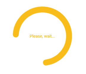
Fig. 79 Example of progress widget displayed inside an Output.
- showAbsolute(output, left, top, zindex=9999)[source]
Displays the progress as an overlay layer in a specific position
- Parameters:
output (ipywidgets.Output) – Output widget to use for the display of the transparent widget
left (str) – Position of the left side of the widget. It can be in pixels, vw, or other units.
top (str) – Position of the top side of the widget. It can be in pixels, vh, or other units.
zindex (int, optional) – Z-index of the progress on the page (default is 9999)
queryStrings module
Read parameters passed in the URL of the Voila dashboard
- queryStrings.readParameters()[source]
Read parameters passed in the URL of the Voilà dashboard.
- Returns:
parameters – Dictionary containing key-values for all the URL passed to the Voilà page
- Return type:
dictionary
Example
Read URL parameters and get value of one of the parameters:
from vois.vuetify import queryStrings

parameters = queryStrings.readParameters()
activetab = parameters.get('activetab', ['chart'])[0]
print(activetab)
Radio widget
Radio buttons to allow users to select from a predefined set of options.
- class Radio.Radio(*args: t.Any, **kwargs: t.Any)[source]
Radio buttons to allow users to select from a predefined set of options.
- Parameters:
index (int) – Index of the option initially selected (from 0 to len(labels)-1)
labels (list of strings) – Strings to be displayed as options in the radio widget
tooltips (list of str, optional) – List of strings to use as tooltips for the corresponding radio items (default is None)
color (str, optional) – Color used for the widget (default is the color_first defined in the settings.py module)
on_change (function, optional) – Python function to call when the user selects one of the values in the list. The function will receive a single parameter, containing the index of the selected option in the range from 0 to len(labels)-1
row (bool, optional) – Flag to control the position of radio buttons, either horizontal or vertical (default is True)
Example
Creation and display of a radio widget to select among three options:
from vois.vuetify import Radio
from ipywidgets import widgets
from IPython.display import display

output = widgets.Output()

def on_change(value):
    with output:
        print(value)

r = Radio(0,
        ['Option 0', 'Option 1', 'Option 2'],
        tooltips=['Tooltip for Option 1'],
        on_change=on_change,
        row=True)

display(r)
display(output)
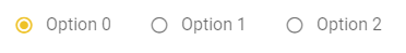
Fig. 80 Example of a radio widget to select from three options.
RangeSlider widget
Slider to select a range of numeric values.
- class RangeSlider.RangeSlider(*args: t.Any, **kwargs: t.Any)[source]
Slider to select a range of numeric values.
- Parameters:
selected_min_value (numeric) – Minimum value of the selected range
selected_max_value (numeric) – Maximum value of the selected range
min_value (numeric) – Minimum value selectable by the user
max_value (numeric) – Maximum value selectable by the user
color (str, optional) – Color used for the widget (default is the color_first defined in the settings.py module)
onchange (function, optional) – Python function to call when the user selects a value. The function will receive two parameters of numeric type containing the current min and max value selected by the user
height (int, optional) – Height of the slider widget in pixel (default is 250 pixels)
vertical (bool, optional) – Flag to display the range slider in vertical mode (default is True)
Example
Creation and display of a range slider widget:
from vois.vuetify import RangeSlider

s = RangeSlider(5,18, 0,20)
display(s)
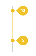
Fig. 81 RangeSlider widget example
rangeSliderFloat widget
Widget to select a range of float values
- class rangeSliderFloat.rangeSliderFloat(selectedminvalue, selectedmaxvalue, minvalue=0.0, maxvalue=1.0, text='Select', showpercentage=True, decimals=2, maxint=None, labelwidth=0, sliderwidth=200, resetbutton=False, showtooltip=False, onchange=None, editable=False, editableWidth=90)[source]
Compound widget to select a range of float values in a specific range.
- Parameters:
selectedminvalue (float) – Initial minimum value of the slider
selectedmaxvalue (float) – Initial maximum value of the slider
minvalue (float, optional) – Minimum value of the slider (default is 0.0)
maxvalue (float, optional) – Maximum value of the slider (default is 1.0)
text (str, optional) – Text to display on the left of the slider (default is ‘Select’)
showpercentage (bool, optional) – If True, the widget will write the current value as a percentage inside the allowed range and will append the % sign to the right of the current value (default is True)
decimals (int, optional) – Number of decimal digits to use in case showpercentage is False (default is 2)
maxint (int, optional) – Maximum integer number for the underlining integer slider (defines the slider sensitivity). Default value is None, meaning it will be automatically calculated
labelwidth (int, optional) – Width of the label part of the widgets in pixels (default is 0, meaning it is automatically calculated based on the provided label text)
sliderwidth (int, optional) – Width in pixels of the slider component of the widget (default is 200)
resetbutton (bool, optional) – If True a reset button is displayed, allowing for resetting the widget to its initial value (default is False)
showtooltip (bool, optional) – If True the up and down buttons will have a tooltip (default is False)
onchange (function, optional) – Python function to call when the changes the range value of the slider. The function will receive a single parameter, containing the new value of the opacity in the range from 0.0 to 1.0 (default is None)
editable (bool, optional) – If True the min and max label can be edited by clicking on them (default is False)
editableWidth (int, optional) – If the slider is editable, set the width of the v.TextField widgets to enter the min and max value (default is 90)
Example
Creation and display of a range slider widget to select an opacity range in a custom interval:
from vois.vuetify import rangeSliderFloat
from ipywidgets import widgets
from IPython.display import display

output = widgets.Output()

def onchange(value):
    with output:
        print(value)

o = rangeSliderFloat.rangeSliderFloat(1.8, 2.5, text='Select Value in [1.0,3.0]:',
                                      minvalue=1.0, maxvalue=3.0, onchange=onchange)

display(o.draw())
display(output)
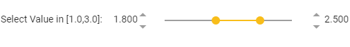
Fig. 82 Example of an range slider widget to select a floating point range.
- property value
Get/Set the slider range value as a list of min and max selected value.
- Returns:
value – Current value of the range slider
- Return type:
list of 2 floats
Example
Programmatically set the slider value
s.value = [0.56, 0.83]
selectImage widget
Select widget that displays images and enables for single selection.
- class selectImage.selectImage(*args: t.Any, **kwargs: t.Any)[source]
Select widget that displays images and enables for single selection.
- Parameters:
images (list of json element, one for each image to display, optional) – Each of the json elements must have “name”, and “image” tags. Optional tags are “max_width”, “max_height”, “margins”
label (str, optional) – Label to show in the select widget (default is ‘’)
selection (int, optional) – Index of the image to display as selected in the selection widgets at start (default is -1)
onchange (function, optional) – Python function to call when the user selects one of the images. The function will receive no parameters. (default is None)
color (str, optional) – Main color of the selection widget (default is settings.color_first)
outlined (bool, optional) – If True the selection widget will have a border around it (default is True)
clearable (Bool, optional) – If True the selection widget will show a -x- button to clear the selection (default is True)
width (str, optional) – Width of the select widget. It can be expressed as pixels (ex: “400px”) or percentage (ex: “50%”). Default is “100%”
dense (Bool, optional) – If True the items of the widgets have a reduced height (default is True)
max_width (int, optional) – Max width in pixels of the images displayed inside the selection widget (default is 100)
max_height (int, optional) – Max height in pixels of the images displayed inside the selection widget (default is 100)
margins (str, optional) – Margins to apply to the images in the selection list and when displayed as selected in the widget (default is “ma-0 mr-1 mb-1”)
Example
Creation of a select widget to select an image:
from vois.vuetify import selectImage
from ipywidgets import widgets
from IPython.display import display

output = widgets.Output()

def onchange():
    with output:
        print(s.value)

images = [
      { "name": 'Image 0', "image": 'https://cdn.vuetifyjs.com/images/cards/plane.jpg'},
      { "name": 'Image 1', "image": 'https://cdn.vuetifyjs.com/images/cards/house.jpg'},
      { "name": 'Image 2', "image": 'https://cdn.vuetifyjs.com/images/cards/road.jpg'},
      { "name": 'Image 3', "image": 'https://cdn.vuetifyjs.com/images/cards/sunshine.jpg'}
]

s = selectImage.selectImage(images=images, selection=1, max_height=100, onchange=onchange,
                            label='Please select an image from the list',
                            outlined=True, clearable=True, margins="ma-1")

display(s)
display(output)
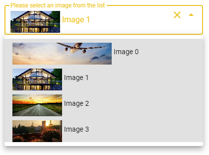
Fig. 83 Example of a selectImage widget
- setImages(images)[source]
Change the images to be selected.
- Parameters:
images (list of json element, one for each image to display) – Each of the json elements must have “name”, and “image” tags. Optional tags are “max_width”, “max_height”, “margins”
- property value
Get/Set the selected image index.
- Returns:
v – index of the image currently selected
- Return type:
int
Example
Programmatically select one of the images given its index:
sel.value = 3
print(sel.value)
selectMultiple widget
Multiple selection widget.
- class selectMultiple.selectMultiple(label, values, selected=[], mapping=None, reverse_mapping=None, width=300, onchange=None, marginy=1)[source]
Single selection widget from a dropdown list. Passing the parameter newvalues_enabled=True enables the user to insert new strings in the widget.
- Parameters:
label (str) – Help text to display
values (list of strings) – Strings to be displayed in the dropdown list of the widget
selected (list of str, optional) – List of strings that are initially selected (default is [])
mapping (function, optional) – Python function to call to transform the visible strings into codes (for example names of countries to their iso2 codes)
reverse_mapping (function, optional) – Python function to call to transform the codes into visible strings (for example iso2 codes of countries to their names)
onchange (function, optional) – Python function to call when the user selects one of the values in the list. The function will receive no parameter (use value property to retrieve the current selection)
width (int, optional) – Width in pixel of the widget (default is 300 pixels)
marginy (int, optional) – Margin in y coordinates to position the widget from top (default is 1)
Example
Creation and display of a multiple selection widget for the selection of one or more countries:
from vois.vuetify import selectMultiple
from ipywidgets import widgets
from IPython.display import display

output = widgets.Output()
display(output)

def onchange():
    with output:
        print(sel.value)

sel = selectMultiple.selectMultiple('Country:',
                                    ['Belgium', 'France', 'Italy', 'Germany'],
                                    selected=['France', 'Italy'],
                                    width=200,
                                    onchange=onchange)
sel.draw()
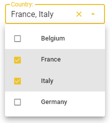
Fig. 84 Example of a selectMultiple widget to select from a list of countries.
- draw()[source]
Returns the ipyvuetify object to display (the internal v.Html widget that contains a v.Select as its unique child)
- property value
Get/Set the selected value.
- Returns:
v – list of strings of the items currently selected
- Return type:
str
Example
Programmatically select a list of values:
sel.value = ['Italy', 'Belgium']
print(sel.value)
selectSingle widget
Single selection widget from a dropdown list.
- class selectSingle.selectSingle(label, values, selection='', mapping=None, reverse_mapping=None, width=300, onchange=None, clearable=True, marginy=1, newvalues_enabled=False, newvalues_type='text', colorbackground=False, color=None)[source]
Single selection widget from a dropdown list. Passing the parameter newvalues_enabled=True enables the user to insert new strings in the widget.
- Parameters:
label (str) – Help text to display
values (list of strings) – Strings to be displayed in the dropdown list of the widget
selection (str, optional) – String that is initially selected (default is ‘’)
mapping (function, optional) – Python function to call to transform the visible strings into codes (for example names of countries to their iso2 codes)
reverse_mapping (function, optional) – Python function to call to transform the codes into visible strings (for example iso2 codes of countries to their names)
onchange (function, optional) – Python function to call when the user selects one of the values in the list. The function will receive no parameter (use value property to retrieve the current selection)
width (int, optional) – Width in pixel of the widget (default is 300 pixels)
clearable (bool, optional) – Flag that controls if the widget should show to the user the ‘X’ button to clear its content (default is True)
marginy (int, optional) – Margin in y coordinates to position the widget from top (default is 1)
newvalues_enabled (bool, optional) – Flag that enables the user to insert new values beside those listed in the dropdown (default is False)
newvalues_type (str, optional) – Type of the new values that the user can add in case newvalues_enabled is True (default is ‘text’)
colorbackground (bool, optional) – Flag that controls the filling of the widget background with color when a value of the list is selected (default is False)
color (str, optional) – Foreground color of the widget (default is settings.color_first)
Example
Creation and display of a single select widget for the selection of a country:
from vois.vuetify import selectSingle
from ipywidgets import widgets
from IPython.display import display

output = widgets.Output()
display(output)

def onchange():
    with output:
        print(sel.value)

sel = selectSingle.selectSingle('Country:',
                                ['Belgium', 'France', 'Italy', 'Germany'],
                                selection='France',
                                width=200,
                                onchange=onchange)
sel.draw()
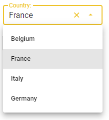
Fig. 85 Example of a selectSingle widget to select from a list of countries.
- property color
Get/Set the widget color.
- Returns:
c – widget color
- Return type:
str
Example
Programmatically change the widget color:
s.color = '#00FF00'
print(s.color)
- property disabled
Get/Set the disabled state.
- draw()[source]
Returns the ipyvuetify object to display (the internal v.Html widget that contains a v.Select or a v.Combobox as its unique child)
- property value
Get/Set the selected value.
- Returns:
v – text of the item currently selected
- Return type:
str
Example
Programmatically select one value:
sel.value = 'Italy'
print(sel.value)
settings module
General settings for ipyvuetify widgets.
- settings.button_rounded = True
Flag to control the appearance of all button widgets (also in the toggle module or inside the title and footer bars).
If True, the buttons will have rounded borders, if False, the buttons will have squared borders.
The
button.buttonclass has an optional parameter rounded that can be used to force a single button to be rounded or squared. This setting will have influence on all the buttons created without expliciting setting the rounded parameter.Example of changing the appearance of all buttons to be rounded:
from vois.vuetify import settings, button
settings.button_rounded = True

import importlib
importlib.reload(button)

b = button.button('Round button', width=200, selected=True)
display(b.draw())

Fig. 86 Example of a round button
Example of changing the appearance of all buttons to be squared:
from vois.vuetify import settings, button
settings.button_rounded = False

import importlib
importlib.reload(button)

b = button.button('Squared button', width=200, selected=True)
display(b.draw())

Fig. 87 Example of a squared button
Note
The usage of importlib.reload is needed to reload the button module after the settings.button_rounded flag is changed
- settings.color_first = '#f8bd1a'
Primary color to be used for all the widgets of the vuetify package (for instance the buttons that have the selected state True will have this color as background color)
- settings.color_second = '#efefef'
Secondary color to be used for all the widgets of the vuetify package (for instance the buttons that have the selected state False will have this color as background color)
- settings.dark_mode = False
Flag to control the dark_mode of all the vuetify widgets.
If this flag is False, the foreground color used for text is ‘black, otherwise it is ‘white’
sidePanel widget
Side panel that opens on the side of the screen to show content or get user input.
- class sidePanel.sidePanel(title='', text='', width=500, right=False, zindex=9999, showclosebuttons=True, dark=False, backdark=False, content=[], output=None, onclose=None)[source]
Side panel that opens on the side of the screen to show content or get user input.
- Parameters:
title (str, optional) – Title to display on top of the side panel (default is ‘’)
text (str, optional) – String of text to display in the content of the side panel (default is ‘’)
width (int, optional) – Width of the panel in pixel (default is 500 pixels)
right (bool, optional) – Flag that controls if the panel is opened on the right side of the screen (default is False)
zindex (int, optional) – Z-index assigned to the panel (default is 9999)
showclosebuttons (bool, optional) – Flag to display the close button in the top bar of the side panel (default is True)
dark (bool, optional) – Flag that controls the color of the text in foreground (if True, the text will be displayed in white, elsewhere in black)
backdark (bool, optional) – Flag that controls the background color of the panel (if True, the background will be black, elsewhere white)
content (list of widgets, optional) – Additional content to be added to the side panel to get user input (default is [])
output (ipywidgets.Output, optional) – Output widget on which the side panel has to be displayed
onclose (function, optional) – Python function to call when the user closes the side panel. The function will be called withput any parameter
Example
Creation and display of a side panel:
from vois.vuetify import sidePanel, slider
from ipywidgets import widgets
from IPython.display import display

output = widgets.Output()
display(output)

def onclose():
    with output:
        print('CLOSED')

text  = 'Lorem ipsum dolor sit amet, consectetur adipiscing elit, sed do eiusmod tempor incididunt ut labore...'

s = slider.slider(66,0,100)

panel = sidePanel.sidePanel(title='Help panel', text=text,
                            width=400, content=[s.draw()],
                            output=output, onclose=onclose,
                            dark=False)
panel.show()
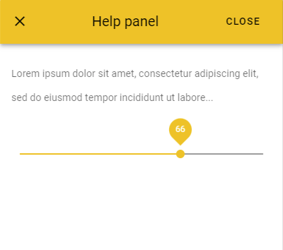
Fig. 88 Example of a side panel containing text and a slider widget.
Slider widget
Slider widget is a better visualization of the number input. It is used for gathering numerical user data.
- class Slider.Slider(*args: t.Any, **kwargs: t.Any)[source]
Slider widget is a better visualization of the number input. It is used for gathering numerical user data.
- Parameters:
selected_value (numeric) – Initial value of the slider
min_value (numeric) – Minimal value selectable by the user
max_value (numeric) – Maximum value selectable by the user
step (numeric, optional) – Step interval for ticks (default is 1.0)
vertical (bool, optional) – Flag that controls the direction of the slider: horizontal or vertical (default is False)
color (str, optional) – Color used for the widget (default is the color_first defined in the settings.py module)
on_change (function, optional) – Python function to call when the user selects a value. The function will receive a parameter of numeric type containing the current value of the slider widget
height (int, optional) – Height of the slider widget in pixel (default is 120 pixels)
width (int, optional) – Width of the slider widget in pixel. It is needed only for vertical sliders (default is None)
Example
Creation and display of a slider widget:
from vois.vuetify import Slider
from ipywidgets import widgets
from IPython.display import display

output = widgets.Output()
display(output)

def onchange(value):
    with output:
        print(value)

s = Slider(2015, 2010, 2021, onchange=onchange)
display(s)

Fig. 89 Slider widget example
- property value
Get/Set the current value.
- Returns:
value – Current value selected
- Return type:
numeric
Example
Programmatically set the value and print it:
s.value = 2012
print(s.value)
sliderFloat widget
Widget to select a float value
- class SliderFloat.SliderFloat(*args: t.Any, **kwargs: t.Any)[source]
Compound widget to select a float value in a specific range.
- Parameters:
value (float, optional) – Initial value of the slider (default is 1.0)
min_value (float, optional) – Minimum value of the slider (default is 0.0)
max_value (float, optional) – Maximum value of the slider (default is 1.0)
text (str, optional) – Text to display on the left of the slider (default is ‘Select’)
show_percentage (bool, optional) – If True, the widget will write the current value as a percentage inside the allowed range and will append the % sign to the right of the current value (default is True)
decimals (int, optional) – Number of decimal digits to use in case show_percentage is False (default is 2)
max_int (int, optional) – Maximum integer number for the underlining integer slider (defines the slider sensitivity). Default value is None, meaning it will be automatically calculated
label_width (int, optional) – Width of the label part of the widgets in pixels (default is 0, meaning it is automatically calculated based on the provided label text)
slider_width (int, optional) – Width in pixels of the slider component of the widget (default is 200)
reset_button (bool, optional) – If True a reset button is displayed, allowing for resetting the widget to its initial value (default is False)
show_tooltip (bool, optional) – If True the up and down buttons will have a tooltip (default is False)
on_change (function, optional) – Python function to call when the changes the value of the slider. The function will receive a single parameter, containing the new value of the slider in the range from minvalue to maxvalue (default is None)
color (str, optional) – Color of the widget (default is settings.color_first)
editable (bool, optional) – If True the label can be edited by clicking on it (default is False)
editable_width (int, optional) – If the slider is editable, set the width of the v.TextField widget to enter the value (default is 90)
Example
Creation and display of a slider widget to select an opacity value in the range [0.0, 1.0]:
from vois.vuetify import sliderFloat
from ipywidgets import widgets
from IPython.display import display

output = widgets.Output()

def on_change(value):
    with output:
        print(value)

o = SliderFloat(0.8, text='Fill opacity:', min_value=0.0, max_value=1.0, on_change=on_change)

display(o)
display(output)
Fig. 90 Example of a slider widget to select a floating point value.
- property color
Get/Set the widget color.
- Returns:
c – widget color
- Return type:
str
Example
Programmatically change the widget color:
s.color = '#00FF00'
print(s.color)
- property value
Get/Set the slider value.
- Returns:
value – Current value of the slider
- Return type:
float
Example
Programmatically set the slider value
s.value = 0.56
snackbar widget
Widget to display a quick message to the user in an overlapping window that will disappear after a timeout
- class snackbar.snackbar(title='', text='', show=False, color='#f8bd1a', dark=False, wrapwidth=80, timeout=10000, output=None)[source]
Widget to display a quick message to the user in an overlapping window that will disappear after a timeout.
- Parameters:
title (str, optional) – Title of the message
text (str, optional) – Text of the message
show (bool, optional) – Flag to control the immediate show of the message to the user (default is True)
color (str, optional) – Color used for the widget (default is the color_first defined in the settings.py module)
dark (bool, optional) – Flag that controls the color of the text in foreground (if True, the text will be displayed in white, elsewhere in black)
wrapwidth (int optional) – Number of chars for each line of the message (default is 80)
timeout (int, optional) – Timeout in milliseconds before the widget disappears (default is 10000, 10 seconds)
output (ipywidgets.Output, optional) – Output widget on which the snackbar has to be displayed
Example
Creation and display of a snackbar message:
from vois.vuetify import snackbar
from ipywidgets import widgets

title = 'Title of the message'
text  = 'Lorem ipsum dolor sit amet, consectetur adipiscing elit, sed do eiusmod tempor incididunt ut labore...'

s = snackbar.snackbar(title=title, text=text, show=True, wrapwidth=40, timeout=3000)
s.draw()
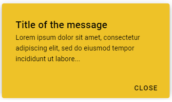
Fig. 91 Example of a snackbar message
sortableList widget
Vertically aligned list of customizable cards with items that can be moved, added and removed.
- class sortableList.sortableList(items=[], width=400, maxheightlist=10000, outlined=True, dark=False, allowNew=True, newOnTop=False, newButtonOnTop=False, itemNew=None, itemContent=None, bottomContent=[], onchange=None, onmovedown=None, onmoveup=None, onremoving=None, onremoved=None, onadded=None, buttonstooltip=False, tooltipadd='Add new', tooltipdown='Move down', tooltipup='Move up', tooltipremove='Remove', activatable=False, ondeactivated=None, onactivated=None, confirmation_for_remove=False, confirmation_text_callback=None, confirmation_title_callback=None, confirmation_dialog_output=None, confirmation_dialog_titleheight=40, confirmation_dialog_width=400, custom_new=None)[source]
Vertically aligned list of customizable cards with items that can be moved, added and removed.
- Parameters:
items (list of dicts, optional) – List of items to display in the list (default is [])
width (int, optional) – Width of widget in pixels (default is 400)
outlined (bool, optional) – Flag to show each of the items with a border (default is True)
dark (bool, optional) – Flag to invert the text and backcolor (default is the value of settings.dark_mode)
allowNew (bool, optional) – If True, a ‘plus’ button is displayed that allows for adding new items (default is True)
newOnTop (bool, optional) – If True, the ‘+’ button adds a new item in first position on the items list (default False, new items are added as last in the items list)
newButtonOnTop (bool, optional) – If True, the ‘+’ button is displayed on top of the first item, otherwise it is displayed below the last item (default is False, the ‘+’ button is on the bottom)
itemNew (function, optional) – Python function called when a new items is added. The function is called with no arguments and it must return the dict initialized with the new item content (default is None). As an alternative, the function can return None, but then the real adding of the new item must be done by directly calling the doAddItem method
itemContent (function, optional) – Python function called when an item is displayed. The function is called with an item as its first argument and the index (position of the item) as second argument. The function must return a list containing the ipyvuetify widgets to display the item content (default is None)
bottomContent (list of ipyvuetify widgets, optional) – Additional widgets content to display in the bottom line (containing the ‘plus’ button), aligned to the right (default is [])
onchange (function, optional) – Python function to call when the user changes the order of items or removes an item. The function will receive no parameters as input (default is None)
onmovedown (function, optional) – Python function to call when the user moves one item down. The function will receive as parameter the zero-based index, before the move, of the moved item (default is None)
onmoveup (function, optional) – Python function to call when the user moves one item up. The function will receive as parameter the zero-based index, before the move, of the moved item (default is None)
onremoving (function, optional) – Python function to call when the user is about to remove an item. The function will receive as parameter the zero-based index of the item that is going to be removed (default is None)
onremoved (function, optional) – Python function to call just after the user removes an item. The function will receive as parameter the zero-based index of the removed item (default is None)
onadded (function, optional) – Python function to call just after a new item is added. The function will receive as parameter the zero-based index of the new item (default is None)
buttonstooltip (bool, optional) – If True, the buttons to mode, add, remove items will have a tooltip (default is False)
tooltipadd (str, optional) – Tooltip text for the “add” button (default is ‘Add new’)
tooltipdown (str, optional) – Tooltip text for the “move down” buttons (default is ‘Move down’)
tooltipup (str, optional) – Tooltip text for the “move up” buttons (default is ‘Move up’)
tooltipremove (str, optional) – Tooltip text for the “remove” buttons (default is ‘Remove’)
activatable (bool, optional) – If True the items can be activated by clicking on them (default is False)
ondeactivated (function, optional) – Python function to call just after an item that was the active one, is deactivated. The function will receive as parameter the zero-based index of the deactivated item (default is None)
onactivated (function, optional) – Python function to call just after an item becomes the active one (or by user-clicking or by setting the active property). The function will receive as parameter the zero-based index of the active item (default is None)
confirmation_for_remove (bool, optional) – If True the removal of an item displays a cobfirmation dialog-box allowing for yes/no with a custom text (default is False)
confirmation_text_callback (function, optional) – In cases when confirmation_for_remove is True, this function is called passing the index of the item to be removed and the function should return the text of the question to ask to the user for confirmation (default is None)
confirmation_title_callback (function, optional) – In cases when confirmation_for_remove is True, this function is called passing the index of the item to be removed and the function should return the title to be displayed on the confirmation dialog-box (default is None)
confirmation_dialog_output (Output widget, optional) – In cases when confirmation_for_remove is True, this is the Output widget to be used for the display of the confirmation dialog-box (default is None)
confirmation_dialog_titleheight (int, optional) – In cases when confirmation_for_remove is True, this is the height in pixels of the confirmation dialog-box title (default is 40)
confirmation_dialog_width (int, optional) – In cases when confirmation_for_remove is True, this is the width in pixels of the confirmation dialog-box (default is 400)
custom_new (function, optional) – Custom function to call when the “Add new item” icon is clicked (default is None)
Examples
Simple list displaying static text:
from vois.vuetify import sortableList
from ipywidgets import widgets
from IPython.display import display
import ipyvuetify as v

items = [{ "name": 'Jane Adams',   "email": 'jane@adams.com'   },
         { "name": 'Paul Davis',   "email": 'paul@davis.com'   },
         { "name": 'Amanda Brown', "email": 'amanda@brown.com' }
        ]

# Creation of a new item
def itemNew():
    return {"name": "new", "email": "empty"}


# Content of an item
def itemContent(item, index):
    return [
        v.CardSubtitle(class_="mb-n4", children=[item['name']]),
        v.CardText(    class_="mt-n2", children=[item['email']])
    ]

s = sortableList.sortableList(items=items, dark=False, allowNew=True,
                              itemNew=itemNew, itemContent=itemContent)
display(s.draw())
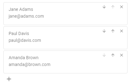
Fig. 92 Example of a simple sortableList displaying static text
Example of a sortable list displaying editable text, boolean and date values (using the
datePicker.datePickerclass):from vois.vuetify import sortableList, datePicker, switch, tooltip from ipywidgets import widgets from IPython.display import display import ipyvuetify as v output = widgets.Output() items = [ { "name": "Paul", "surname": "Dockery", "married": False, "date": "" }, { "name": "July", "surname": "Winters", "married": True, "date": "1997-07-28" }, { "name": "David", "surname": "Forest", "married": True, "date": "1999-03-03" }, { "name": "Dorothy", "surname": "Landmann", "married": False, "date": "" } ] dark = False # Called when an item is moved or deleted def onchange(): with output: print('Changed!') # Creation of a new item def itemNew(): return { "name": "", "surname": "", "married": False, "date": "" } # Remove all items def itemRemoveAll(widget, event, data): s.items = [] reset = v.Btn(icon=True, children=[v.Icon(children=['mdi-playlist-remove'])]) reset.on_event('click', itemRemoveAll) # Content of an item def itemContent(item, index): def onname(widget, event, data): item["name"] = int(data) def onsurname(widget, event, data): item["surname"] = data def onmarried(flag): item["married"] = flag dp.disabled = not flag if not flag: item["date"] = '' dp.date = None def ondate(): item["date"] = dp.date tfname = v.TextField(label='Name:', value=item['name'], color='amber', dense=True, style_="max-width: 70px", class_="pa-0 ma-0 mt-2") tfname.on_event('input', onname) tfsurname = v.TextField(label='Surname:', value=item['surname'], color='amber', dense=True, style_="max-width: 100px", class_="pa-0 ma-0 mt-2") tfsurname.on_event('input', onsurname) sw = switch.switch(item['married'], "Married", onchange=onmarried) dp = datePicker.datePicker(date=item['date'], dark=dark, width=88, onchange=ondate, offset_x=True, offset_y=False) dp.disabled = not item['married'] sp = v.Html(tag='div', class_="pa-0 ma-0 mr-3", children=['']) return [ v.Row(class_="pa-0 ma-0 ml-2", no_gutters=True, children=[tfname, sp, tfsurname, sp, sw.draw(), sp, dp.draw()]) ] s = sortableList.sortableList(items=items, width=520, outlined=False, dark=dark, allowNew=True, itemNew=itemNew, itemContent=itemContent, bottomContent=[tooltip.tooltip("Remove all persons", reset)], onchange=onchange, buttonstooltip=True) display(s.draw()) display(output)
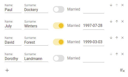
Fig. 93 Example of a sortableList to edit textual, boolean and date values on persons.
- property active
Get/Set the active item.
- Returns:
index – index of the active item
- Return type:
int
- disableMoveItems()[source]
Disable the buttons that allow the movement of items up and down in the list
- draw()[source]
Returns the ipyvuetify object to display (a v.Html object displaying two output widgets)
- property items
Get/Set the updated items.
- Returns:
items – List of items in their updated position
- Return type:
list of dicts
svgsGrid widget
Display and selection of a list of SVG files
- class svgsGrid.svgsGrid(*args: t.Any, **kwargs: t.Any)[source]
Display of a list of SVG files in rows and columns, with possibility to select one of the SVGs.
- Parameters:
filepaths (list of str) – File paths of the SVG files to display in the grid
width (str, optional) – Width to use for the display of the SVGs (default is ‘80px’)
height (str, optional) – Heigth to use for the display of the SVGs (default is ‘100px’ to accomodate for the title of the files)
cols (int, optional) – Horizontal column span [1,12] for each of the SVGs (default is 1, meaning 12 files are displayed in every row)
color (str, optional) – Background color of the SVGs (default is ‘white’)
ripple (bool, optional) – If True the click on the SVG files is highlighted (default is False)
svgsize (int, optional) – Size in pixel of the square area where the SVG is displayed (default is 80)
on_click (function, optional) – Python function to call when the user clicks on one of the SVG files. The function will receive as parameter the index of the clicked SVG. (default is None)
Example
Creation of a grid to display and select SVG files read from a subfolder:
from vois.vuetify import svgsGrid
from ipywidgets import widgets
from IPython.display import display
import glob

output = widgets.Output()

def on_click(index):
    with output:
        print(index)

filepaths = sorted(glob.glob("./maki/icons/*"))

svgsize = 80
height  = '%dpx'%(svgsize + 30)
g = svgsGrid(filepaths=filepaths, cols=1, svgsize=svgsize,
             height=height, ripple=True, on_click=on_click)

display(g)
display(output)
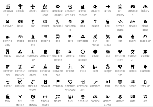
Fig. 94 Example of an svgsGrid to display a list of SVG files allowing selection
Switch widget
The switch widget provides users the ability to choose between two distinct values.
- class Switch.Switch(*args: t.Any, **kwargs: t.Any)[source]
The switch widget provides users the ability to choose between two distinct values.
- Parameters:
flag (int) – Initial value of the switch
label (str) – Text to display on the left of the switch widget
color (str, optional) – Color used for the widget (default is the color_first defined in the settings.py module)
inset (bool, optional) – Flag to enlarge switch track to encompass the thumb (default is True)
dense (bool, optional) – If True, the widget is displayed with smaller dimensions (default is False)
onchange (function, optional) – Python function to call when the user clicks on the switch. The function will receive a parameter of type bool containing the status of the switch flag
Example
Creation and display of a switch widget:
from vois.vuetify import switch
from ipywidgets import widgets
from IPython.display import display

output = widgets.Output()

def onchange(value):
    with output:
        print(value)

s = switch.switch(True, "Label of the switch", inset=True, onchange=onchange)

display(s.draw())
display(output)
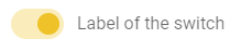
Fig. 95 Switch widget with inset flag True.
- property color
Get/Set the widget color.
- Returns:
c – widget color
- Return type:
str
Example
Programmatically change the widget color:
s.color = '#00FF00'
print(s.color)
- property disabled
Get/Set the disabled state.
- draw()[source]
Returns the ipyvuetify object to display (the internal v.Html that has a v.Switch widget as its only child)
- property value
Get/Set the status of the switch.
- Returns:
flag – Status of the switch
- Return type:
bool
Example
Programmatically set the switch status and print it:
t.value = True
print(t.value)
Tabs widget
Widget to select among alternative display using a list of tabs displayed horizontally or vertically.
- class Tabs.Tabs(*args: t.Any, **kwargs: t.Any)[source]
Widget to select among alternative display using a list of tabs displayed horizontally or vertically.
- Parameters:
index (int) – Index of the selected option at start (from 0 to len(labels)-1)
labels (list of strings) – Strings to be displayed as text of the options
contents (list of widgets, optional) – Widgets to be alternatively displayed when each of the tabs option is selected (for instance could be a list of ipywidgets.Output widgets). Default is None
tooltips (list of strings, optional) – List of strings to be used as tooltips for the single tabs, in order (default is None)
color (str, optional) – Color used for the widget (default is the color_first defined in the settings.py module)
dark (bool, optional) – Flag to invert the text and backcolor (default is the value of settings.dark_mode)
on_change (function, optional) – Python function to call when the user clicks on one of the tabs. The function will receive a parameter of type int containing the index of the selected tab, from 0 to len(labels)-1
row (bool, optional) – Flag to display the tabs horizontally or vertically (default is True)
Example
Creation and display of a tabs widget to select among alternative Outputs display:
from vois.vuetify import Tabs
from ipywidgets import widgets
from IPython.display import display

debug = widgets.Output()

output0 = widgets.Output()
output1 = widgets.Output()
output2 = widgets.Output()

with output0: print('This is output 0')
with output1: print('This is output 1')
with output2: print('This is output 2')

def on_change(index):
    with debug:
        print(index)

t = Tabs(0, ['Option 0', 'Option 1', 'Option 2'],
              contents=[output0,output1,output2],
              on_change=on:change, row=False)

display(t)
display(debug)
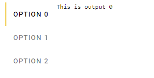
Fig. 96 Creation of a tabs widget to display ipywidgets.Output content at every selection.
- property color
Get/Set the widget color.
- Returns:
c – widget color
- Return type:
str
Example
Programmatically change the widget color:
s.color = '#00FF00'
print(s.color)
- property disabled
Get/Set the disabled state.
- property value
Get/Set the active tab index.
- Returns:
index – Index of the selected tab (from 0 to len(labels)-1)
- Return type:
int
Example
Programmatically select one of the tab and print the index of the selected option:
t.value = 2
print(t.value)
TextList widget
Widget to display text strings vertically aligned.
- class TextList.TextList(*args: t.Any, **kwargs: t.Any)[source]
Widget to vertically display a list of titles and texts strings. Each couple of title and text occupies a row.
- Parameters:
titles (list of strings) – Strings to be displayed as title of each row
texts (list of strings) – Strings to be displayed as the content of each row
titles_bold (list of strings, optional) – List of titles whose corresponding texts should be displayed in with bold font (default is [])
title_font_size (int, optional) – Size in pixel of the font used for the titles (default is 12)
text_font_size (int, optional) – Size in pixel of the font used for the texts (default is 12)
title_column (int, optional) – Number of column (out of 12) occupied by the titles (default is 4)
text_column (int, optional) – Number of column (out of 12) occupied by the texts (default is 8)
title_color (str, optional) – Color to use for the titles (default is ‘black’)
text_color (str, optional) – Color to use for the texts (default is ‘black’)
line_height_factor (float, optional) – Factor to multiply to the font-size to calculate the height of each row (default is 1.5)
Example
Creation and display of a widget to display some textual information:
from vois.vuetify import TextList
from IPython.display import display

t = TextList(['Name', 'Surname', 'Address', 'Role'],
                      ['Davide', 'De Marchi', 'via Eduardo 34, Roccacannuccia (PE)', 'Software developer'],
                      titles_bold=['Surname'],
                      title_font_size=14,
                      text_font_size=16,
                      title_column=3,
                      text_column=10,
                      title_color='#003300',
                      text_color='#000000',
                      line_height_factor=1.4
                     )

# Set some attributes of the card widget (margins, colors, width, etc.)
t.class_    = 'pa-0 ma-4 ml-6 mr-8'
t.flat      = False
t.color     = '#e0ffe0'
t.elevation = 8
t.width     = '430px'

display(t)
Fig. 97 Textlist widget for displaying textual information.
title bar
Class that implements a title bar that can be used as a simple main interface for a dashboard.
- class title.title(text='', textweight=500, buttons=[], menu=True, onmenuclick=None, dark=False, height=85, color='#f8bd1a', onclick=None, logo='https://jeodpp.jrc.ec.europa.eu/services/shared/Notebooks/images/European_Commission.svg', logowidth=100, logomarginy=0, menumarginy=2, output=None)[source]
Class that implements a title bar that can be used as a simple main interface for a dashboard.
- Parameters:
text (str, optional) – Text to display in the title widget
textweight (int, optional) – Weight of the title text (default is 500)
height (int, optional) – Height of the title bar in pixels (default is 85 pixels)
color (str, optional) – Background color of the title bar (default is the color_first defined in the settings.py module)
dark (bool, optional) – Flag that controls the color of the text in foreground (if True, the text will be displayed in white, elsewhere in black)
buttons (list of strings, optional) – List of strings to be used as text of the buttons to display below the title bar main text
onclick (function, optional) – Python function to call when the user clicks on one of the buttons. The function will receive a parameter of string containing the name of the button clicked
menu (bool, optional) – Flag that controls the display of a menu icon on the left side of the title bar (default is True)
menumarginy (int, optional) – Vertical displace of the menu icon from the top of the title bar (default is 2)
onmenuclick – Python function to call when the user clicks on the menu icon. The function will receive no parameters
logo (str, optional) – String conaining the URL of the logo image to display on the right side of the title bar
logowidth (int, optional) – Width in pixels of the area where the logo has to be displayed
logomarginy (int, optional) – Vertical displace of the logo from the top of the title bar (default is 0)
output (ipywidgets.Output, optional) – Output widget on which the title bar has to be displayed
Example
Creation and display of a title bar with additional buttons and left menu icon:
from vois.vuetify import title
from ipywidgets import widgets
from IPython.display import display

output = widgets.Output()
display(output)

def onclick(arg):
    with output:
        print(arg)

def onmenu():
    with output:
        print('MENU')

f = title.title(text='Title text to display', color='amber',
                menu=True, onmenuclick=onmenu,
                buttons=['Home', 'About Us', 'Team', 'Services', 'Blog', 'Contact Us'],
                logo='https://jeodpp.jrc.ec.europa.eu/services/shared/home/images/JRCBigDataPlatform2.png',
                logomarginy=6, menumarginy=4,
                height=80, onclick=onclick, output=output)
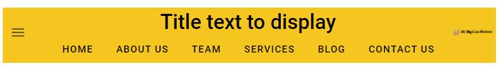
Fig. 98 Example of a title bar.
Toggle widget
Widget to select among alternative options using a list of buttons displayed horizontally or vertically.
- class Toggle.Toggle(*args: t.Any, **kwargs: t.Any)[source]
Widget to select among alternative options using a list of buttons displayed horizontally or vertically.
- Parameters:
index (int) – Index of the selected option at start (from 0 to len(labels)-1)
labels (list of strings) – Strings to be displayed as text of the options
tooltips (list of strings, optional) – Tooltip text for the options (default is the empty list)
icons (list of strings, optional) – Icons for the options (default is the empty list)
on_change (function, optional) – Python function to call when the user clicks on one of the buttons. The function will receive a parameter of type int containing the index of the clicked button, from 0 to len(labels)-1
row (bool, optional) – Flag to display the buttons horizontally or vertically (default is True)
width (int, optional) – Width in pixels of the buttons (default is 150)
height (int, optional) – Height in pixels of the buttons (default is 36)
justify (str, optional) – In case of horizontal placement, applies the justify-content css property. Available options are: start, center, end, space-between and space-around.
rounded (bool, optional) – Flag to display the buttons with a rounded shape (default is the button_rounded flag defined in the settings.py module)
outlined (bool, optional) – Flag to display the buttons as outlined (default is False)
color_selected (str, optional) – Color used for the buttons when they are selected (default is settings.color_first)
color_unselected (str, optional) – Color used for the buttons when they are not selected (default is settings.color_second)
dark (bool, optional) – Flag that controls the color of the text and icons in foreground (if True, the text and icons will be displayed in white, otherwise in black)
padding_row (int, optional) – Horizontal padding among toggle buttons (1 unit means 4 pixels). Default is 1
padding_col (int, optional) – Vertical padding among toggle buttons (1 unit means 4 pixels). Default is 2
tile (bool, optional) – Flag to remove the buttons small border (default is False)
large (bool, optional) – Flag that sets the large version of the button (default is False)
x_large (bool, optional) – Flag that sets the xlarge version of the button (default is False)
small (bool, optional) – Flag that sets the small version of the button (default is False)
x_small (bool, optional) – Flag that sets the xsmall version of the button (default is False)
Example
Creation and display of a widget for the selection among 3 options:
from vois.vuetify import Toggle
from ipywidgets import widgets
from IPython.display import display

output = widgets.Output()

def onchange(index):
    with output:
        print(index)

t = Toggle(0, ['Option 1', 'Option 2', 'Option 3'], tooltips=['Tooltip for option 1'],
                  on_change=onchange, row=False, width=150, rounded=False)

display(t)
display(output)
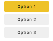
Fig. 99 Toogle widget for selecting alternative options using buttons.
- property color_selected
Get/Set the color of the selected button.
- Returns:
color – Color of the selected button
- Return type:
str
Example
Programmatically change the color of the selected button:
t.colorselected = '#ff0000'
print(t.colorselected)
- property color_unselected
Get/Set the color of the unselected buttons.
- Returns:
color – Color of the unselected buttons
- Return type:
str
Example
Programmatically change the color of the unselected buttons:
t.colorunselected = '#ff0000'
print(t.colorunselected)
- property dark
Get/Set the dark mode of the buttons.
- Returns:
flag – If True the text and the icons are displayed in white color, otherwise in black color
- Return type:
bool
Example
Programmatically change the dark mode:
t.dark = Fals
print(t.dark)
- property value
Get/Set the active option index.
- Returns:
index – Index of the selected option (from 0 to len(labels)-1)
- Return type:
int
Example
Programmatically select one of the options and print the index of the selected option:
t.value = 2
print(t.value)
tooltip widget
Add tooltip text to a widget: returns a “modified” widget to be used instead of the original one.
- tooltip.tooltip(text, widget)[source]
Add a tooltip to a widget.
- Parameters:
text (str) – Text of the tooltip
widget (ipyvuetify widget) – Instance of the widget to which the tooltip has to be added
- Returns:
An ipyvuetify v.Item widget having a v.Tooltip as its only child
- Return type:
v.Item
Example
Add a tooltip to a switch widget:
from vois.vuetify import tooltip, switch
from IPython.display import display

s = switch.switch(True, "Activate the notification")
t = tooltip.tooltip('Select to activate the notification of events to the user', s.draw())
display(t)
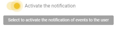
Fig. 100 Tooltip added to a switch widget.
treeview widget
Simplified creation of v-treeview vuetify widget to display hierarchical data in a tree
- class treeview.CustomTreeview(*args: t.Any, **kwargs: t.Any)[source]
Ipyvuetify template to display a custom treeview. The nodes of the tree can have a checkbox (selectable=True) and/or can be activated (activatable=True).
- items
JSON object to represent the tree: each object has ‘id’ and ‘name’ key, ‘disabled’, ‘isfolder’ and ‘icon’ are optional keys (default is [])
- Type:
list, optional
- selectable
If True the nodes of the tree have a checkbox to select them (default is True)
- Type:
bool, optional
- activatable
If True, one of the nodes of the tree can be activated (default is False)
- Type:
bool, optional
- selected
List of id of the nodes that are selected on start (default is [])
- Type:
list, optional
- selectednames
List of name of the nodes that are selected at any time (default is [])
- Type:
list, optional
- opened
List of id of the nodes that are to be opened on start (default is [])
- Type:
list, optional
- color
Color for the selected nodes (default is ‘blue’)
- Type:
str, optional
- on_change
Python function to call when the selection of the tree items changes (default is None)
- Type:
function, optional
- on_activated
Python function to call when the active item changes (user selecting a node) (default is None)
- Type:
function, optional
- expand_selection_to_parents
If True, also the parent nodes are returned as selected when all children are selected (default is True)
- Type:
bool, optional
- iconsshow
If True, an icon is added to each node of the tree (default is False)
- Type:
bool, optional
- iconscolor
Color of the icons (default is ‘blue’)
- Type:
str, optional
- icons_folder_opened
Name of the icon to use for opened nodes that have children when iconsfolder is True (default ‘mdi-folder-open’)
- Type:
str, optional
- icons_folder_closed
Name of the icon to use for closed nodes that have children when iconsfolder is True (default ‘mdi-folder’)
- Type:
str, optional
- tooltips
If True the nodes will show the tooltip (default is False)
- Type:
bool, optional
- tooltips_chars
Minimum lenght of the node label to show the tooltip (default is 20)
- Type:
int, optional
- search
Filter to display only the nodes of the tree that contain the text (default is ‘’ which means that all the nodes of the tree are displayed)
- Type:
str, optional
- item_height
Item height in pixels (default is 24)
- Type:
int, optional
- font_size
Font size in pixels (default is 15)
- Type:
int, optional
- icon_size
Icon size in pixels (default is 18)
- Type:
int, optional
- checkbox_size
Checkbox size in pixels (default is 24)
- Type:
int, optional
Note
This class is not intended to be called directly, but only through the functions
createTreeviewFromList()andcreateTreeviewFromDF2Columns().
- treeview.createFlatTreeview(nameslist=[], select_all=True, on_change=None, on_activated=None, displayfullname=True, width='200px', height='500px', elevation=0, color='#f8bd1a', dark=False, transition=False, selectable=True, activatable=False, active=None, selected=[], disabled=[], iconsshow=False, iconscolor='#f8bd1a', iconsDict=None, tooltips=False, tooltips_chars=20, item_height=24, font_size=15, icon_size=18, checkbox_size=24)[source]
Create a flat treeview form a list of strings
- Parameters:
nameslist (list, optional) – List of strings that contain a hierarchical structure, considering the separator character (default is [])
select_all (bool, optional) – Flag to control the initial selection of all the nodes of the tree (default is True)
on_change (function, optional) – Python function to call when the selected nodes change caused by user clicking in one of the checkboxes (default is None)
on_activated (function, optional) – Python function to call when the active item changes (user selecting a node) (default is None)
displayfullname (bool, optional) – If True the nodes will display the full names, id False only the last part splitted by the separator (default is True)
width (str, optional) – Width of the treeview widget (default is ‘200px’)
height (str, optional) – Height of the treeview widget (default is ‘500px’)
elevation (int, optional) – Elevation to assign to the widget (default is 0)
color (str, optional) – Color to be used as main color of the Treeview widget (default is settings.color_first)
dark (bool, optional) – If True, the treeview widget will have a dark background (default is settings.dark_mode)
transition (bool, optional) – If True applies a transition when nodes are opened and closed (default is False)
selectable (bool, optional) – If True the nodes of the tree have a checkbox to select them (default is True)
activatable (bool, optional) – If True, one of the nodes of the tree can be activated (default is False)
active (str, optional) – Name of the node to activate on start (default is None)
selected (list of str, optional) – List of fullnames of the nodes to select at start (default is []).
disabled (list of str, optional) – List of fullnames of the nodes to display as disabled in the tree (default is [])
iconsshow (bool, optional) – If True, an icon is added to each node of the tree (default is False)
iconscolor (str, optional) – Color of the icons (default is settings.color_first)
iconsDict (dict, optional) – Dictionary to apply icons to the fullnames of the items, if iconsshow is True (default is None)
tooltips (bool, optional) – If True the nodes will show the tooltip (default is False)
tooltips_chars (int, optional) – Minimum lenght of the node label to show the tooltip (default is 20)
item_height (int, optional) – Item height in pixels (default is 24)
font_size (int, optional) – Font size in pixels (default is 15)
icon_size (int, optional) – Icon size in pixels (default is 18)
checkbox_size (int, optional) – Checkbox size in pixels (default is 24)
- Returns:
v.Card – An ipyvuetify v.Card widget having a v.Html as its only child. The v.Html has a treeview.CustomTreeview widget as its only child
- Return type:
ipyvuetify Card widget
Example
Creation and display of a treeview:
from vois.vuetify import treeview
from IPython.display import display

treecard = treeview.createFlatTreeview(['A','B','C','D','E'], color='green', height='150px')
display(treecard)
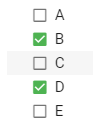
Fig. 101 Flat treeview widget created from a list of strings.
- treeview.createTreeviewFromDF2Columns(df, columnName1, columnName2, rootName='Root', separator='.', select_all=True, on_change=None, on_activated=None, expand_selection_to_parents=True, width='200px', height='500px', elevation=0, repeat_parent_as_first_child=False, color='#f8bd1a', dark=False, transition=False, selectable=True, activatable=False, active=None, open_on_click=False, opened=[], opened_all=False, selected=[], disabled=[], iconsshow=False, iconscolor='#f8bd1a', iconsfolder=True, icons_folder_opened='mdi-folder-open', icons_folder_closed='mdi-folder', iconroot=None, iconscolumnName1=None, iconscolumnName2=None, tooltips=False, tooltips_chars=20, item_height=24, font_size=15, icon_size=18, checkbox_size=24)[source]
Create a two levels treeview form the strings contained in two columns of a Pandas DataFrame.
- Parameters:
df (Pandas DataFrame) – Pandas DataFrame containing at least two columns of type string
columnName1 (str) – Name of the column of the Pandas DataFrame df containing the parent strings
columnName2 (str) – Name of the column of the Pandas DataFrame df containing the child strings
rootName (str, optional) – Name to be displayed as root of the tree (default is ‘Root’)
separator (str, optional) – String or character to be considered as separator for calculating the fullname of a node (default is ‘.’). The full name of a node is the concatenation of the path to reach the node, using the separator character
select_all (bool, optional) – Flag to control the initial selection of all the nodes of the tree (default is True)
on_change (function, optional) – Python function to call when the selected nodes change caused by user clicking in one of the checkboxes (default is None). The function receives as argument a list of all the fullnames of the selected nodes
on_activated (function, optional) – Python function to call when the active item changes (user selecting a node) (default is None)
expand_selection_to_parents (bool, optional) – If True, also the parent nodes are returned as selected when all children are selected (default is True)
width (str, optional) – Width of the treeview widget (default is ‘200px’)
height (int, optional) – Height of the treeview widget (default is ‘500px’)
elevation (int, optional) – Elevation to assign to the widget (default is 0)
repeat_parent_as_first_child (bool, optional) – If True each parent node will have a first children with its name (default is False)
color (str, optional) – Color to be used as main color of the Treeview widget (default is settings.color_first)
dark (bool, optional) – If True, the treeview widget will have a dark background (default is settings.dark_mode)
transition (bool, optional) – If True applies a transition when nodes are opened and closed (default is False)
selectable (bool, optional) – If True the nodes of the tree have a checkbox to select them (default is True)
activatable (bool, optional) – If True, one of the nodes of the tree can be activated (default is False)
active (str, optional) – Fullname of the node to activate on start (default is None). The full name of a node is the concatenation of the path to reach the node, using the separator character
open_on_click (bool, optional) – If True, the nodes of the tree can be opened also by clicking on the node label (default is False)
opened (list of str, optional) – List of fullnames of the nodes to open at start (default is []). The full name of a node is the concatenation of the path to reach the node, using the separator character
opened_all (bool, optional) – If True, all the tree nodes are opened at start (default is False). This setting has prevalence over the opened parameter.
selected (list of str, optional) – List of fullnames of the nodes to select at start (default is []). The full name of a node is the concatenation of the path to reach the node, using the separator character
disabled (list of str, optional) – List of fullnames of the nodes to display as disabled in the tree (default is [])
iconsshow (bool, optional) – If True, an icon is added to each node of the tree (default is False)
iconscolor (str, optional) – Color of the icons (default is settings.color_first)
iconsfolder (bool, optional) – If True (and if iconsshow is True) it adds the open/closed folder icon to nodes that have children (default is True)
icons_folder_opened (str, optional) – Name of the icon to use for opened nodes that have children when iconsfolder is True (default ‘mdi-folder-open’)
icons_folder_closed (str, optional) – Name of the icon to use for closed nodes that have children when iconsfolder is True (default ‘mdi-folder’)
iconroot (str, optional) – Name of the icon for the root node of the tree (default is None)
iconscolumnName1 (str, optional) – Name of the DataFrame column that contains the icon name for the node on the first level of the tree (default is None)
iconscolumnName2 (str, optional) – Name of the DataFrame column that contains the icon name for the node on the second level of the tree (default is None)
tooltips (bool, optional) – If True the nodes will show the tooltip (default is False)
tooltips_chars (int, optional) – Minimum lenght of the node label to show the tooltip (default is 20)
item_height (int, optional) – Item height in pixels (default is 24)
font_size (int, optional) – Font size in pixels (default is 15)
icon_size (int, optional) – Icon size in pixels (default is 18)
checkbox_size (int, optional) – Checkbox size in pixels (default is 24)
- Returns:
An ipyvuetify v.Card widget having a v.Html as its only child. The v.Html has a treeview.CustomTreeview widget as its only child
- Return type:
v.Card
Example
Creation of a treeview from a simple Pandas DataFrame:
from vois.vuetify import treeview
import pandas as pd

table = [['parent', 'child'], ['John', 'Mary'], ['John', 'Peter'],
                              ['Ann', 'Hellen'], ['Ann', 'Sue'], ['Ann', 'Claire']]
headers = table.pop(0)
df = pd.DataFrame(table, columns=headers)
display(df)

def on_change(arg):
    print(arg)

treecard = treeview.createTreeviewFromDF2Columns(df, headers[0], headers[1],
                                                 rootName='Families',
                                                 on_change=on_change)
display(treecard)
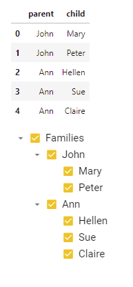
Fig. 102 Treeview widget created from a Pandas DataFrame.
- treeview.createTreeviewFromDF3Columns(df, columnName1, columnName2, columnName3, rootName='Root', separator='.', select_all=True, on_change=None, on_activated=None, expand_selection_to_parents=True, width='200px', height='500px', elevation=0, repeat_parent_as_first_child=False, color='#f8bd1a', dark=False, transition=False, selectable=True, activatable=False, active=None, open_on_click=False, opened=[], opened_all=False, selected=[], disabled=[], iconsshow=False, iconscolor='#f8bd1a', iconsfolder=True, icons_folder_opened='mdi-folder-open', icons_folder_closed='mdi-folder', iconroot=None, iconscolumnName1=None, iconscolumnName2=None, iconscolumnName3=None, tooltips=False, tooltips_chars=20, item_height=24, font_size=15, icon_size=18, checkbox_size=24)[source]
Create a three levels treeview form the strings contained in three columns of a Pandas DataFrame.
- Parameters:
df (Pandas DataFrame) – Pandas DataFrame containing at least two columns of type string
columnName1 (str) – Name of the column of the Pandas DataFrame df containing the parent strings
columnName2 (str) – Name of the column of the Pandas DataFrame df containing the child strings
columnName3 (str) – Name of the column of the Pandas DataFrame df containing the sub-child strings
rootName (str, optional) – Name to be displayed as root of the tree (default is ‘Root’)
separator (str, optional) – String or character to be considered as separator for calculating the fullname of a node (default is ‘.’). The full name of a node is the concatenation of the path to reach the node, using the separator character
select_all (bool, optional) – Flag to control the initial selection of all the nodes of the tree (default is True)
on_change (function, optional) – Python function to call when the selected nodes change caused by user clicking in one of the checkboxes (default is None). The function receives as argument a list of all the fullnames of the selected nodes
on_activated (function, optional) – Python function to call when the active item changes (user selecting a node) (default is None)
expand_selection_to_parents (bool, optional) – If True, also the parent nodes are returned as selected when all children are selected (default is True)
width (str, optional) – Width of the treeview widget (default is ‘200px’)
height (int, optional) – Height of the treeview widget (default is ‘500px’)
elevation (int, optional) – Elevation to assign to the widget (default is 0)
repeat_parent_as_first_child (bool, optional) – If True each parent node will have a first children with its name (default is False)
color (str, optional) – Color to be used as main color of the Treeview widget (default is settings.color_first)
dark (bool, optional) – If True, the treeview widget will have a dark background (default is settings.dark_mode)
transition (bool, optional) – If True applies a transition when nodes are opened and closed (default is False)
selectable (bool, optional) – If True the nodes of the tree have a checkbox to select them (default is True)
activatable (bool, optional) – If True, one of the nodes of the tree can be activated (default is False)
active (str, optional) – Fullname of the node to activate on start (default is None). The full name of a node is the concatenation of the path to reach the node, using the separator character
open_on_click (bool, optional) – If True, the nodes of the tree can be opened also by clicking on the node label (default is False)
opened (list of str, optional) – List of fullnames of the nodes to open at start (default is []). The full name of a node is the concatenation of the path to reach the node, using the separator character
opened_all (bool, optional) – If True, all the tree nodes are opened at start (default is False). This setting has prevalence over the opened parameter.
selected (list of str, optional) – List of fullnames of the nodes to select at start (default is []). The full name of a node is the concatenation of the path to reach the node, using the separator character
disabled (list of str, optional) – List of fullnames of the nodes to display as disabled in the tree (default is [])
iconsshow (bool, optional) – If True, an icon is added to each node of the tree (default is False)
iconscolor (str, optional) – Color of the icons (default is settings.color_first)
iconsfolder (bool, optional) – If True (and if iconsshow is True) it adds the open/closed folder icon to nodes that have children (default is True)
icons_folder_opened (str, optional) – Name of the icon to use for opened nodes that have children when iconsfolder is True (default ‘mdi-folder-open’)
icons_folder_closed (str, optional) – Name of the icon to use for closed nodes that have children when iconsfolder is True (default ‘mdi-folder’)
iconroot (str, optional) – Name of the icon for the root node of the tree (default is None)
iconscolumnName1 (str, optional) – Name of the DataFrame column that contains the icon name for the node on the first level of the tree (default is None)
iconscolumnName2 (str, optional) – Name of the DataFrame column that contains the icon name for the node on the second level of the tree (default is None)
iconscolumnName3 (str, optional) – Name of the DataFrame column that contains the icon name for the node on the third level of the tree (default is None)
tooltips (bool, optional) – If True the nodes will show the tooltip (default is False)
tooltips_chars (int, optional) – Minimum lenght of the node label to show the tooltip (default is 20)
item_height (int, optional) – Item height in pixels (default is 24)
font_size (int, optional) – Font size in pixels (default is 15)
icon_size (int, optional) – Icon size in pixels (default is 18)
checkbox_size (int, optional) – Checkbox size in pixels (default is 24)
- Returns:
An ipyvuetify v.Card widget having a v.Html as its only child. The v.Html has a treeview.CustomTreeview widget as its only child
- Return type:
v.Card
Example
Creation of a treeview from a simple Pandas DataFrame:
from vois.vuetify import treeview
import pandas as pd

table = [['parent', 'child', 'nephew'], ['John', 'Mary', 'Johnny'], ['John', 'Peter', 'Lisa'],
                                        ['Ann', 'Hellen', 'July'], ['Ann', 'Sue', 'Hellen'],
                                        ['Ann', 'Claire', 'Pieter']]
headers = table.pop(0)
df = pd.DataFrame(table, columns=headers)
display(df)

def on_change(arg):
    print(arg)

treecard = treeview.createTreeviewFromDF3Columns(df, headers[0], headers[1], headers[2],
                                                 rootName='Families',
                                                 on_change=on_change)
display(treecard)
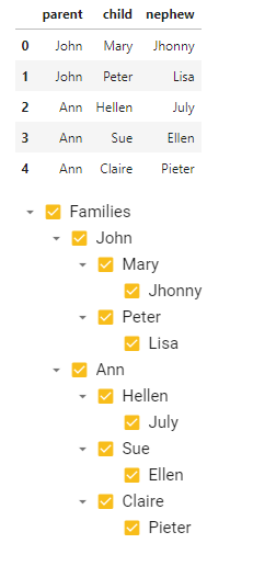
Fig. 103 Treeview widget created from a Pandas DataFrame.
- treeview.createTreeviewFromList(nameslist=[], rootName='Root', separator='.', select_all=True, on_change=None, on_activated=None, expand_selection_to_parents=True, displayfullname=True, width='200px', height='500px', elevation=0, repeat_parent_as_first_child=False, substitutionDict=None, color='#f8bd1a', dark=False, transition=False, selectable=True, activatable=False, active=None, open_on_click=False, opened=[], opened_all=False, selected=[], disabled=[], iconsshow=False, iconscolor='#f8bd1a', iconsfolder=True, icons_folder_opened='mdi-folder-open', icons_folder_closed='mdi-folder', iconroot=None, iconsDict=None, tooltips=False, tooltips_chars=20, item_height=24, font_size=15, icon_size=18, checkbox_size=24)[source]
Create a treeview form a list of strings and a separator that defines the hierarchical structure (example: [‘A’, ‘A.1’, ‘A.2’, ‘B’, ‘B.3’]).
- Parameters:
nameslist (list, optional) – List of strings that contain a hierarchical structure, considering the separator character (default is [])
rootName (str, optional) – Name to be displayed as root of the tree (default is ‘Root’)
separator (str, optional) – String or character to be considered as separator for extracting the hierarchical structure from the nameslist list of strings (default is ‘.’)
select_all (bool, optional) – Flag to control the initial selection of all the nodes of the tree (default is True)
on_change (function, optional) – Python function to call when the selected nodes change caused by user clicking in one of the checkboxes (default is None)
on_activated (function, optional) – Python function to call when the active item changes (user selecting a node) (default is None)
expand_selection_to_parents (bool, optional) – If True, also the parent nodes are returned as selected when all children are selected (default is True)
displayfullname (bool, optional) – If True the nodes will display the full names, id False only the last part splitted by the separator (default is True)
width (str, optional) – Width of the treeview widget (default is ‘200px’)
height (str, optional) – Height of the treeview widget (default is ‘500px’)
elevation (int, optional) – Elevation to assign to the widget (default is 0)
repeat_parent_as_first_child (bool, optional) – If True each parent node will have a first children with its name (default is False)
substitutionDict (dict, optional) – Dictionary to apply substitutions to the fullnames of the items extracted from the nameslist parameters (default is None)
color (str, optional) – Color to be used as main color of the Treeview widget (default is settings.color_first)
dark (bool, optional) – If True, the treeview widget will have a dark background (default is settings.dark_mode)
transition (bool, optional) – If True applies a transition when nodes are opened and closed (default is False)
selectable (bool, optional) – If True the nodes of the tree have a checkbox to select them (default is True)
activatable (bool, optional) – If True, one of the nodes of the tree can be activated (default is False)
active (str, optional) – Name of the node to activate on start (default is None)
open_on_click (bool, optional) – If True, the nodes of the tree can be opened also by clicking on the node label (default is False)
opened (list of str, optional) – List of names of the nodes to open at start (default is [])
opened_all (bool, optional) – If True, all the tree nodes are opened at start (default is False). This setting has prevalence over the opened parameter.
selected (list of str, optional) – List of fullnames of the nodes to select at start (default is []).
disabled (list of str, optional) – List of fullnames of the nodes to display as disabled in the tree (default is [])
iconsshow (bool, optional) – If True, an icon is added to each node of the tree (default is False)
iconscolor (str, optional) – Color of the icons (default is settings.color_first)
iconsfolder (bool, optional) – If True (and if iconsshow is True) it adds the open/closed folder icon to nodes that have children (default is True)
icons_folder_opened (str, optional) – Name of the icon to use for opened nodes that have children when iconsfolder is True (default ‘mdi-folder-open’)
icons_folder_closed (str, optional) – Name of the icon to use for closed nodes that have children when iconsfolder is True (default ‘mdi-folder’)
iconroot (str, optional) – Name of the icon for the root node of the tree (default is None)
iconsDict (dict, optional) – Dictionary to apply icons to the fullnames of the items, if iconsshow is True (default is None)
tooltips (bool, optional) – If True the nodes will show the tooltip (default is False)
tooltips_chars (int, optional) – Minimum lenght of the node label to show the tooltip (default is 20)
item_height (int, optional) – Item height in pixels (default is 24)
font_size (int, optional) – Font size in pixels (default is 15)
icon_size (int, optional) – Icon size in pixels (default is 18)
checkbox_size (int, optional) – Checkbox size in pixels (default is 24)
- Returns:
v.Card – An ipyvuetify v.Card widget having a v.Html as its only child. The v.Html has a treeview.CustomTreeview widget as its only child
- Return type:
ipyvuetify Card widget
Example
Creation and display of a treeview:
from vois.vuetify import treeview
from IPython.display import display

treecard = treeview.createTreeviewFromList(['A','A.1','A.2','A.1.1',
                                            'A.3.1','A.4.1.2','A.5.2.1',
                                            'A.4.2.3.1','B','B.A'],
                                           rootName='Root',
                                           expand_selection_to_parents=False,
                                           substitutionDict={'A.1': 'A.1 new name'},
                                           color='green',
                                           height='350px')
display(treecard)
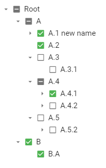
Fig. 104 Treeview widget created from a list of strings.
- class treeview.treeviewOperations(treecard)[source]
Helper class to operate on a treeview returned by the
createTreeviewFromList()andcreateTreeviewFromDF2Columns()functions. This class allows for activation and opening/closing of nodes of the tree- treecard
Value returned by a call to the functions
createTreeviewFromList()andcreateTreeviewFromDF2Columns().- Type:
instance of ipyvuetify Card widget
Example
Creation and display of a treeview and programmatical activation and opening of the nodes:
from vois.vuetify import treeview
from IPython.display import display

treecard = treeview.createTreeviewFromList(['A','A.1','A.2','A.1.1',
                                            'A.3.1','A.4.1.2','A.5.2.1',
                                            'A.4.2.3.1','B','B.A'],
                                           rootName='Root',
                                           activatable=True,
                                           expand_selection_to_parents=False,
                                           substitutionDict={'A.1': 'A.1 new name'},
                                           color='green',
                                           height=350)
display(treecard)

top = treeview.treeviewOperations(treecard)

# Print active node
print(top.getActive())

# Set active node
top.setActive('A.1.1')

# Set the list of opened nodes
top.setOpened(['Root', 'A', 'A.3'])
- getFirstChildFullname(fullname)[source]
Given the fullname of a node, returns the fullname of its first child, or None if the node has no children
- setChildren(nodefullname, childrenfullnames)[source]
Dynamically change the children of a node
Example
Creation and display of a treeview and programmatically add children to nodes:
from vois.vuetify import treeview
from IPython.display import display

treecard = treeview.createTreeviewFromList(['A','A.1','A.2','B'],
                                           separator='.',
                                           rootName='Root',
                                           expand_selection_to_parents=False,
                                           color='green',
                                           width='500px',
                                           height='350px',
                                           selectable=False,
                                           activatable=True)

display(treecard)

top = treeview.treeviewOperations(treecard)

top.setChildren('A.2', ['A.2.1', 'A.2.2'])
upload widget
UploadImage widget